New in 2.5: iPhone Duo, charts, Tasks
Design in Figma. Ship in your app.
A Figma UI kit for iOS and Android, built like a design system rather than a sticker sheet. Every component is bound to variables and already sits on real app screens, so a rebrand is one edit.
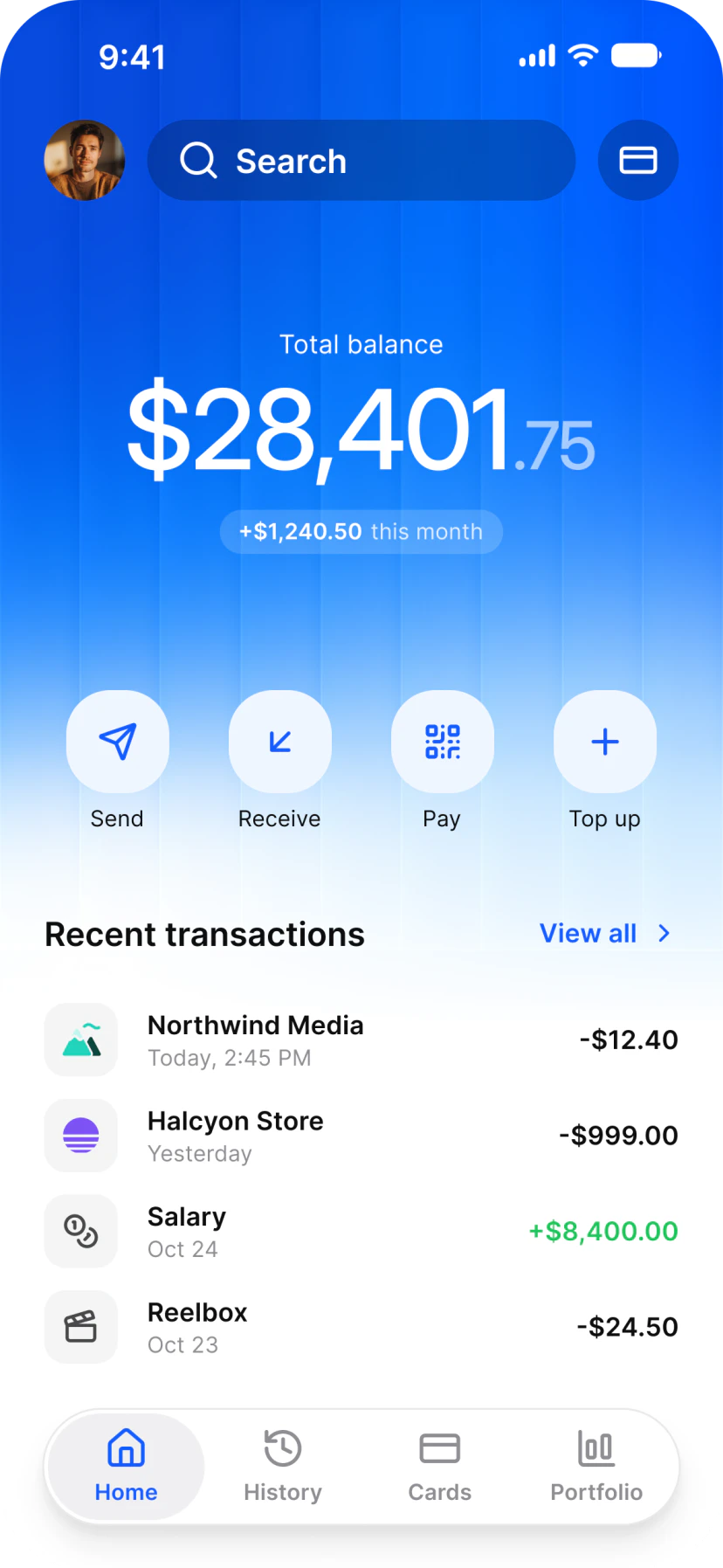
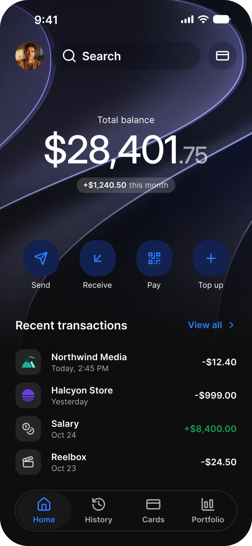
Finance
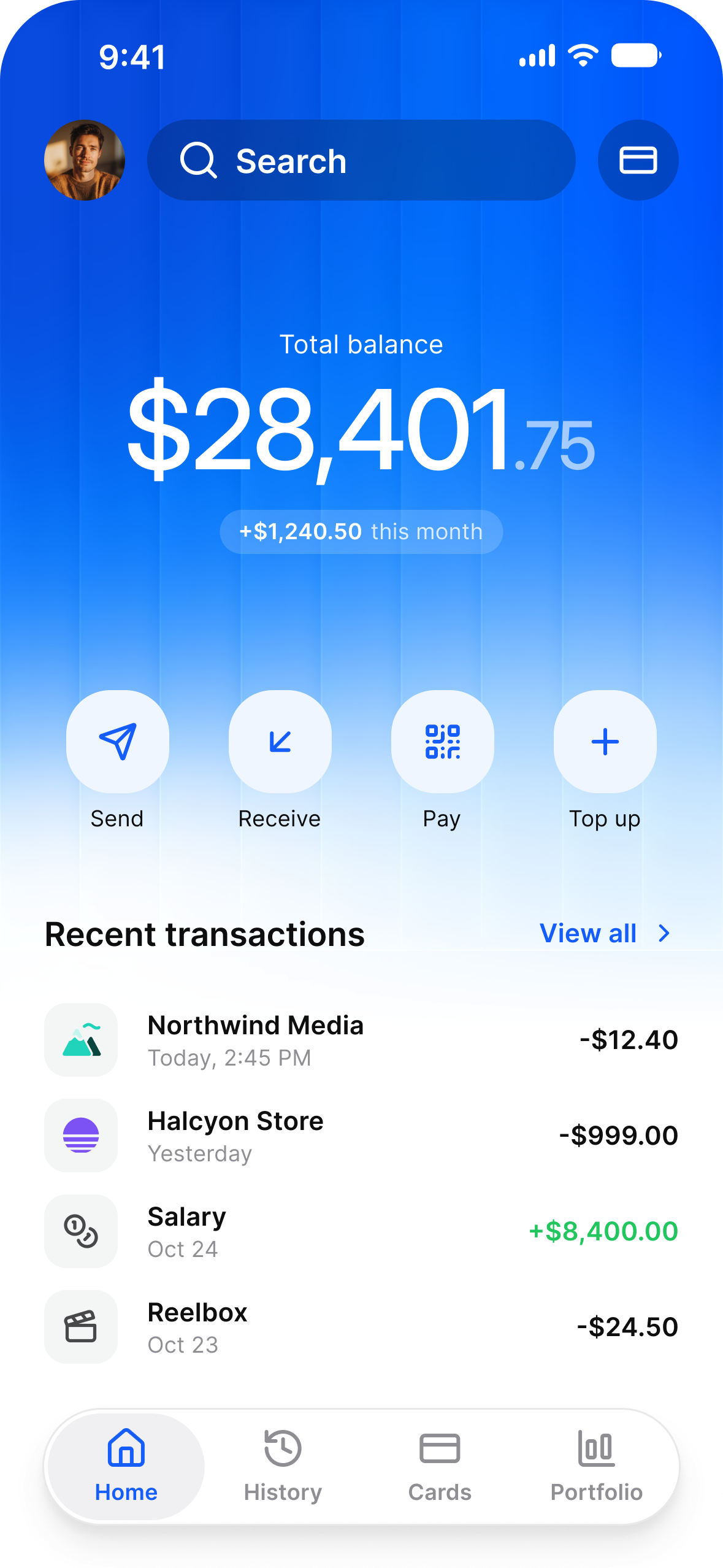
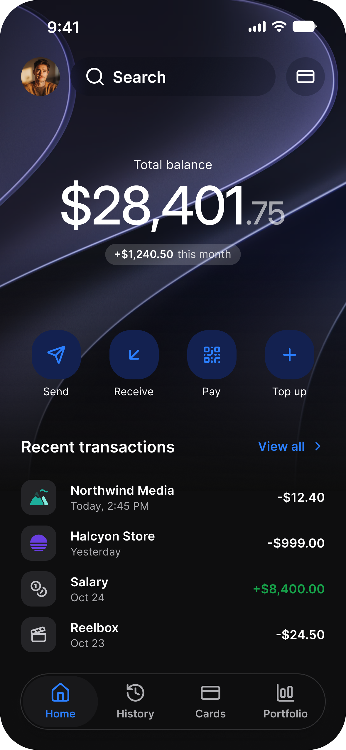
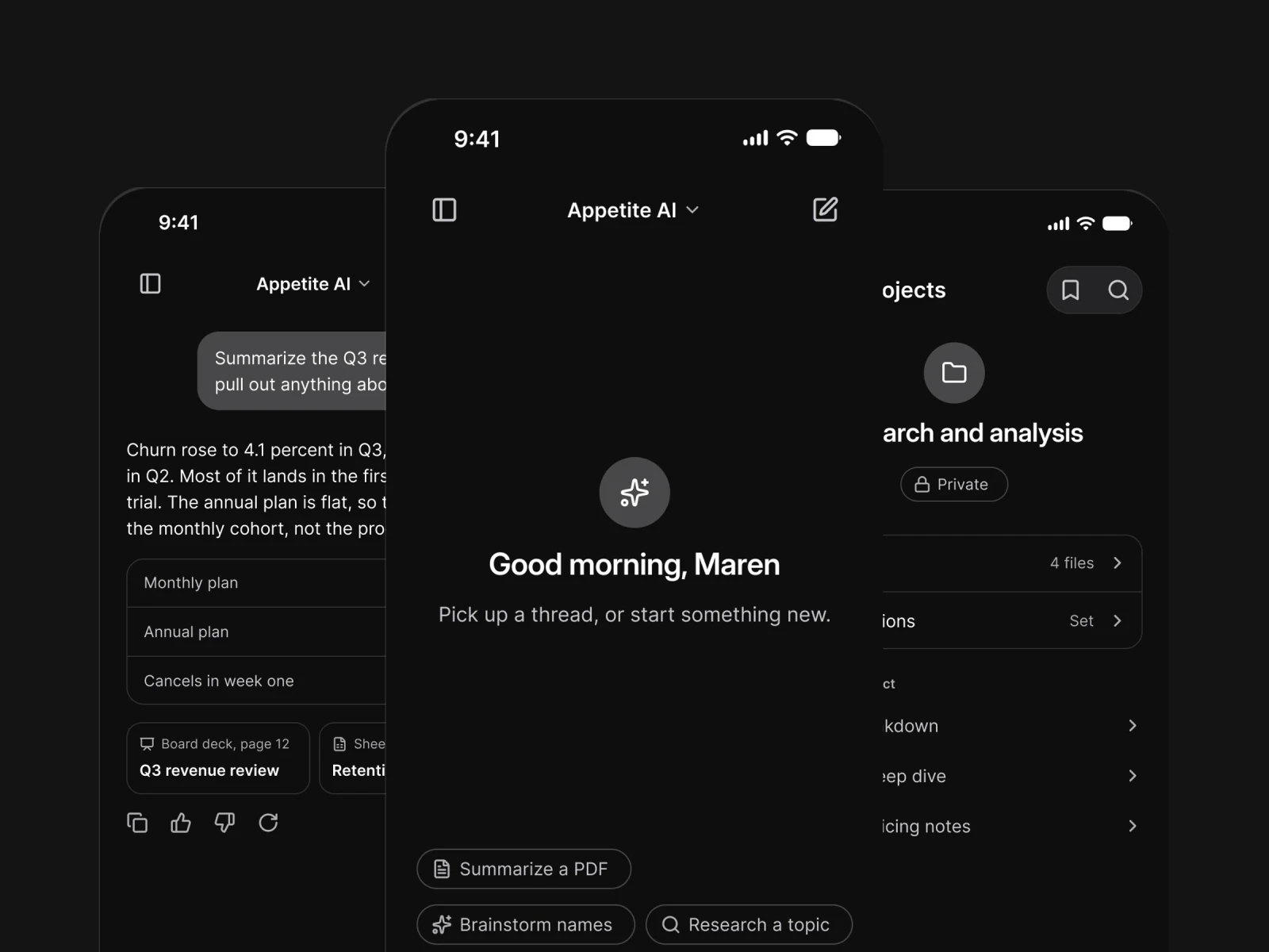
AI
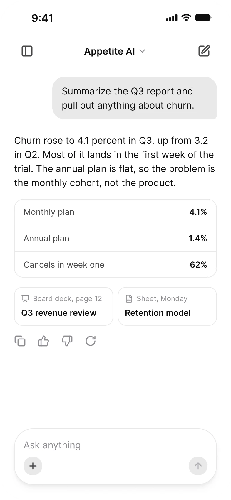
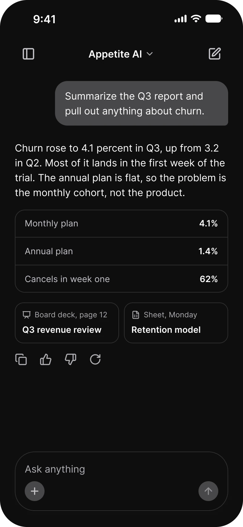
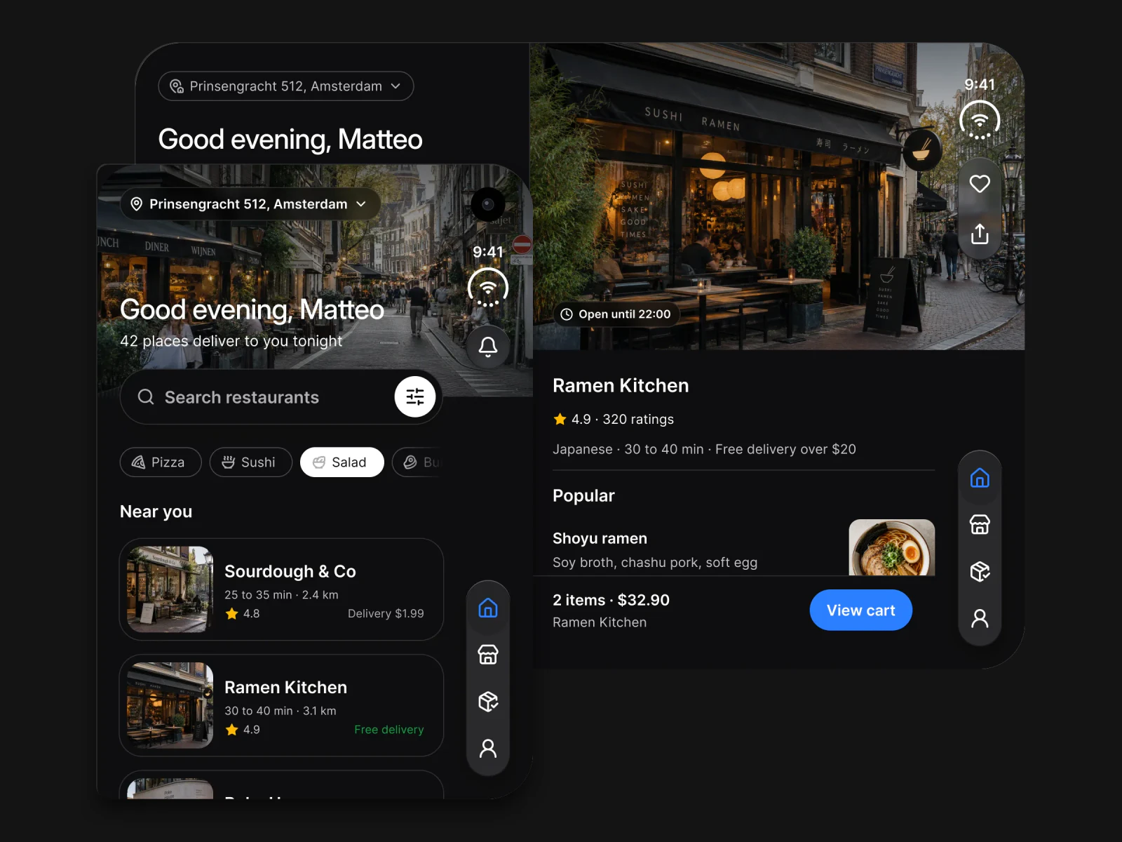
Foodie
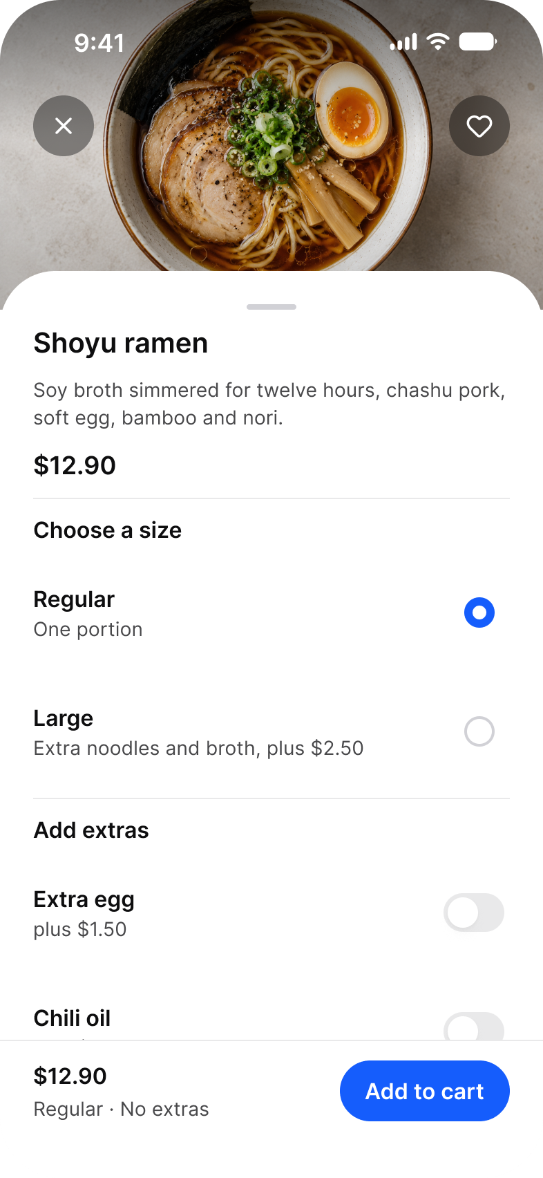
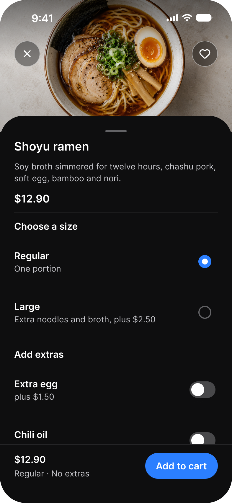
Booking
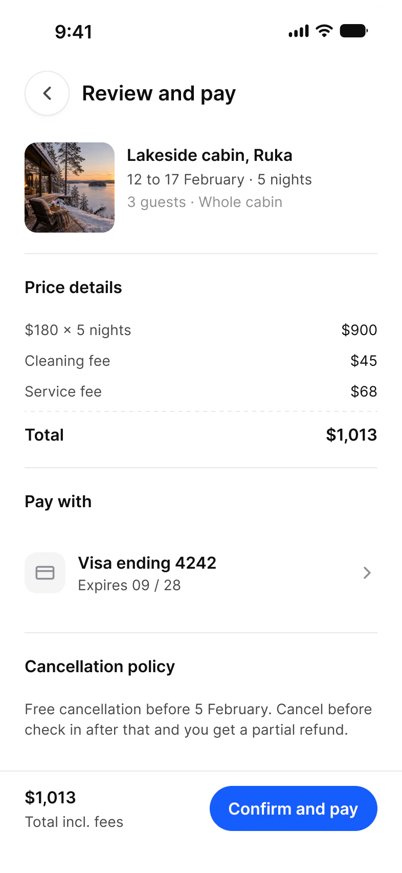
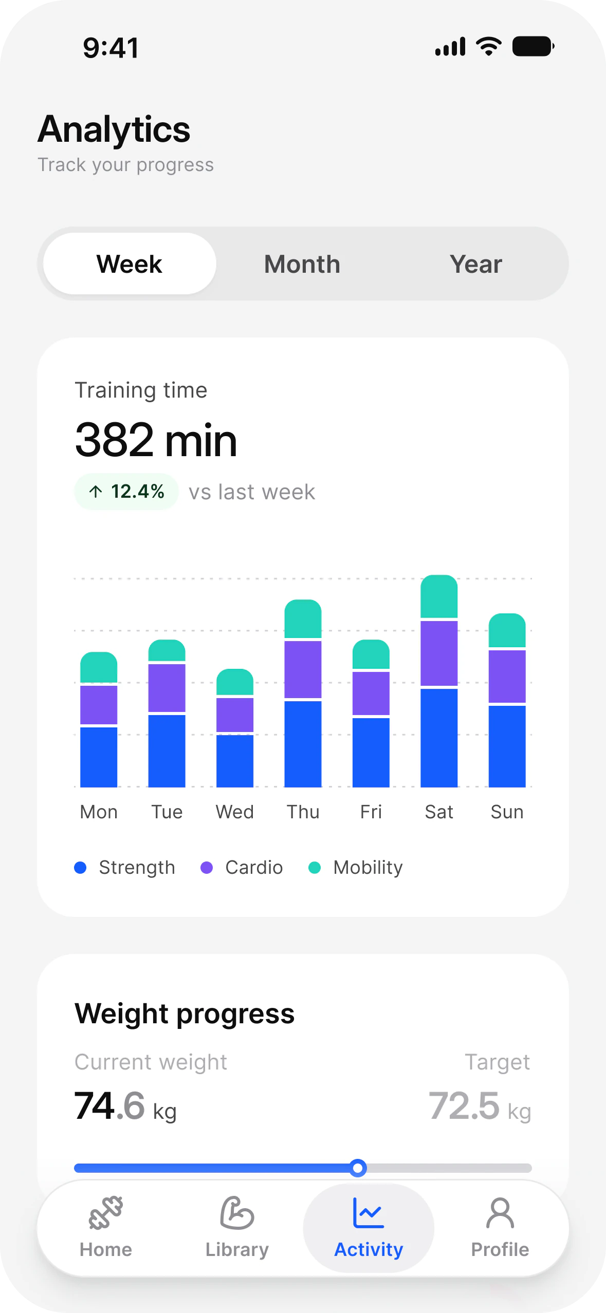
Fitness
Social
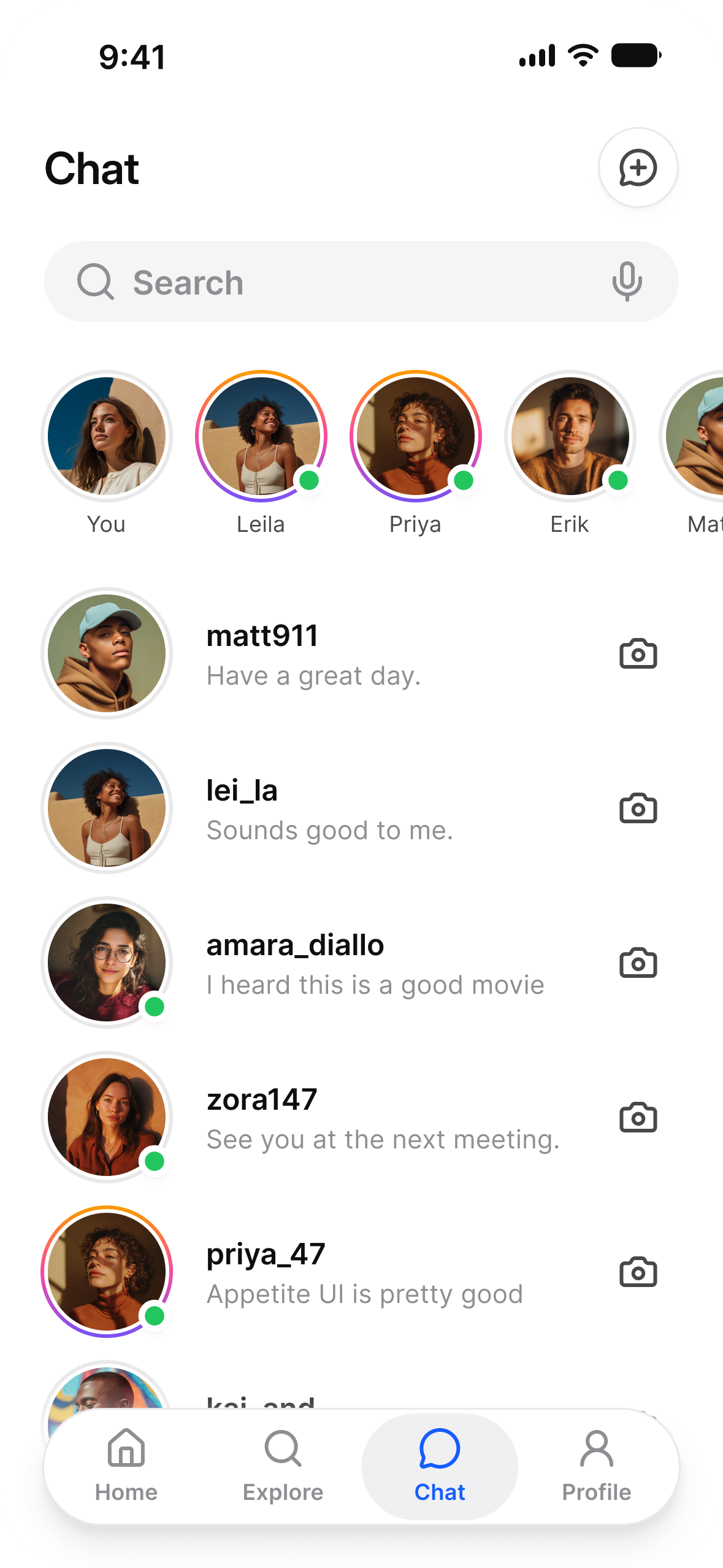
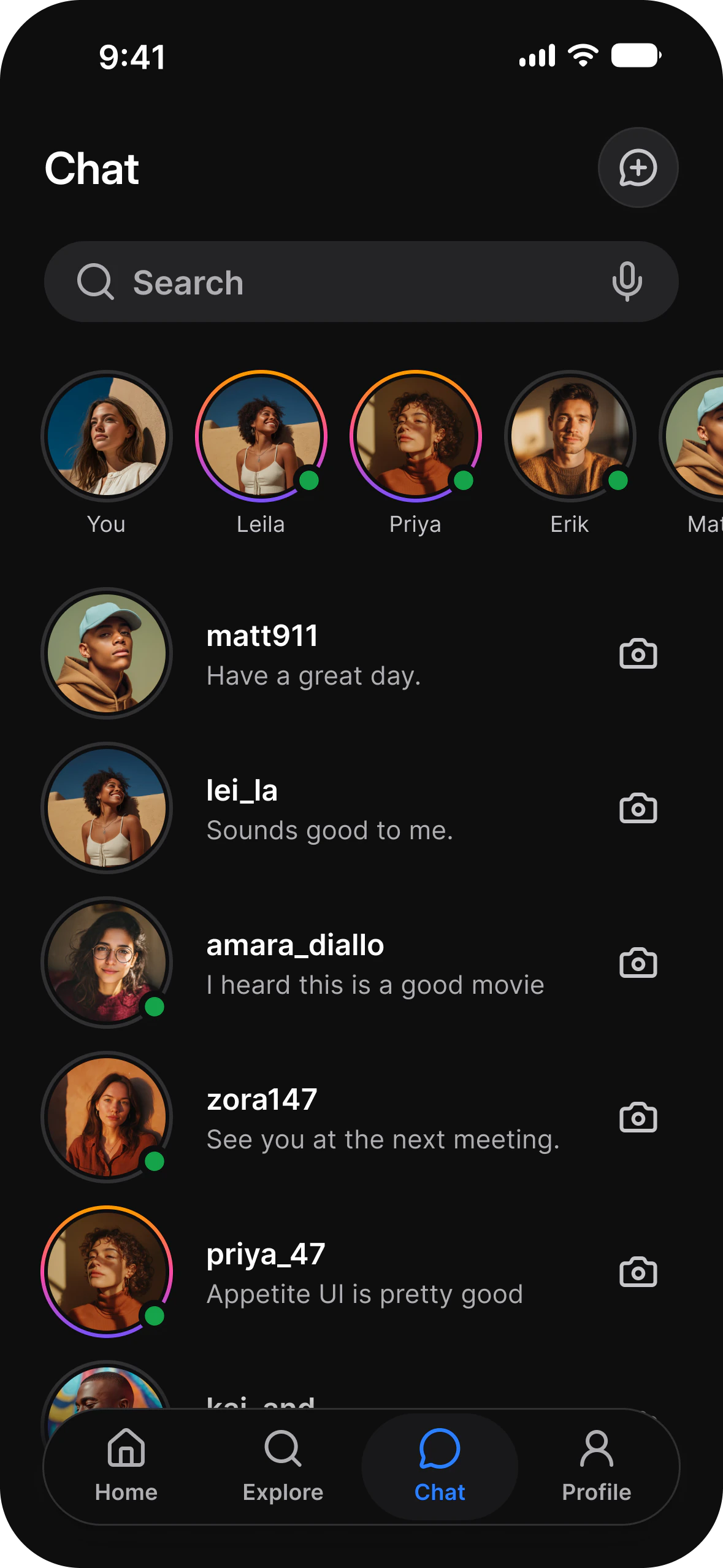
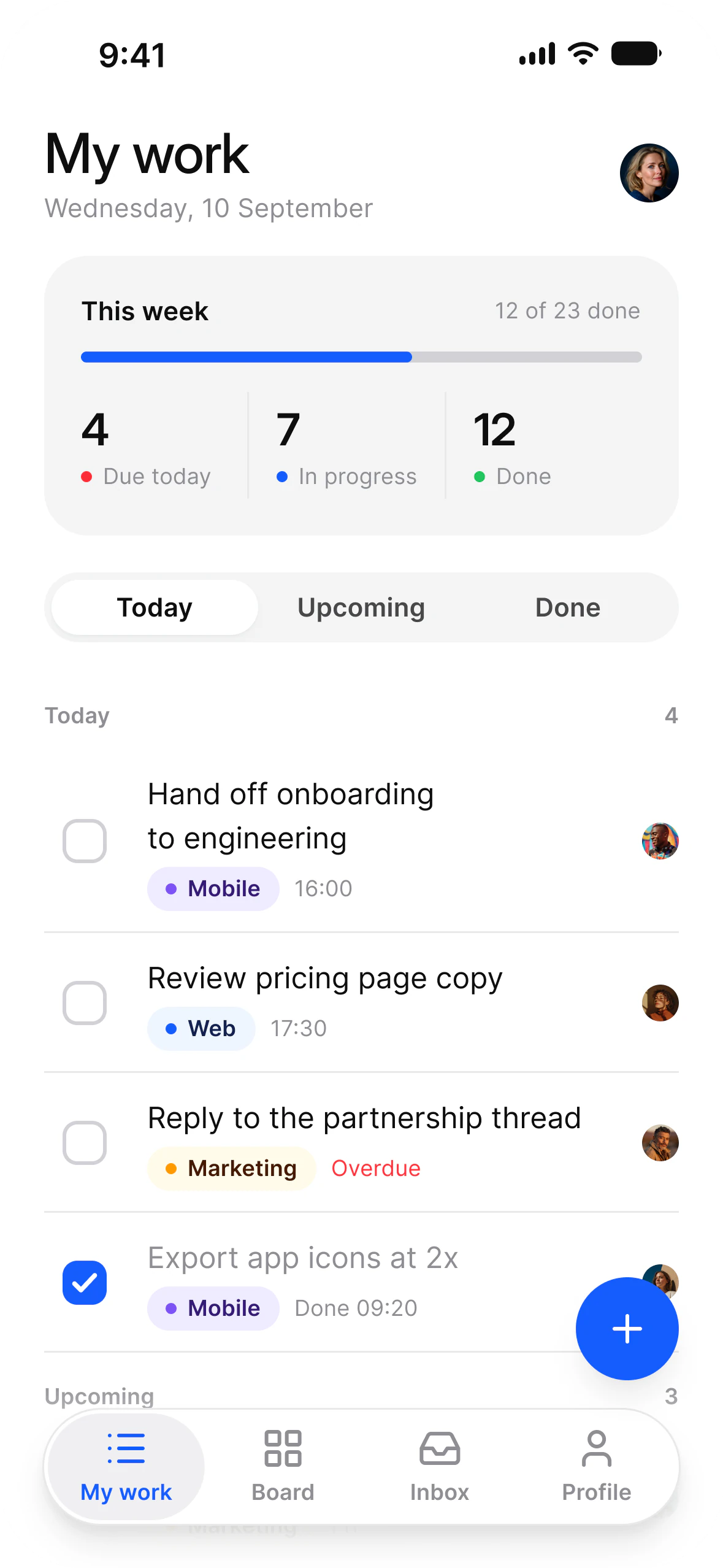
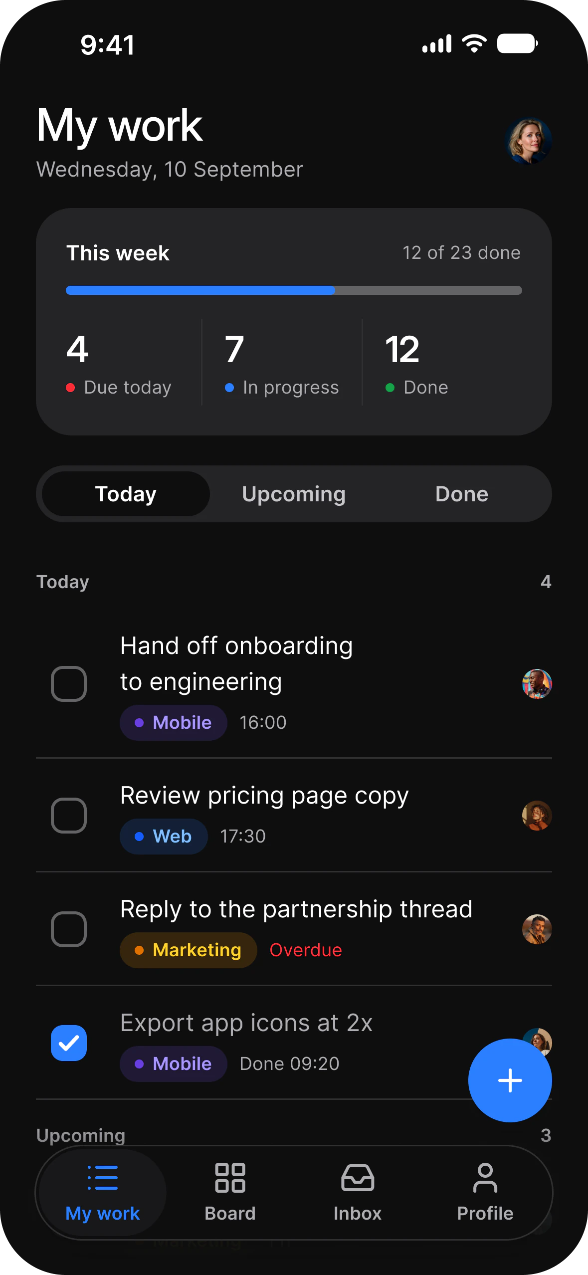
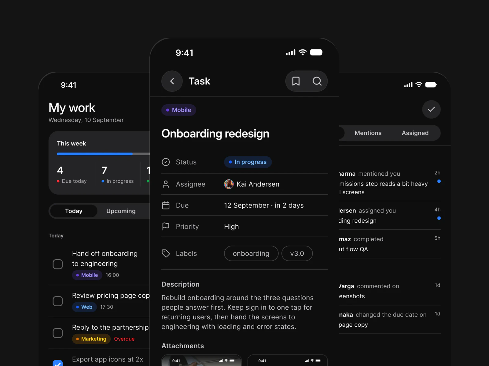
Tasks
Onboarding
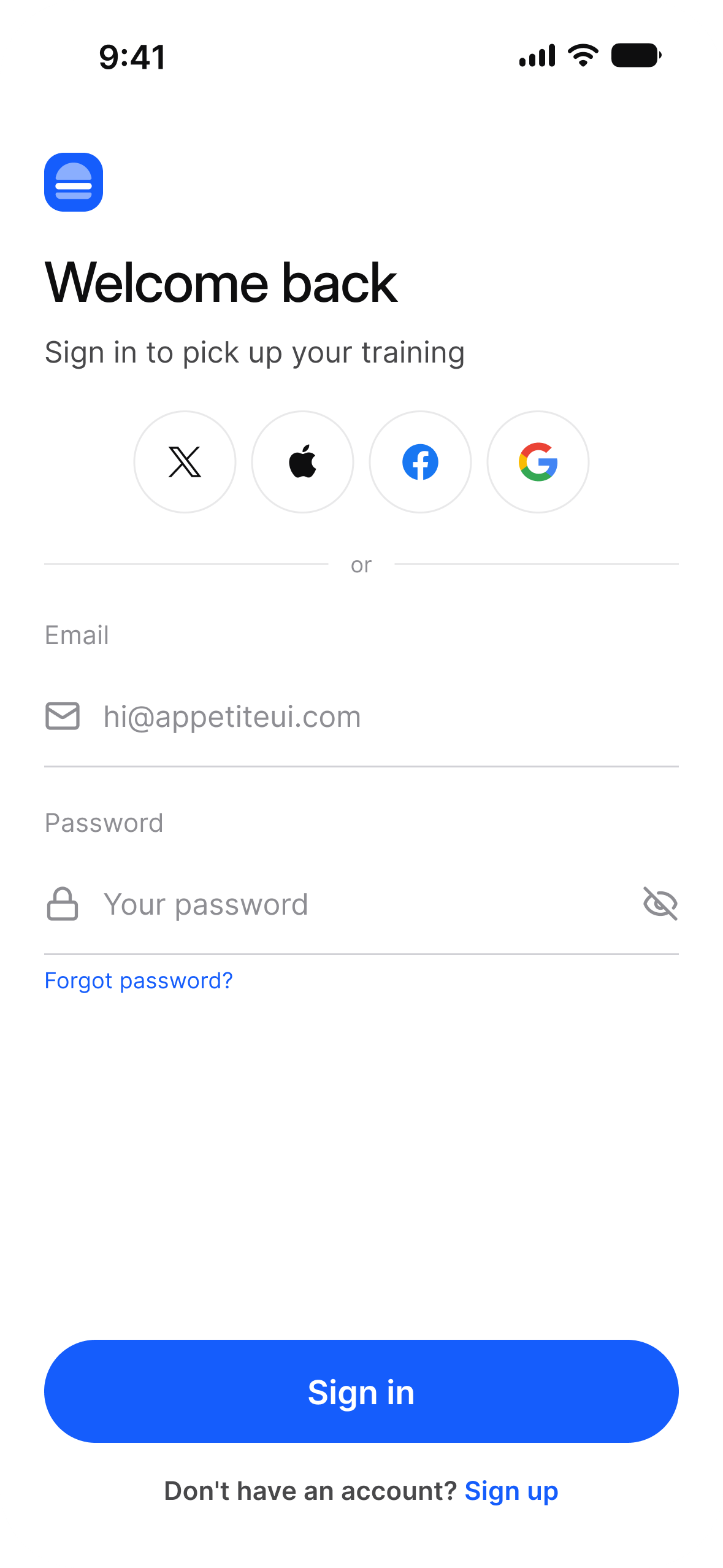
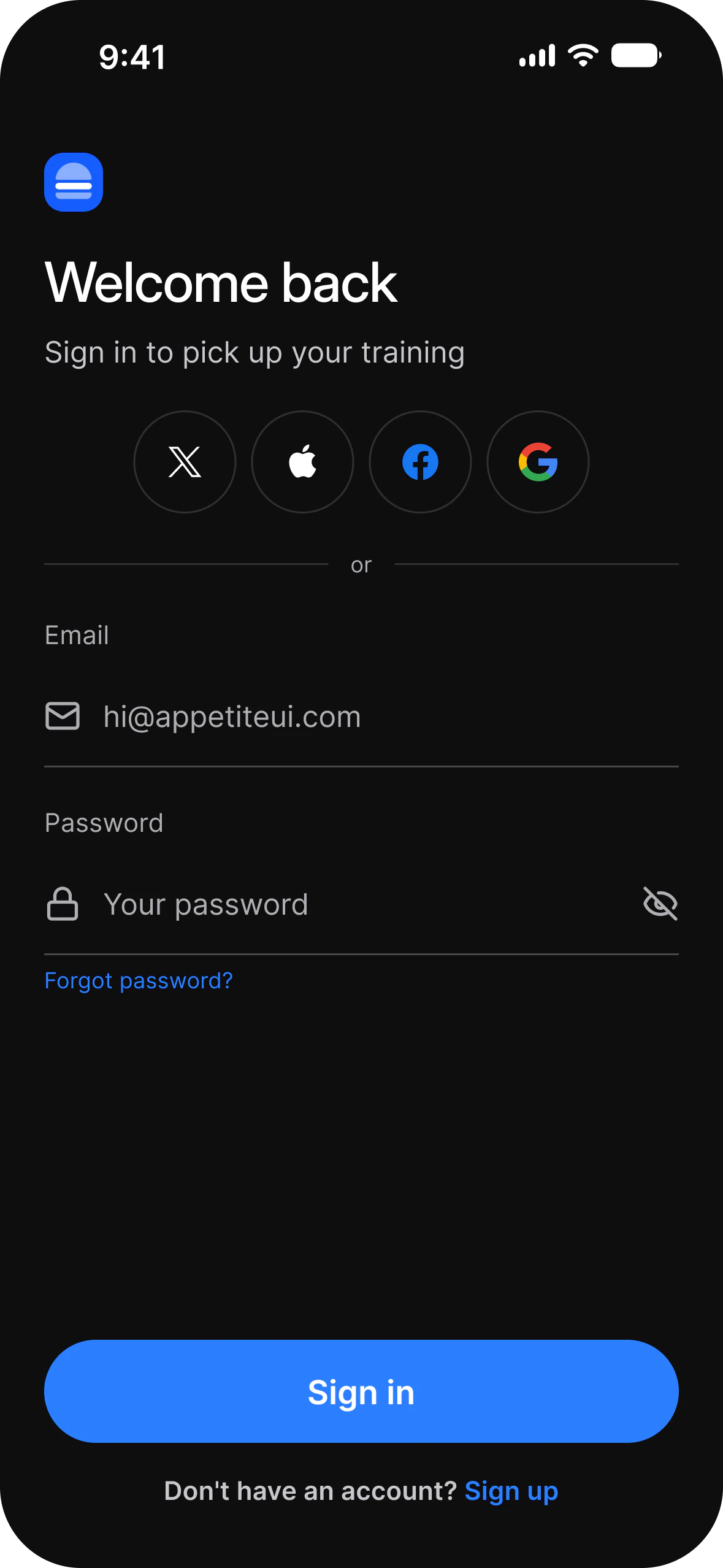
Settings
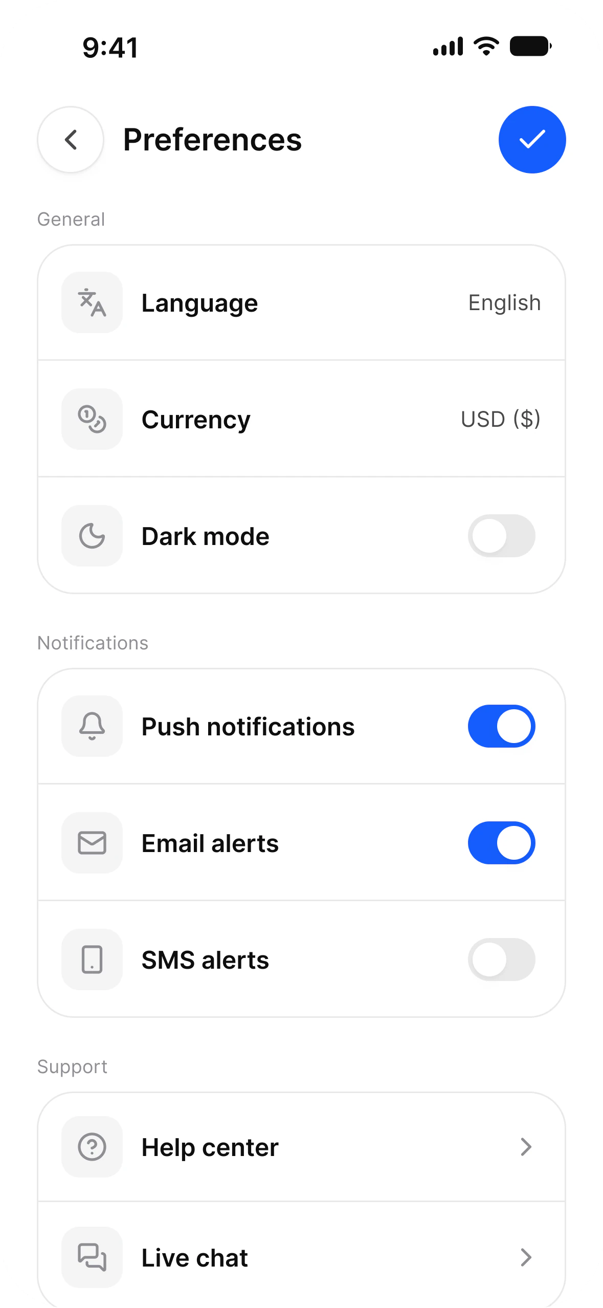
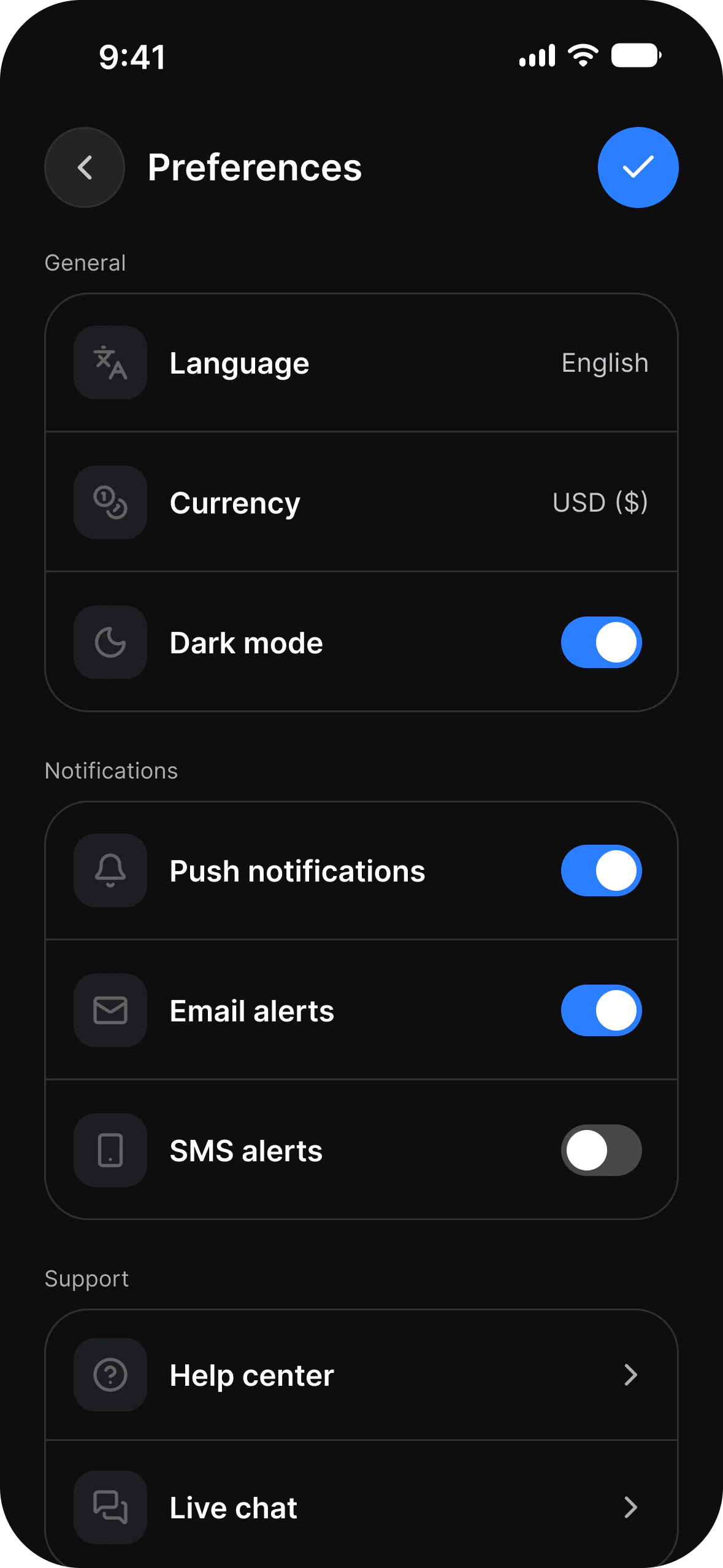
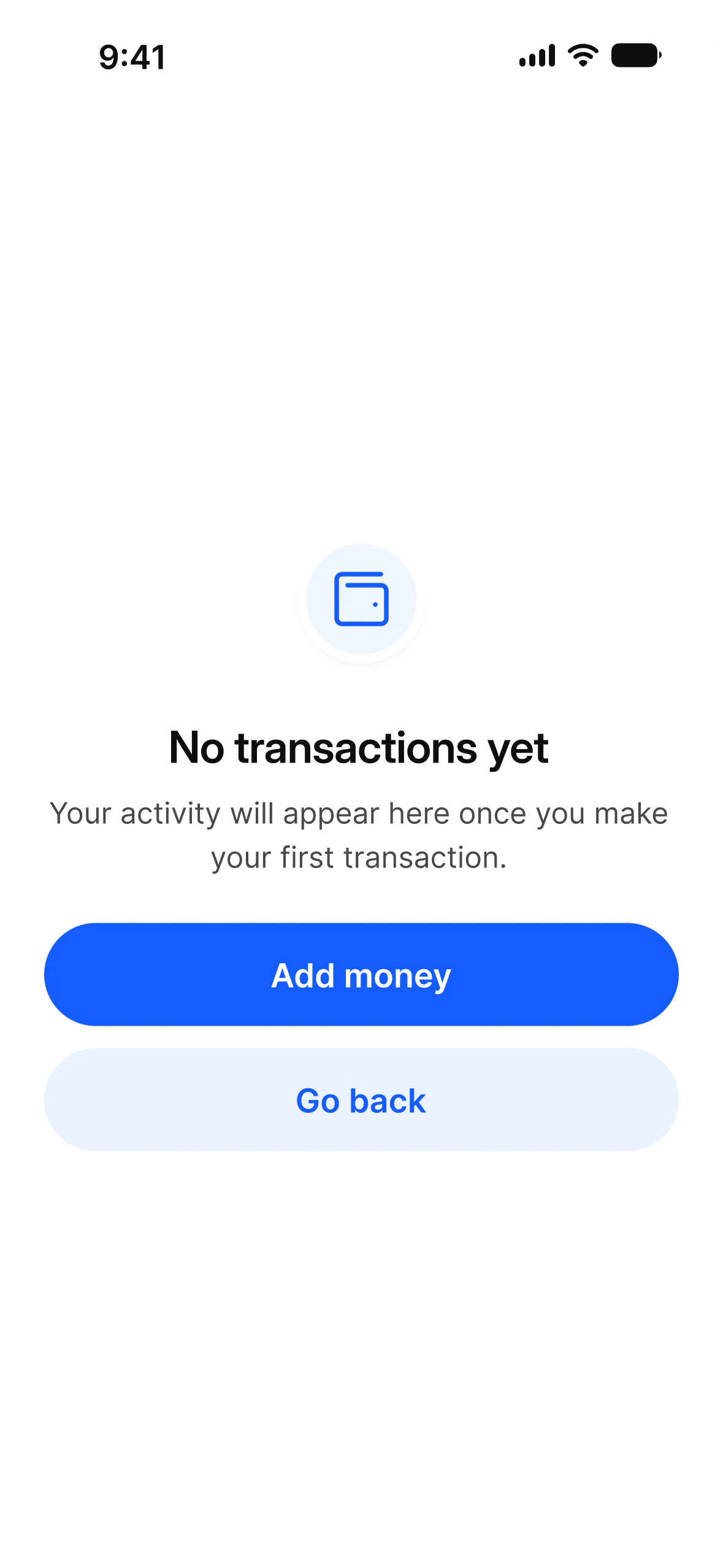
Empty state
Changelog 2.5
iPhone Duo, Dynamic Island, charts and tables, and a Tasks app, from one token source.
Full changelogArchitecture
One source of truth. One file for iOS and Android.
Open a screen group and build today. The token architecture underneath is why a rebrand is still one edit six months from now.
Tokens
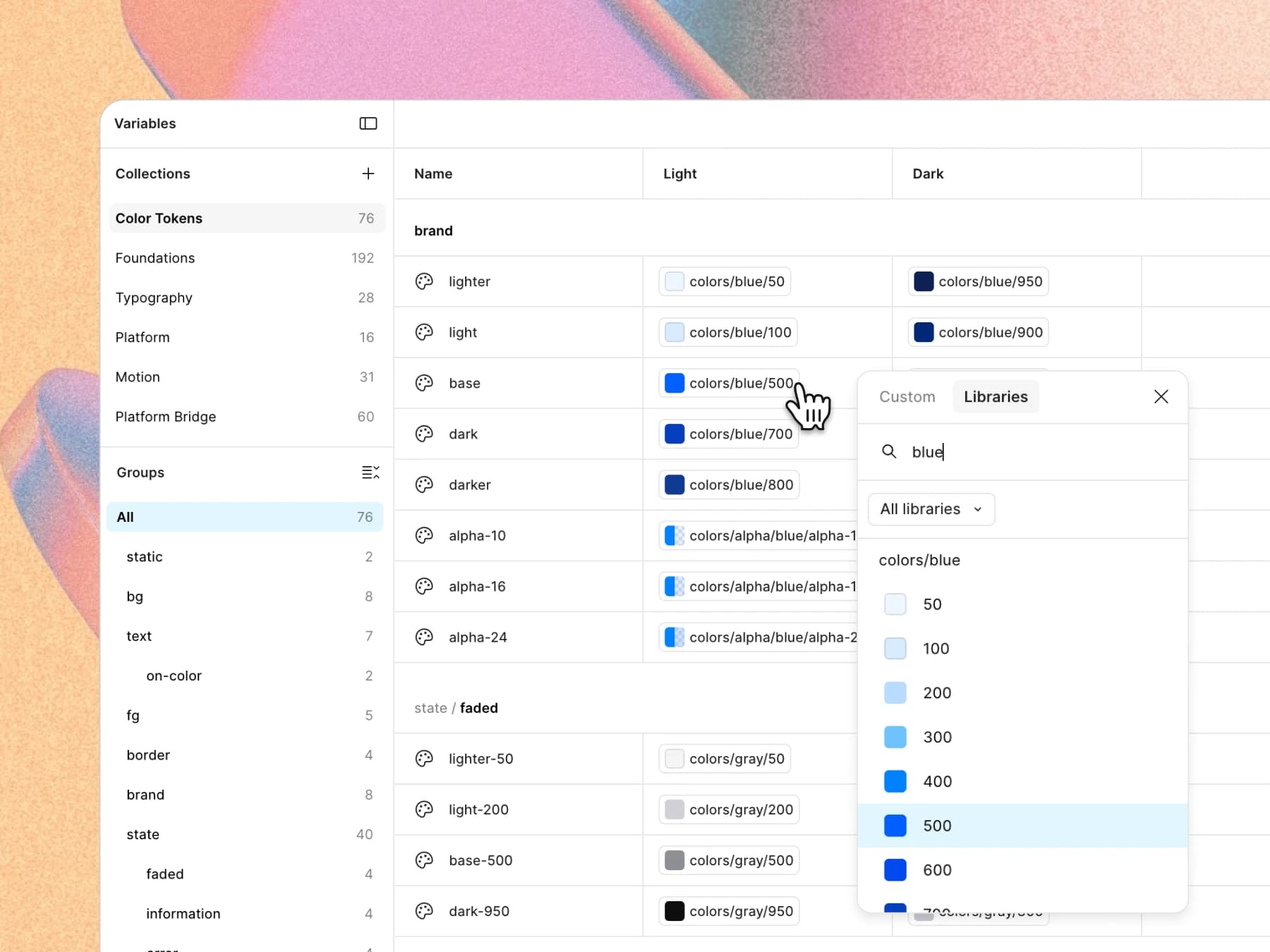
Rebrand in minutes
App examples
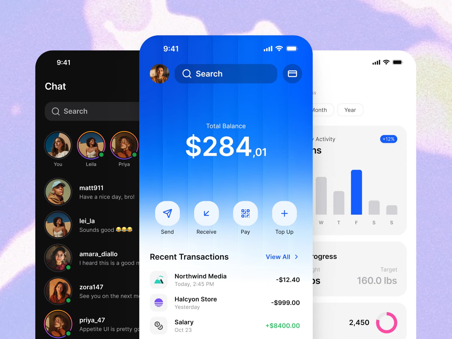
Ready-to-use screens
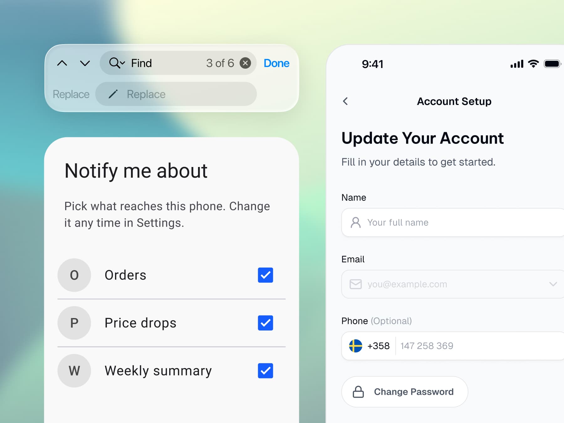
Platforms
Ship both platforms
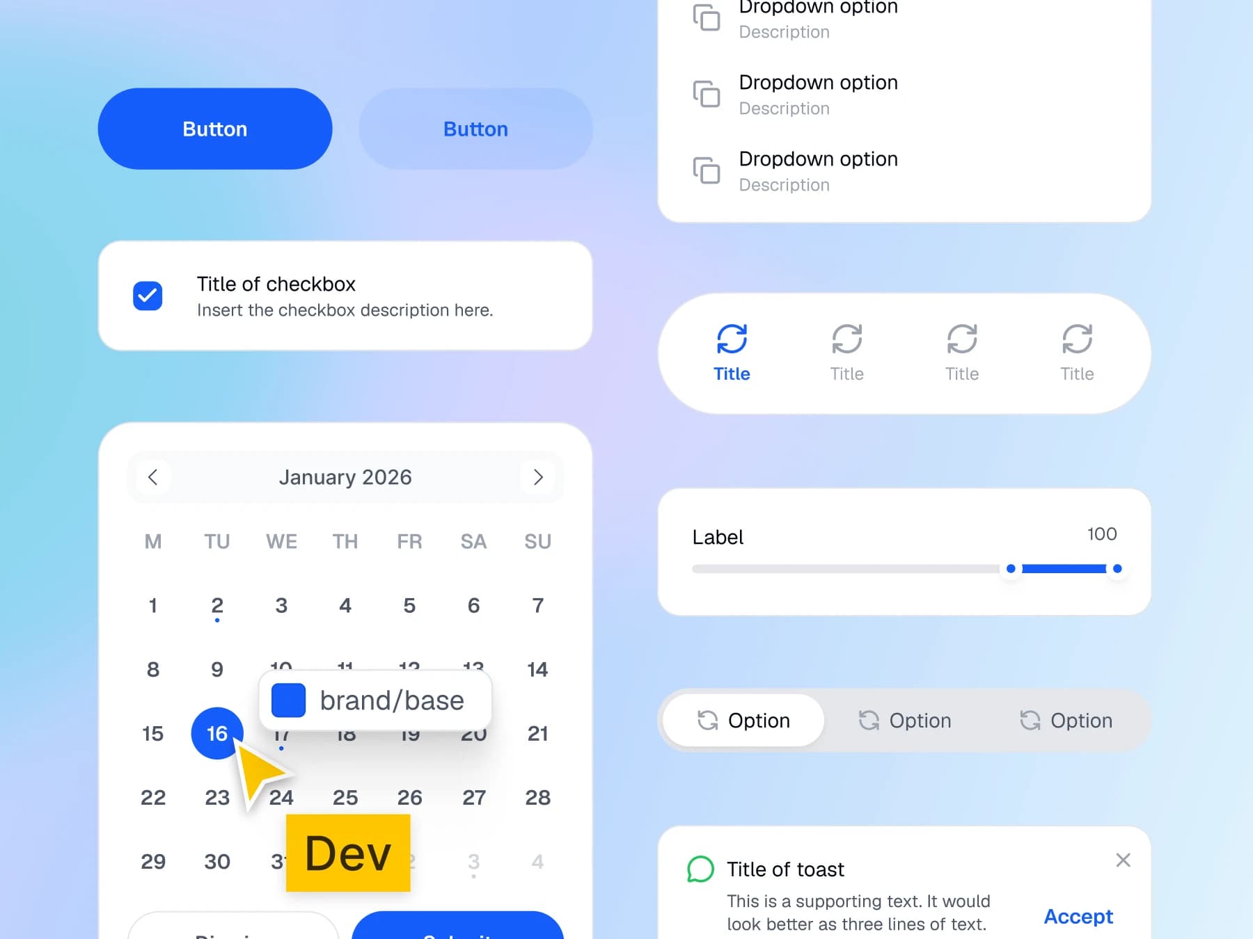
Code handoff
Hand off without a spec
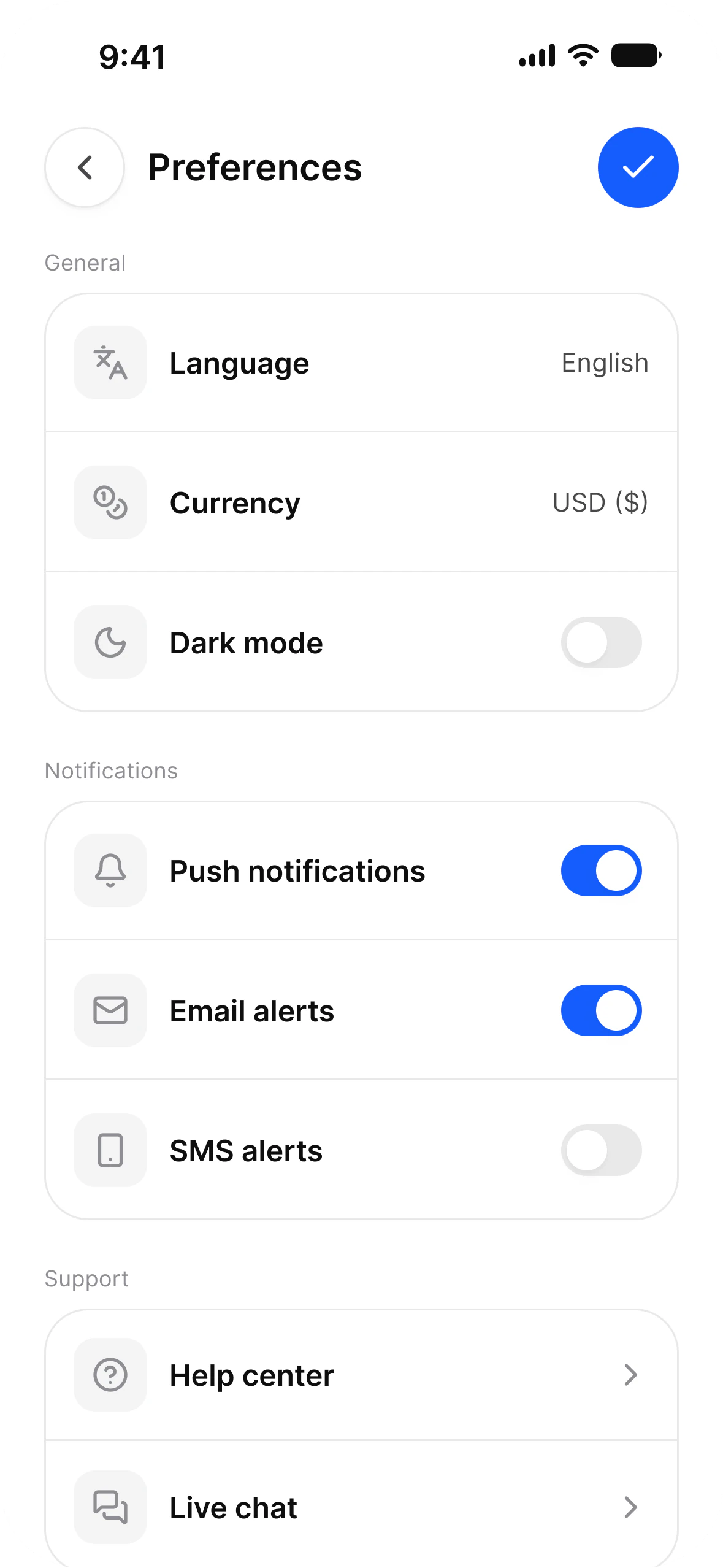
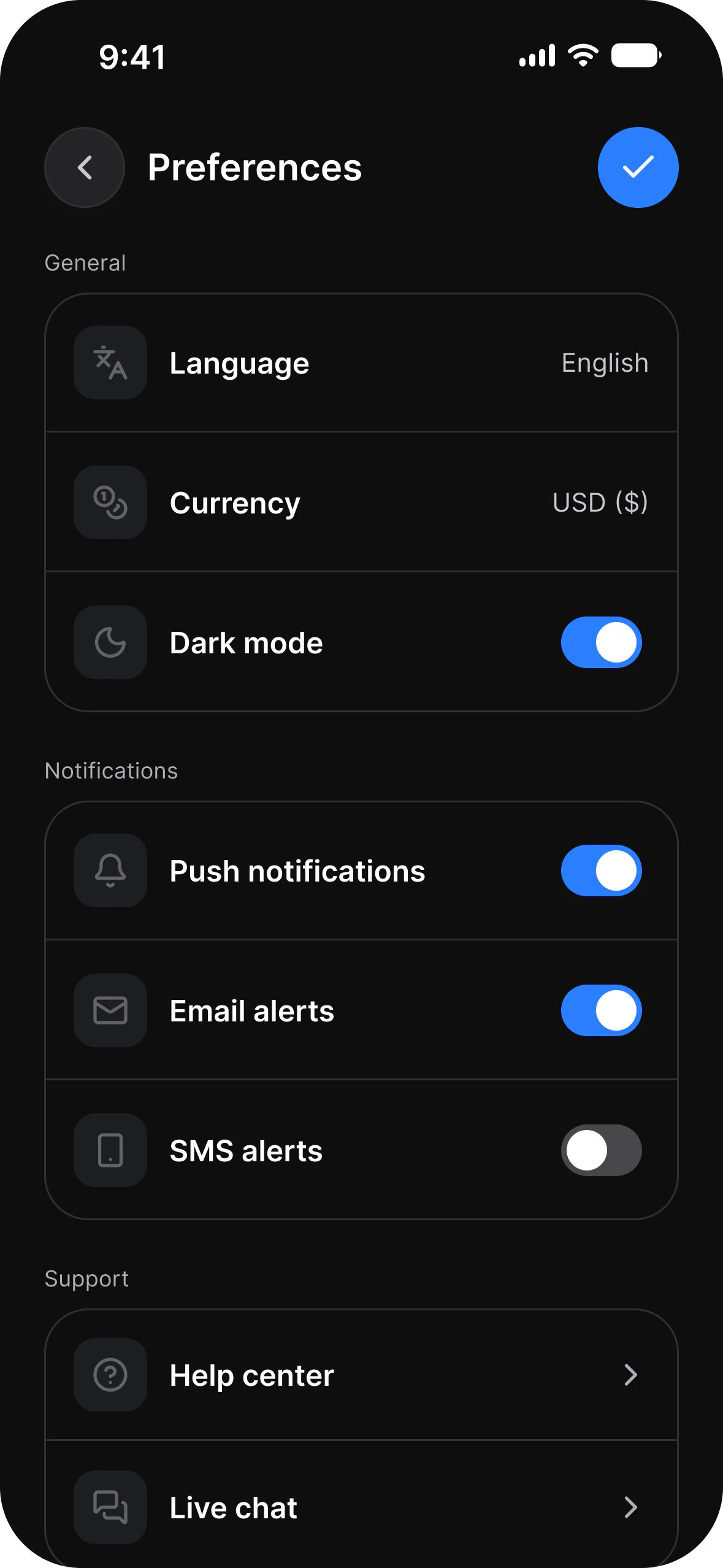
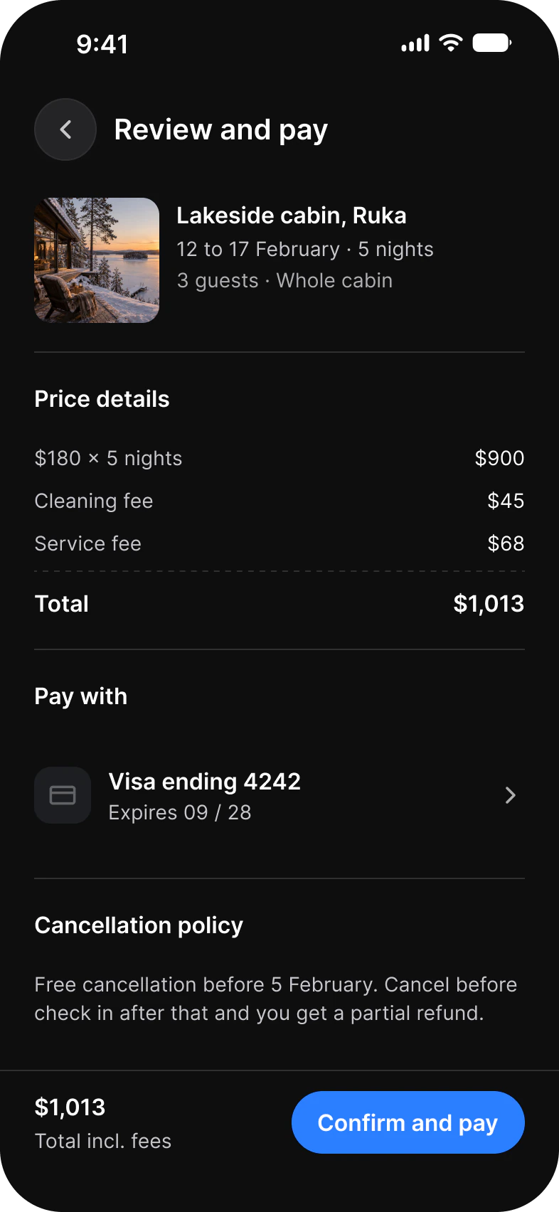
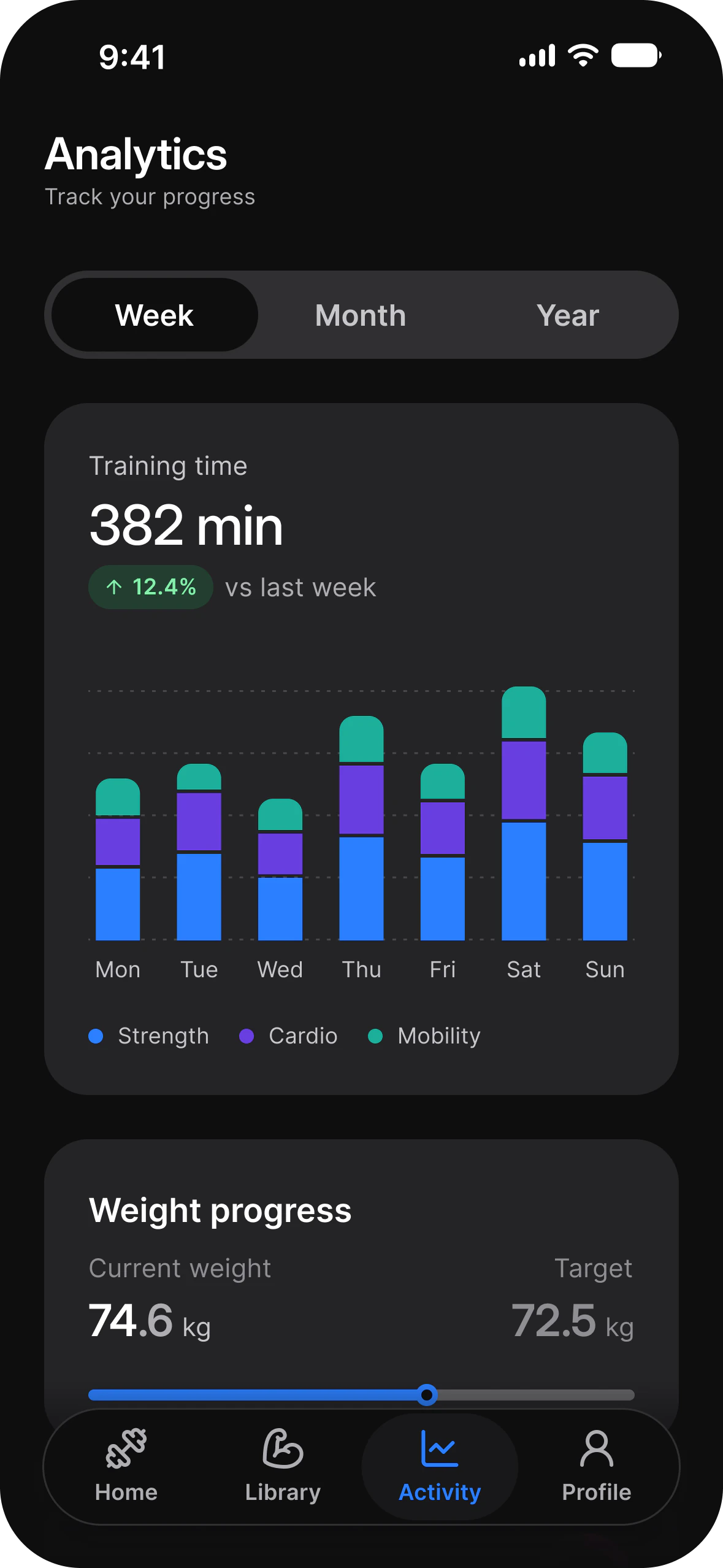
Dark mode
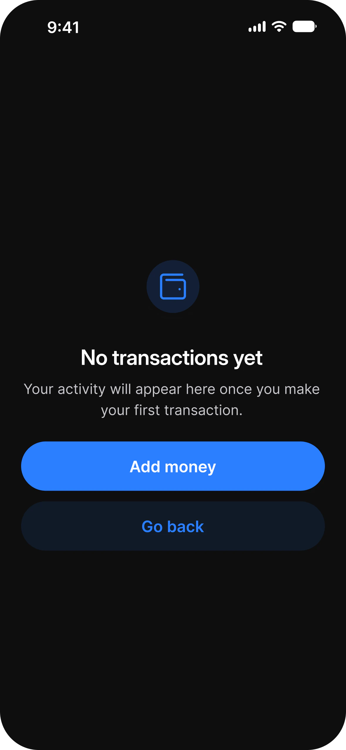
Dark mode is already drawn
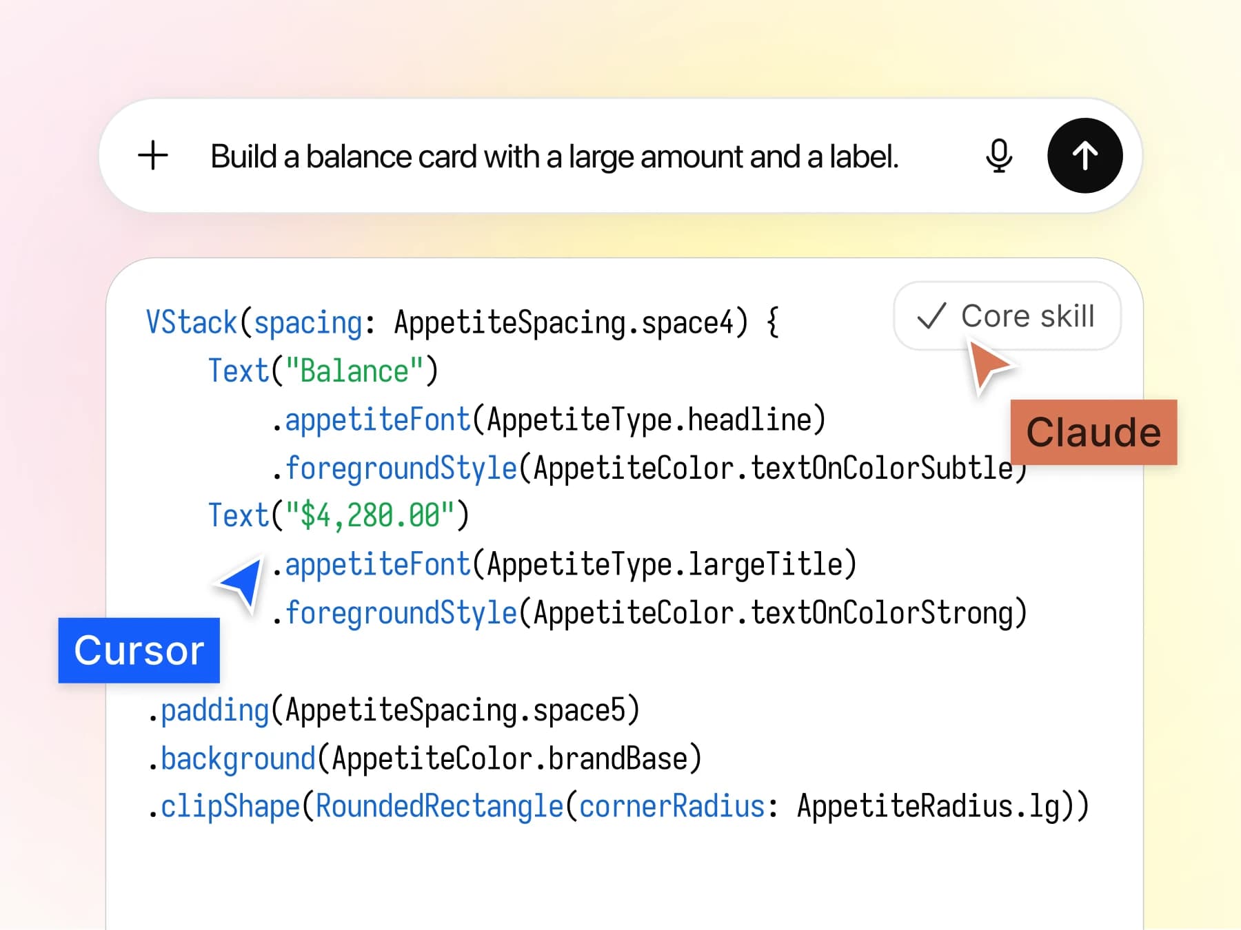
AI agents
Brief an agent in one file
Screens
Start at screen level, not at button level.
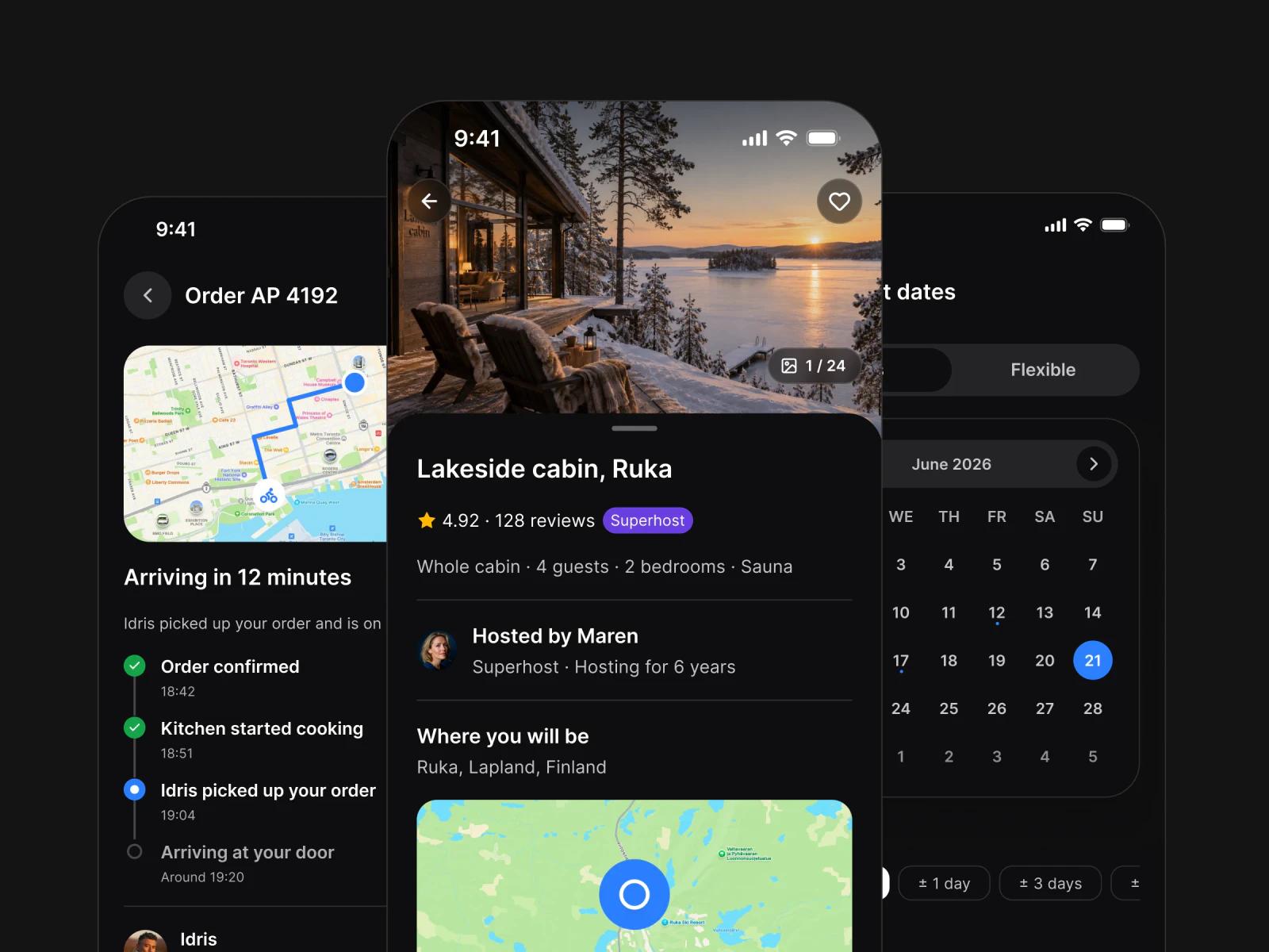
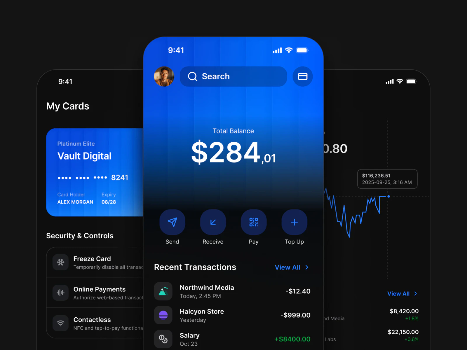
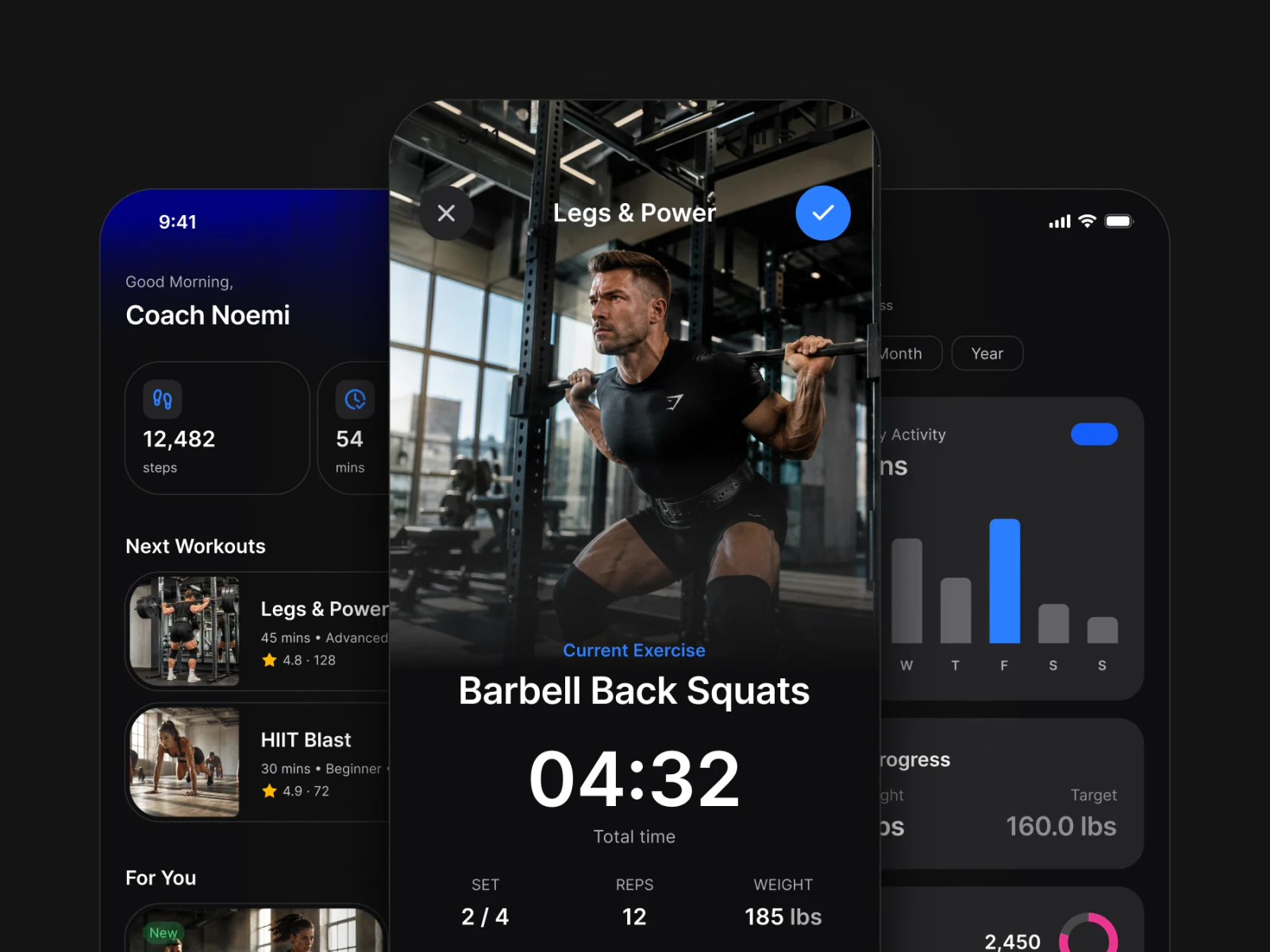
Complete app screens, wired to your tokens. Open one and keep building.
Components
One architecture under every component.
Every component reads the same 589 variables in 6 collections, in light and dark.
Workflows
Four ways to ship. Multiplatform, iOS, Android, AI.
Changing path never means changing file.
Design once, ship both.
One neutral token set drives every screen on both platforms. Most projects start here and never need to leave.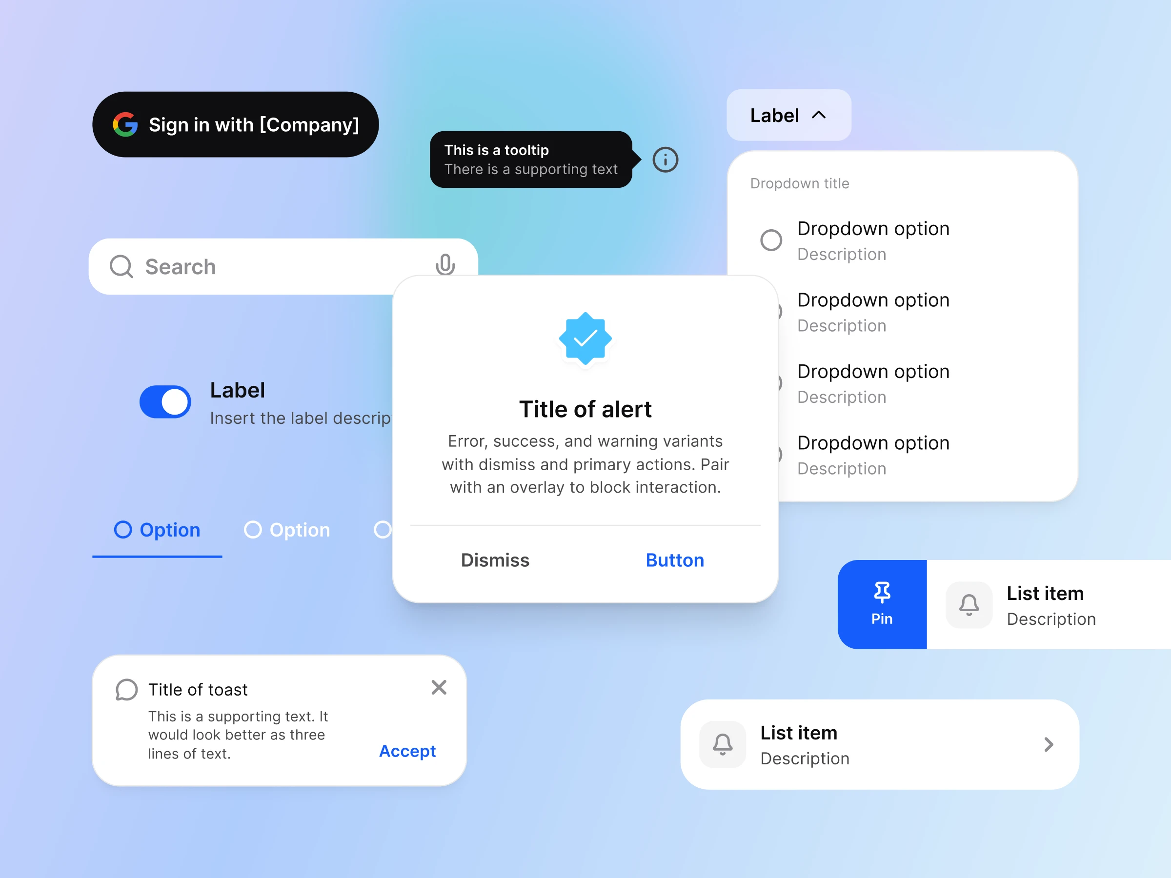
Apple conventions, your brand.
System colors keep their accessibility behavior. Only the accent carries your brand, so nothing about the platform breaks.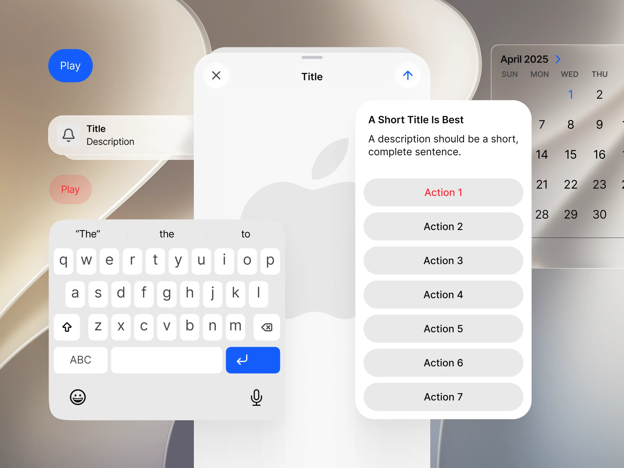
Material 3 with real values.
Material roles mapped to your brand. One dropdown returns the whole set to the untouched system.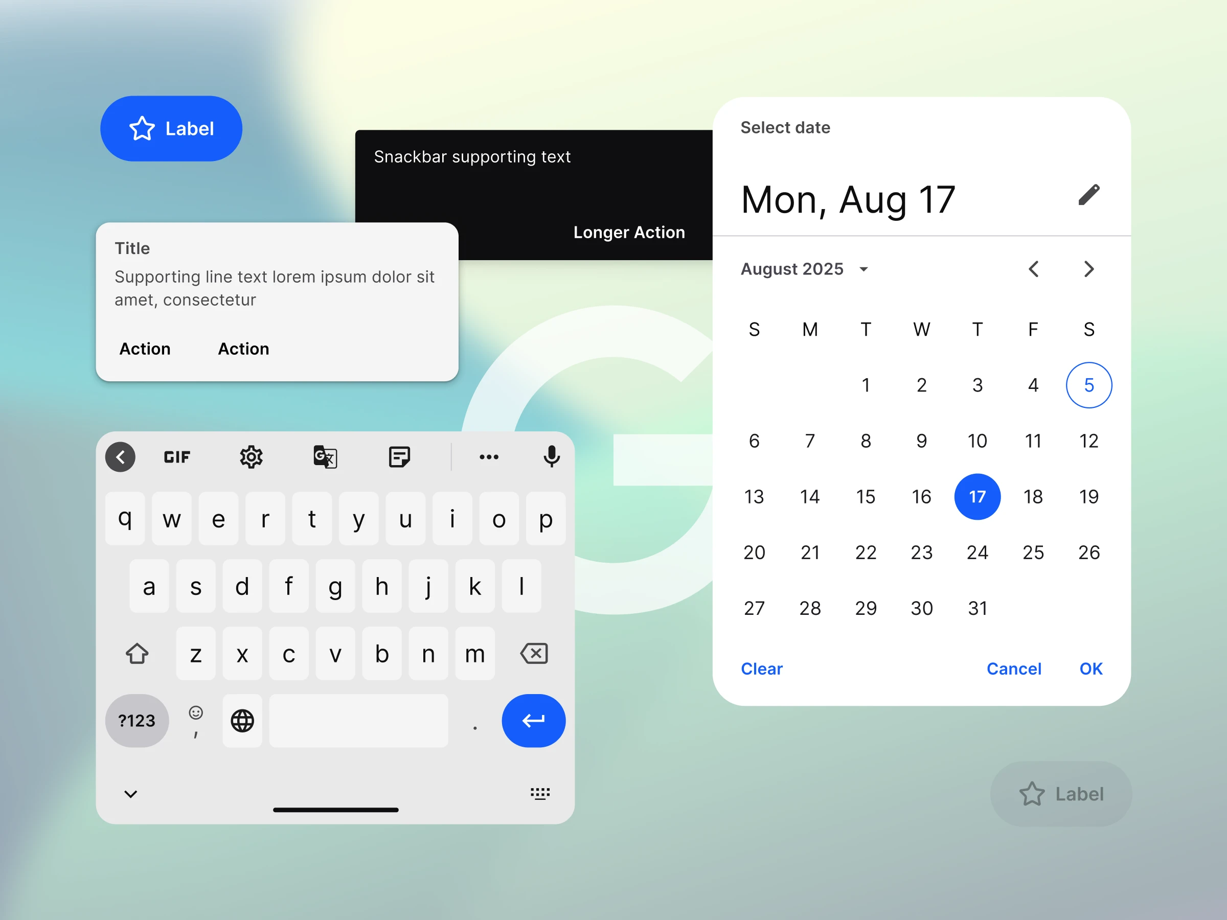
Your agent reads the same file.
The Core Skill in the file tells Claude, Cursor or Figma Make which token and platform pattern to use.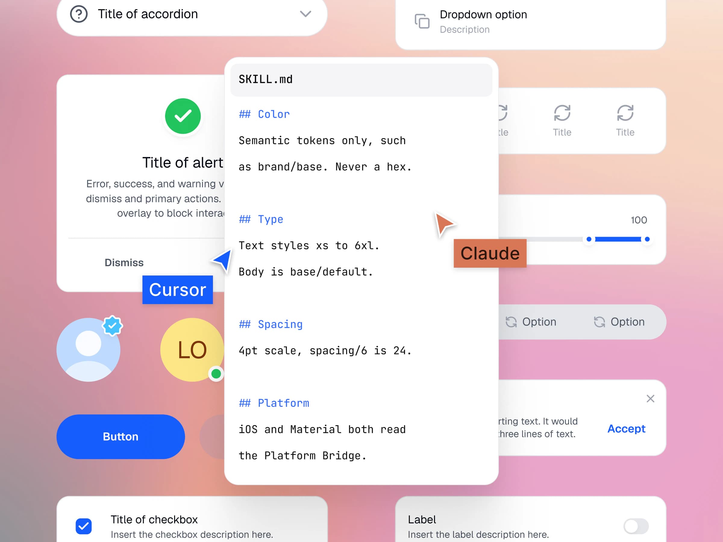
I now design systems and apps much faster and more efficiently. A great investment and a foundation for good app designs.
 Bára LiškováUI Designer
Appetite UI has helped us develop mobile apps much faster and more efficiently.
 Jan DoanUX Designer
The outputs I get from our designer are more understandable for development. I recommend it.
 Braňo StupákApp developer
The token architecture is the real product. Everything else in the file is downstream of it.
 Jakub EngelbrethDigital Concept Developer
Solo
$79
Price goes up Nov 1USD, paid once
One designer, unlimited projects.
- Personal and client work, no project limit
- Edit components, variables and styles for your brand
- Share design files with clients and developers
- Every future release
Team
$149
USD, paid once
Up to ten people on one shared system.
- Everything in Solo
- Ten people sharing the same source of truth
- Shared library setup guidance
- Direct support from the maker
Enterprise
Custom
Quoted in writing
Several product teams on one private library.
- Everything in Team
- Unlimited users
- A derived private library for your brand
- Every future release
In every plan
The same Figma file on every plan.
Solo, Team and Enterprise open one file. The license sets how many people work in it.
App screens to start from
Finance, booking, fitness, social, AI and food flows, built from the same components.
Apple and Material 3 in one file
20 Apple and 17 Material 3 pattern pages on the same tokens.
589 variables in 6 collections
Light and dark color, type, spacing, radius and motion.
Token source and outputs
One W3C DTCG source, exported to SwiftUI, Jetpack Compose, Flutter and CSS.
Your next rebrand is one edit.
One-time payment, Lifetime updates, Unlimited client projects