Skip to content

Design in Figma. Ship in your app.

A Figma UI kit for iOS and Android, built like a design system rather than a sticker sheet. Every component is bound to variables and already sits on real app screens, so a rebrand is one edit.
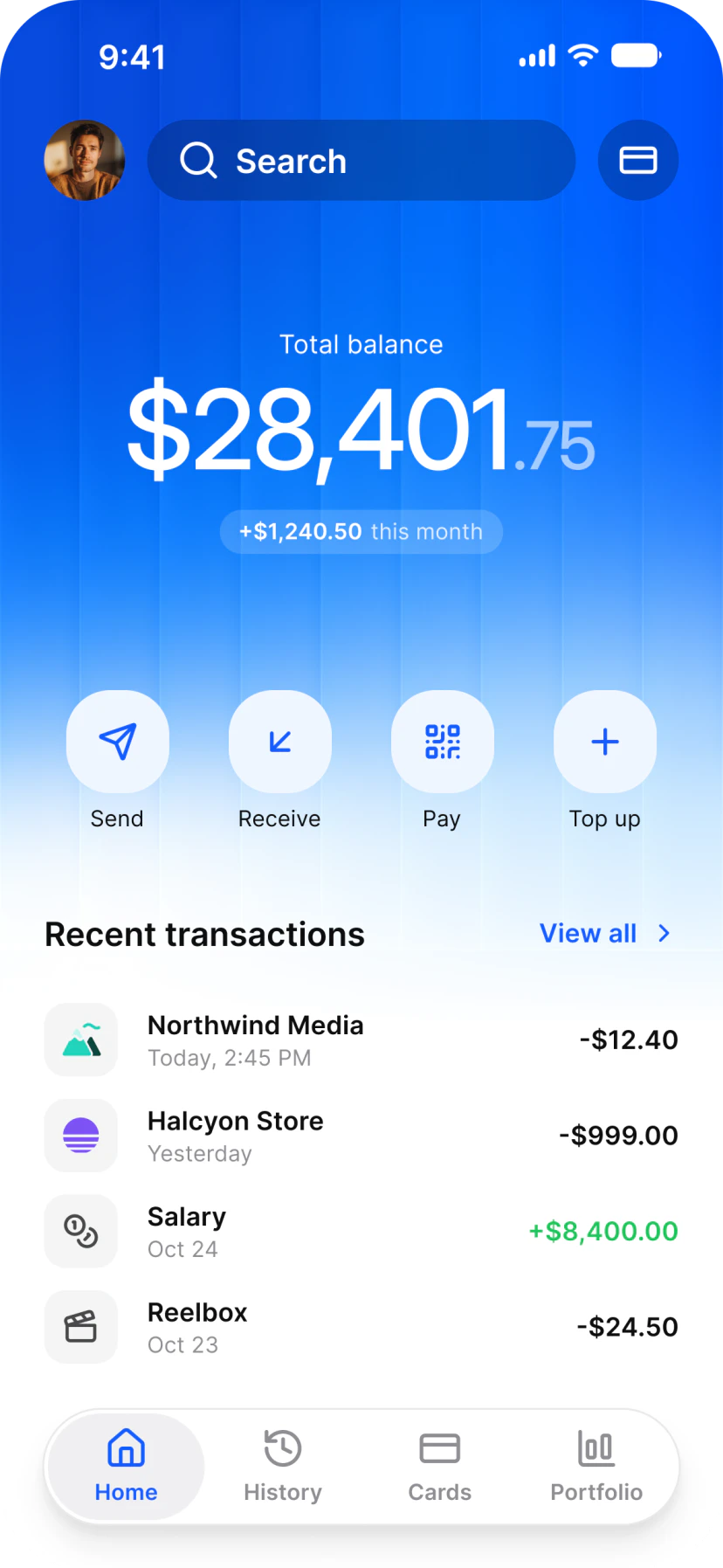
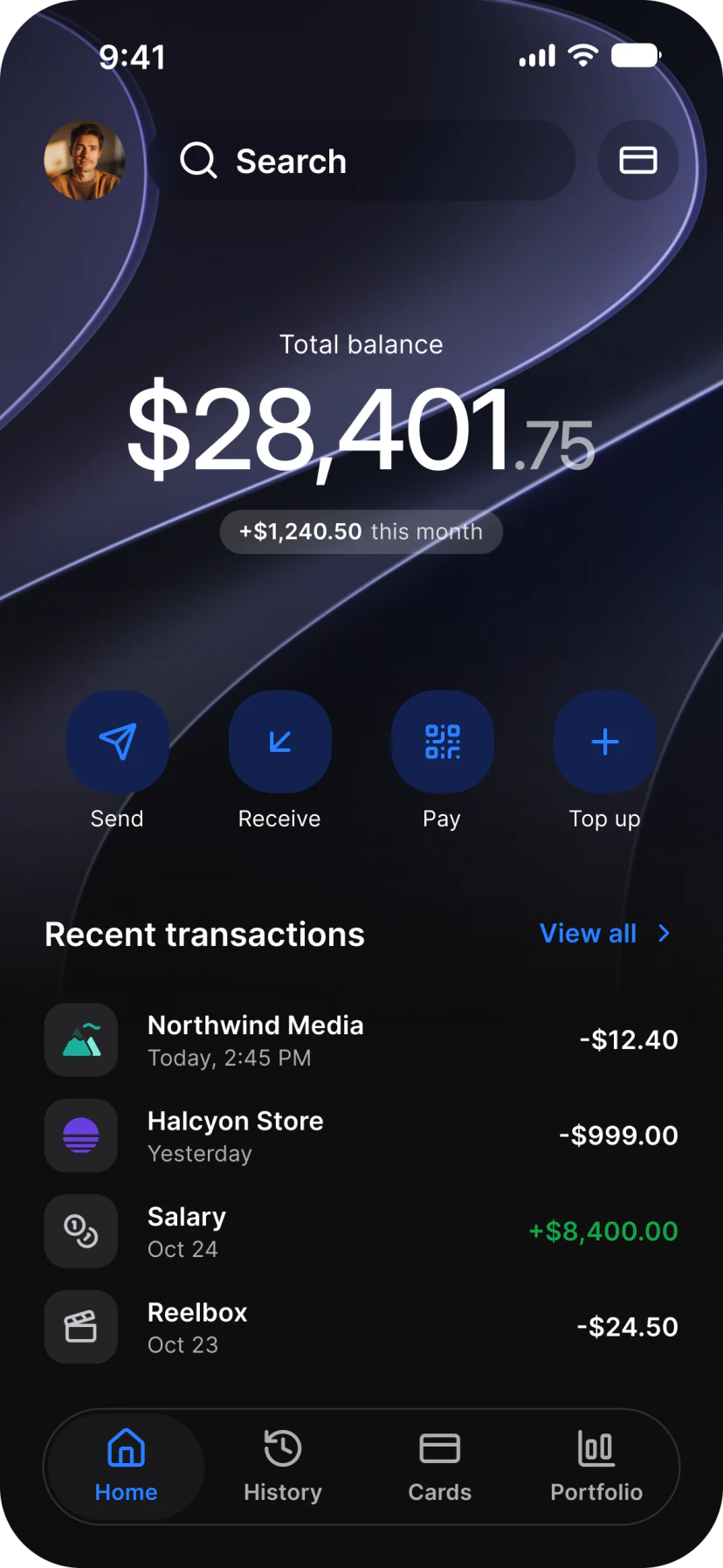
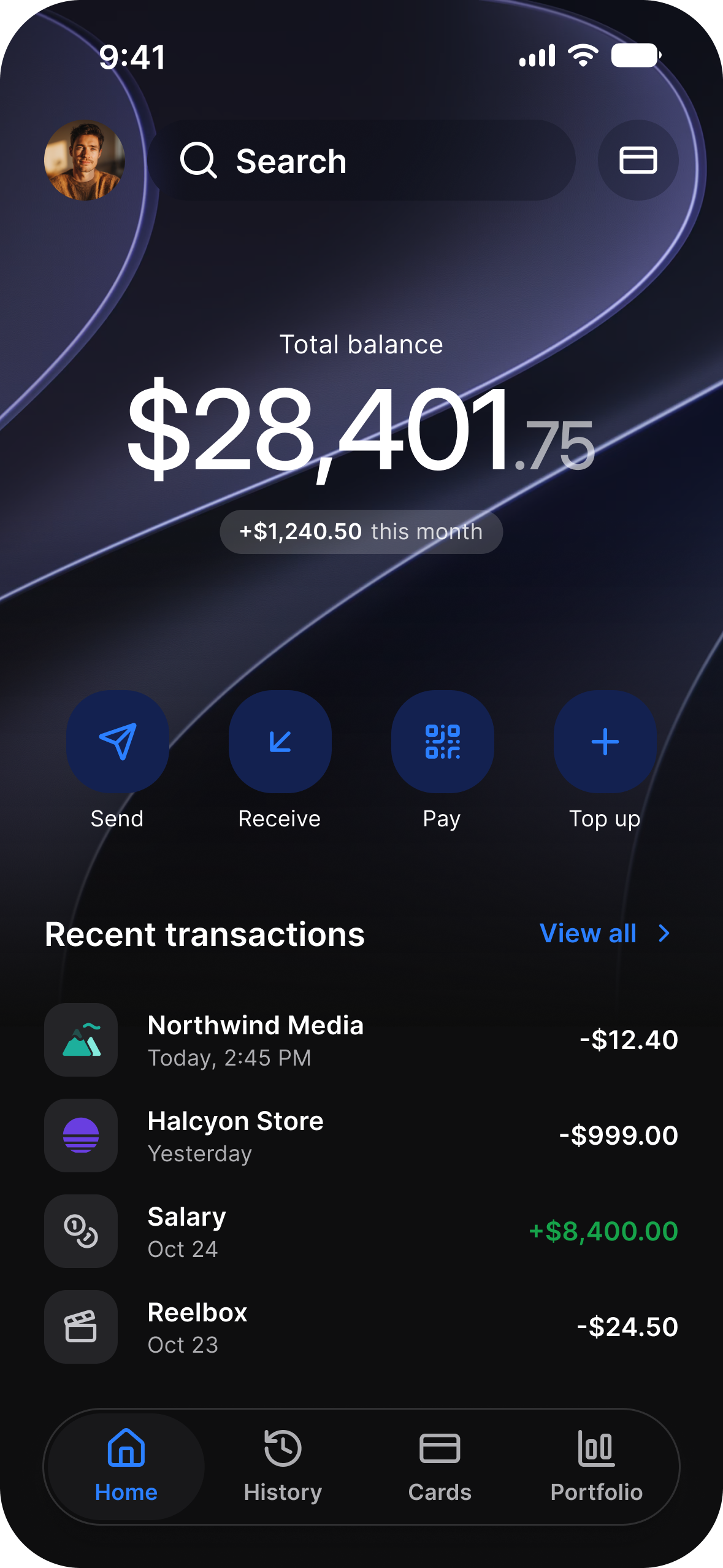
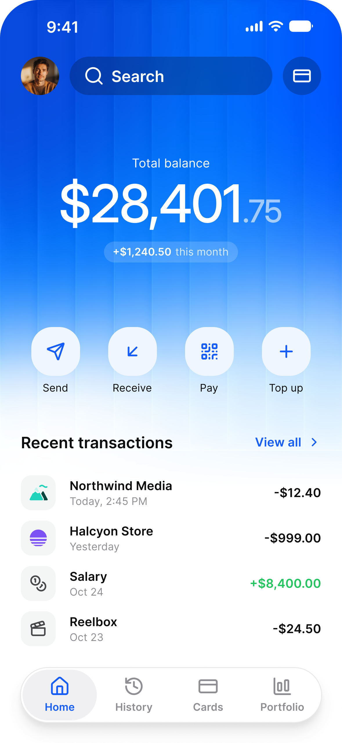
Finance app home in light mode: a total balance card, Send, Receive, Pay and Top Up, and recent transactions
Finance
  • Finance

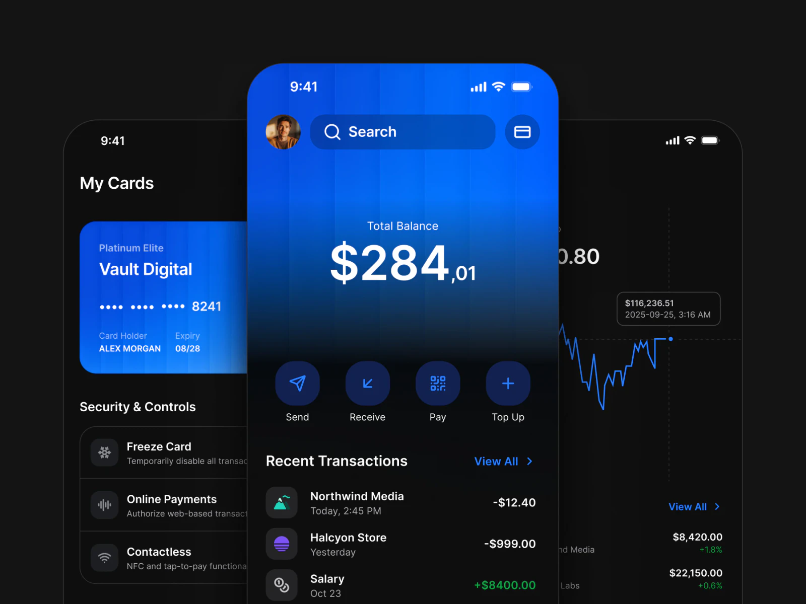
    Finance app home in light mode: a total balance card, Send, Receive, Pay and Top Up, and recent transactionsFinance app home in dark mode: a total balance card, Send, Receive, Pay and Top Up, and recent transactions
  • AI

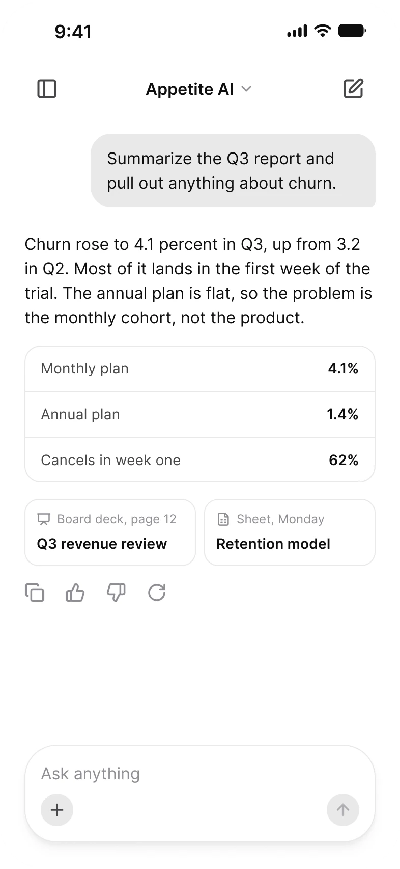
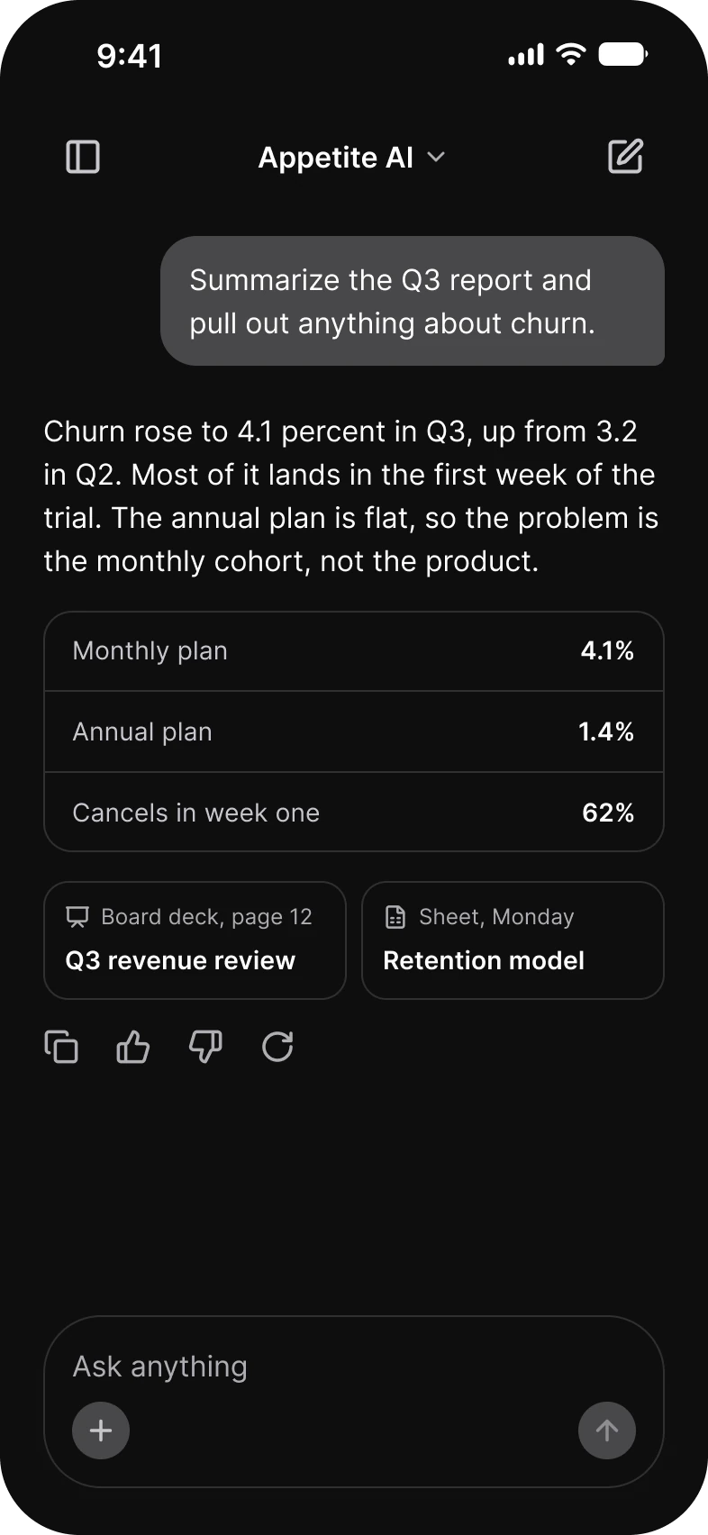
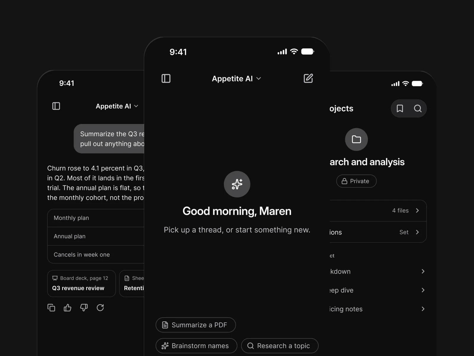
    AI assistant thread in light mode: a request to summarize the Q3 report, answered with churn by plan in a table, and an Ask anything fieldAI assistant thread in dark mode: a request to summarize the Q3 report, answered with churn by plan in a table, and an Ask anything field
  • Foodie

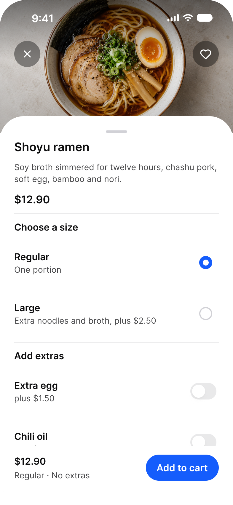
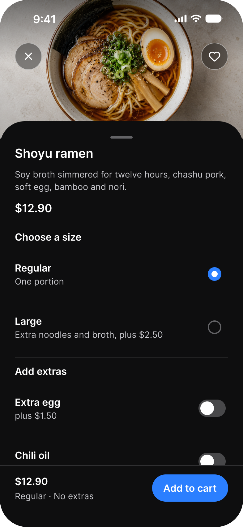
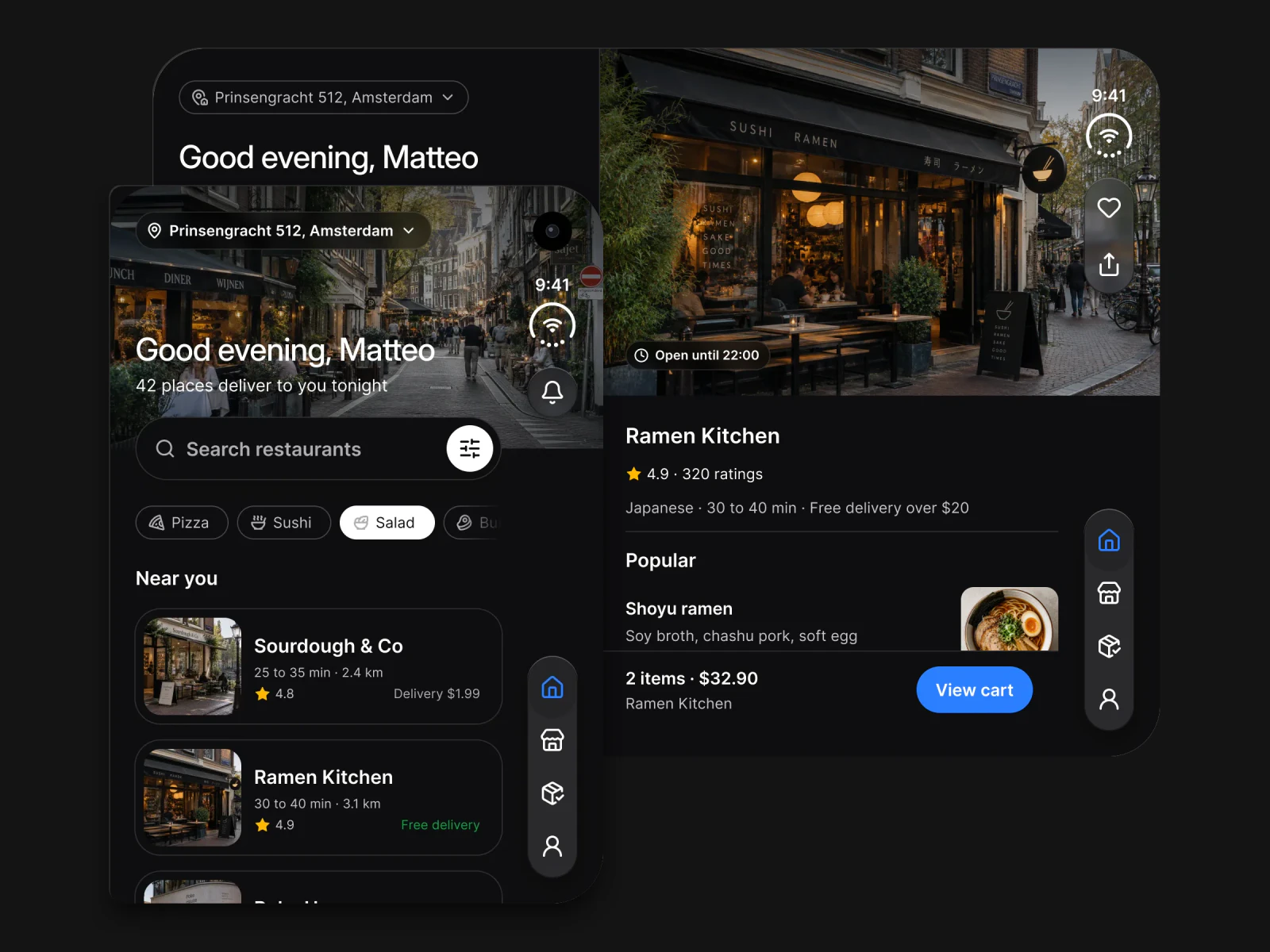
    Dish sheet in light mode: Shoyu ramen with a choice of size, extras and Add to cartDish sheet in dark mode: Shoyu ramen with a choice of size, extras and Add to cart
  • Booking

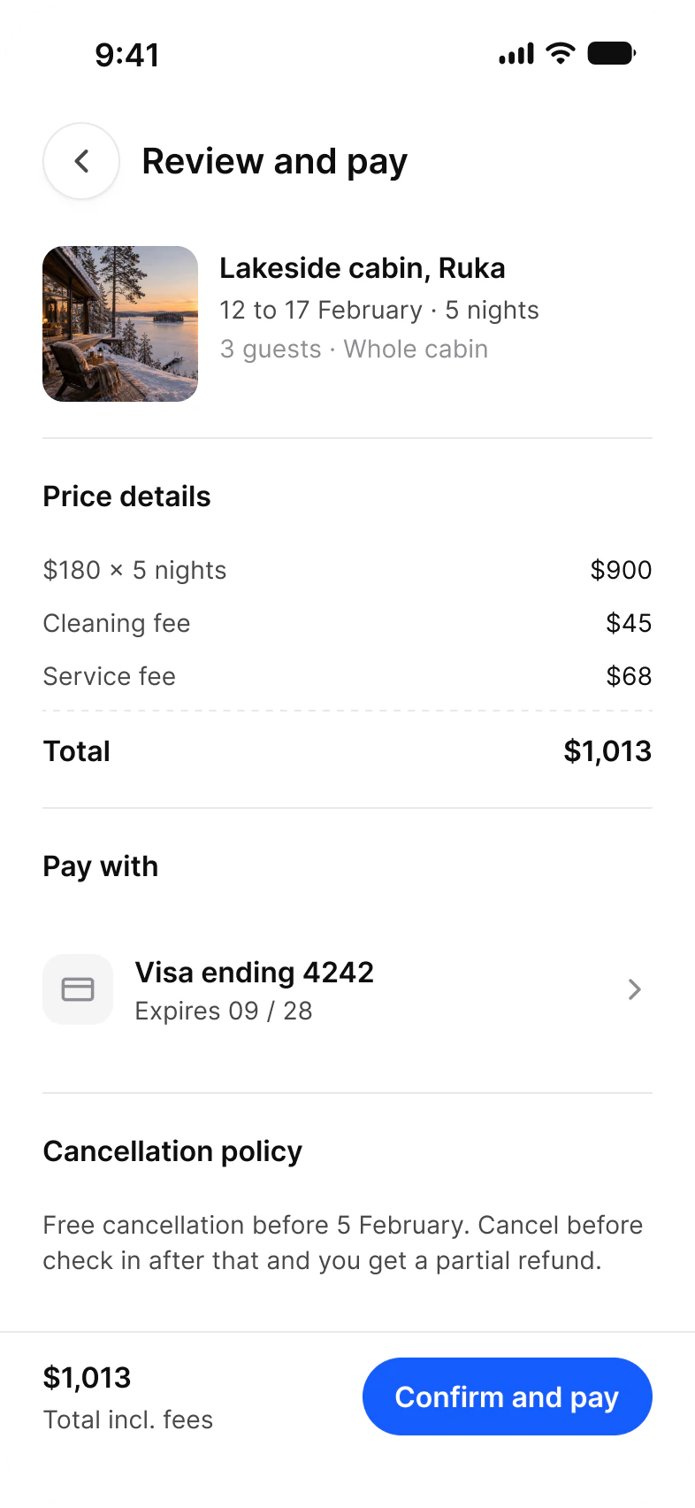
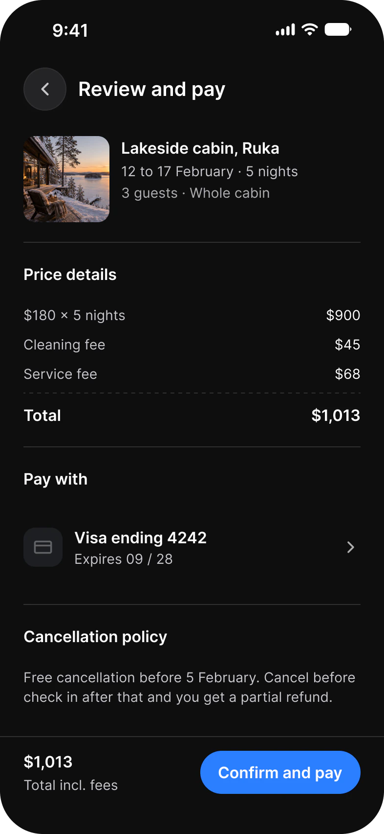
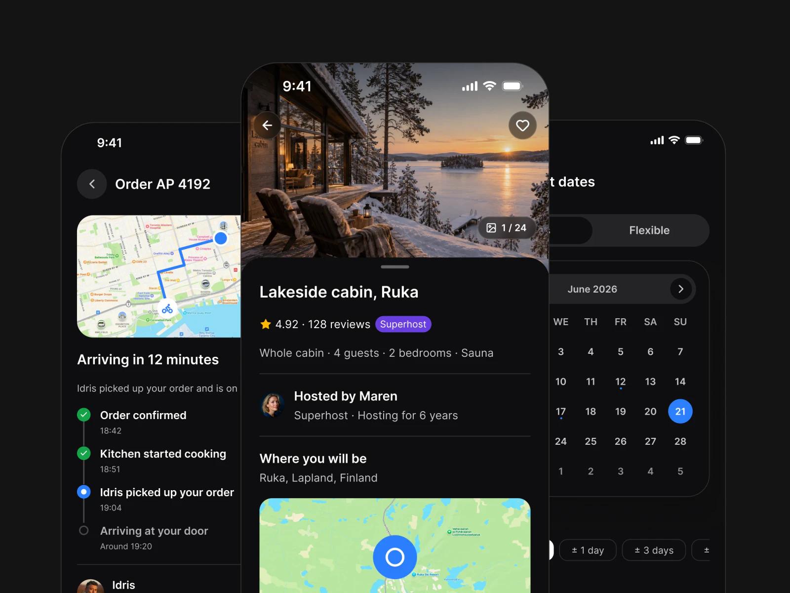
    Review and pay screen in light mode: a lakeside cabin in Ruka, price details, a Visa card and Confirm and payReview and pay screen in dark mode: a lakeside cabin in Ruka, price details, a Visa card and Confirm and pay
  • Fitness

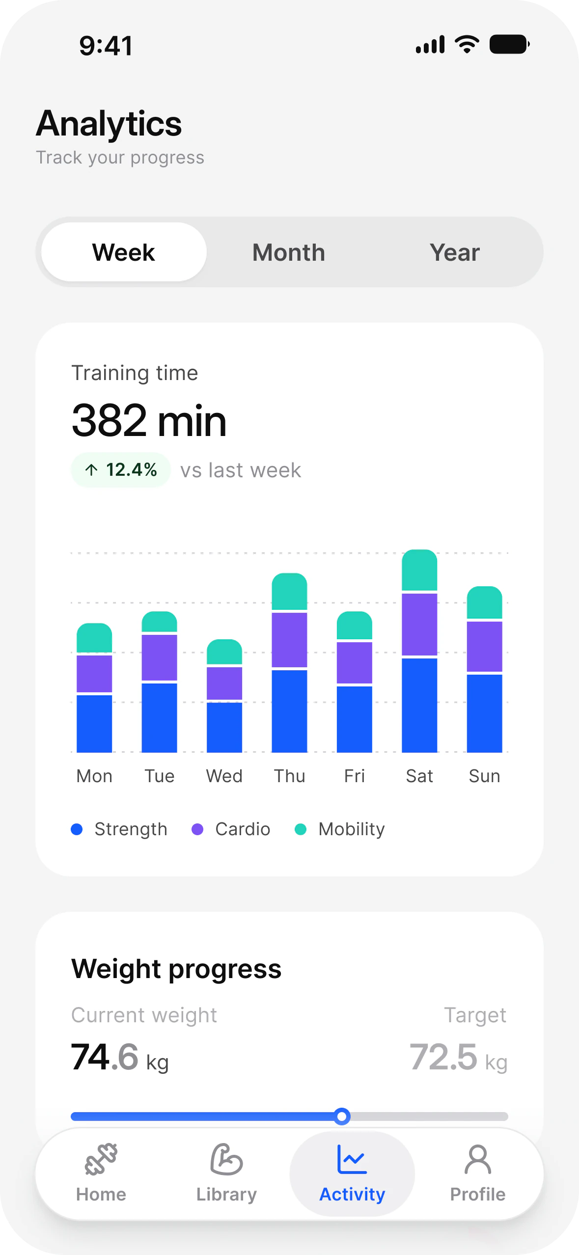
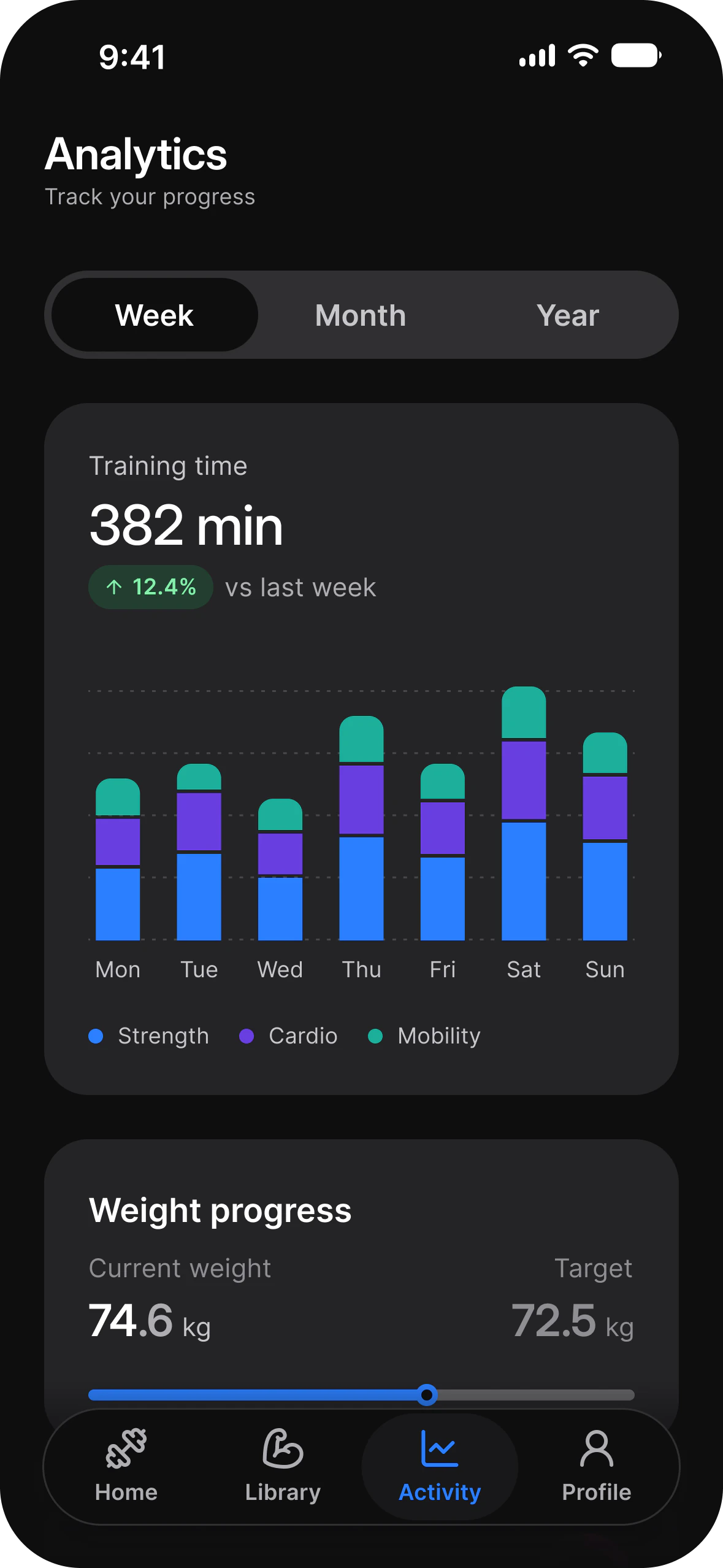
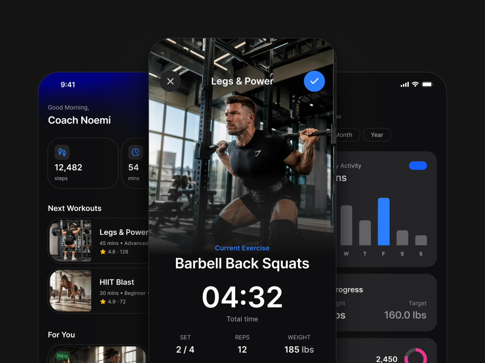
    Fitness analytics in light mode: weekly activity in bars by day, and weight progress against a targetFitness analytics in dark mode: weekly activity in bars by day, and weight progress against a target
  • Social

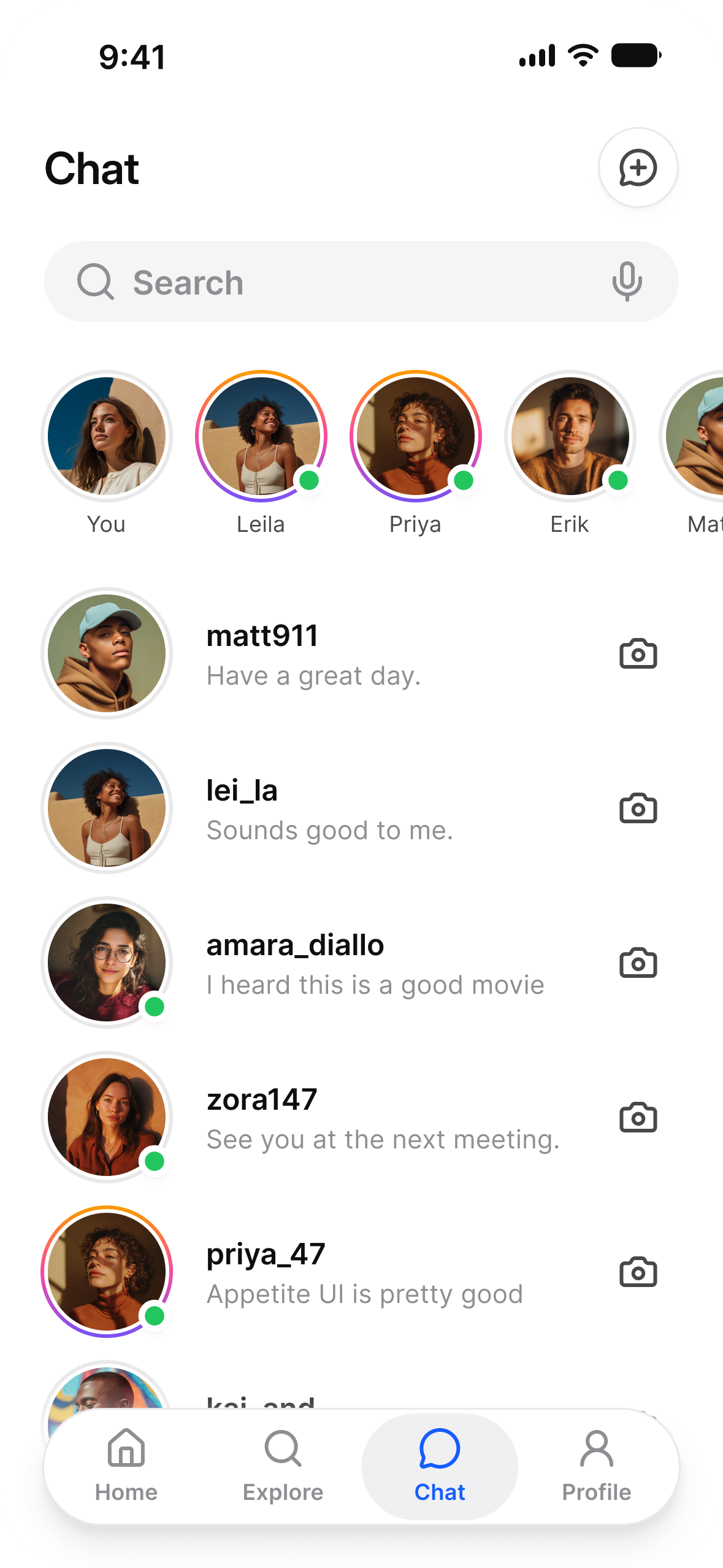
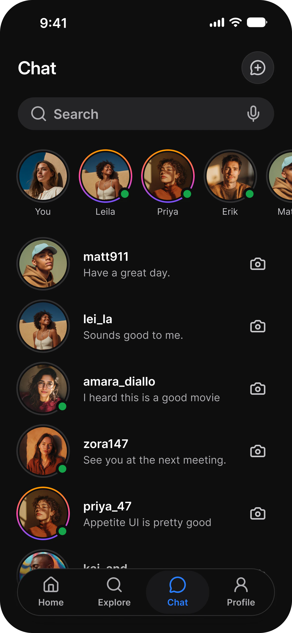
    Chat list in light mode: a row of stories above recent conversationsChat list in dark mode: a row of stories above recent conversations
  • Onboarding

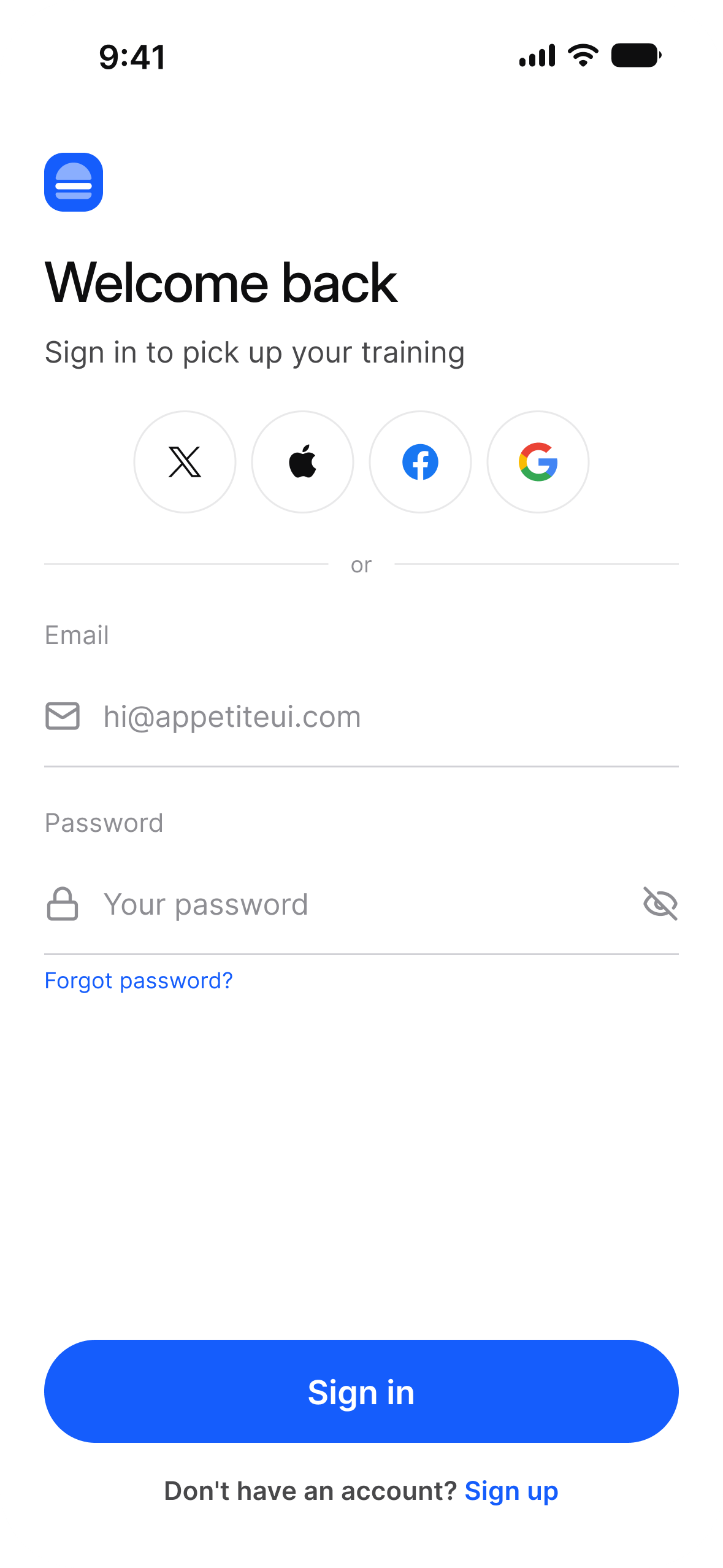
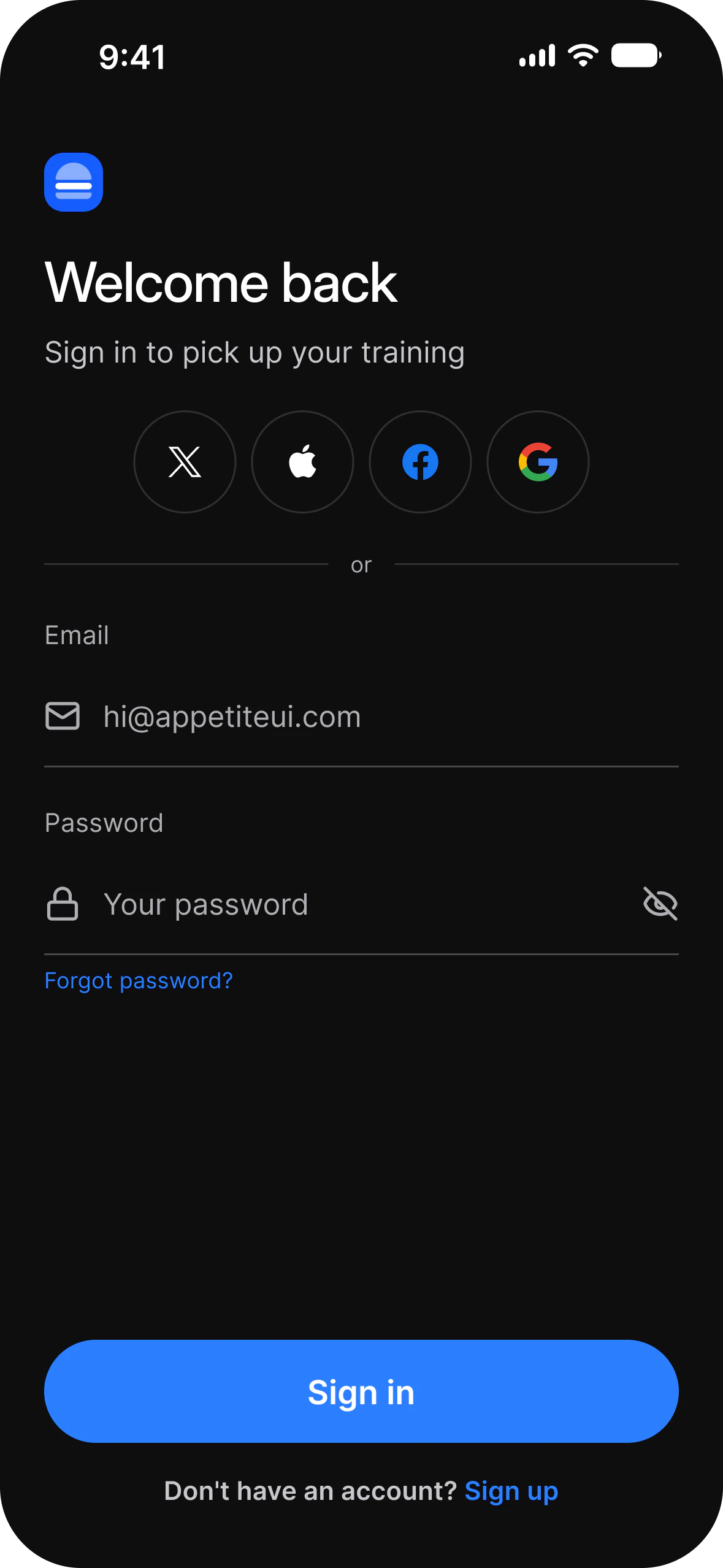
    Welcome back sign in, light mode: X, Apple, Facebook and Google buttons, email and password fields, and Sign InWelcome back sign in, dark mode: X, Apple, Facebook and Google buttons, email and password fields, and Sign In
  • Settings

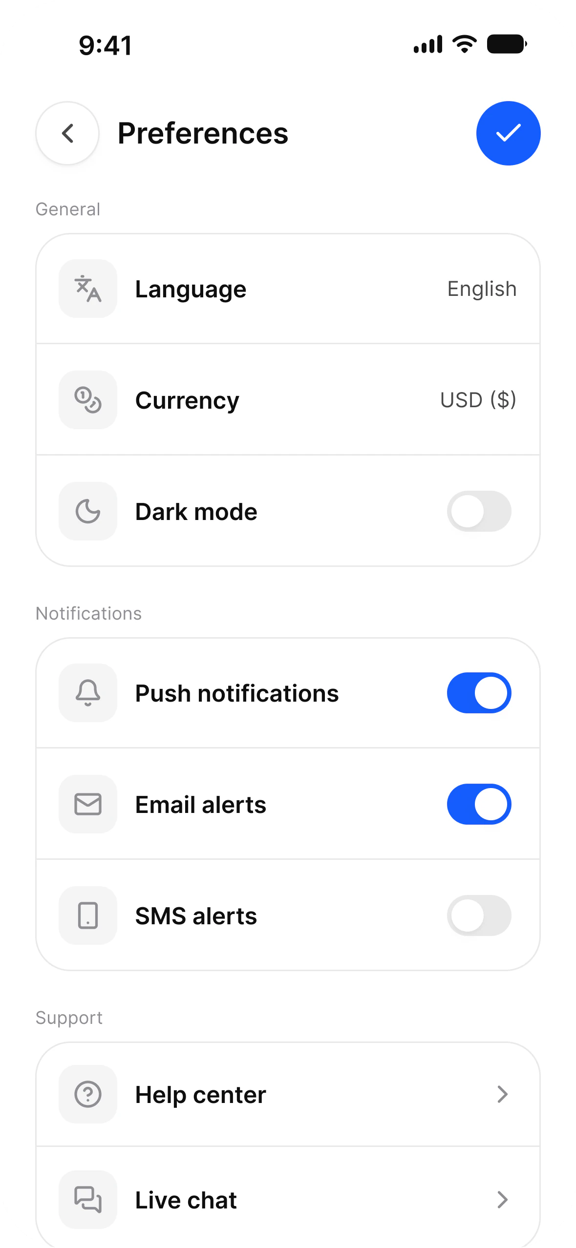
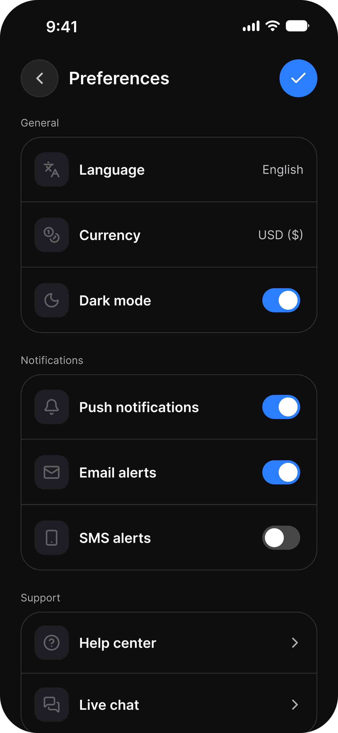
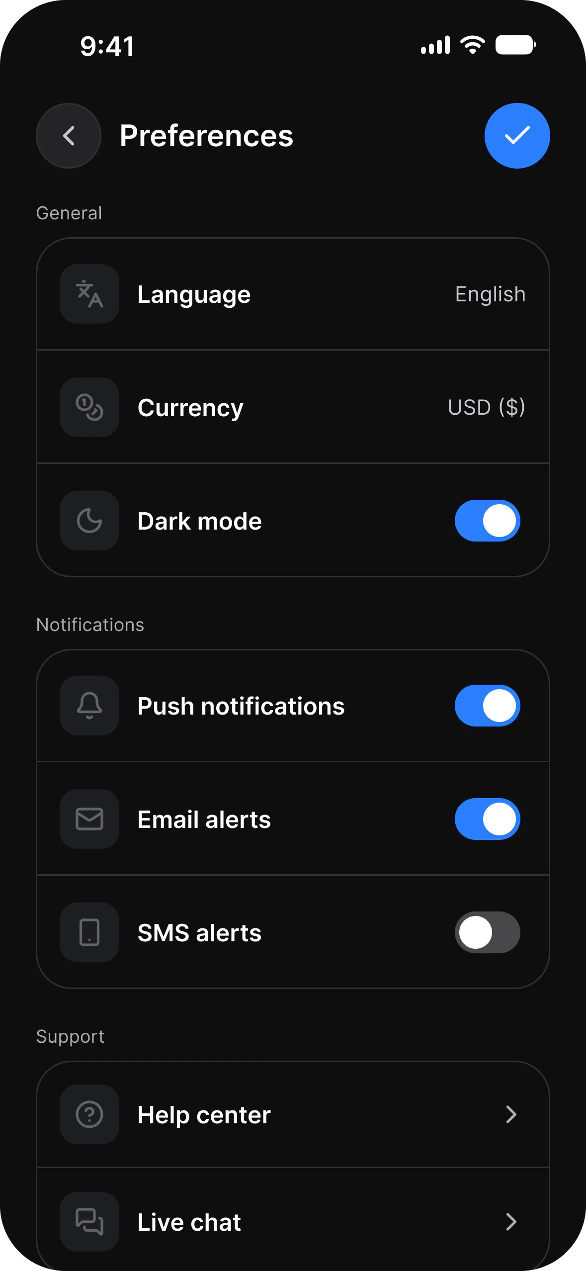
    Account setup in light mode: language, currency and dark mode rows, and switches for push, email and SMS alertsAccount setup in dark mode: language, currency and dark mode rows, and switches for push, email and SMS alerts
  • Empty state

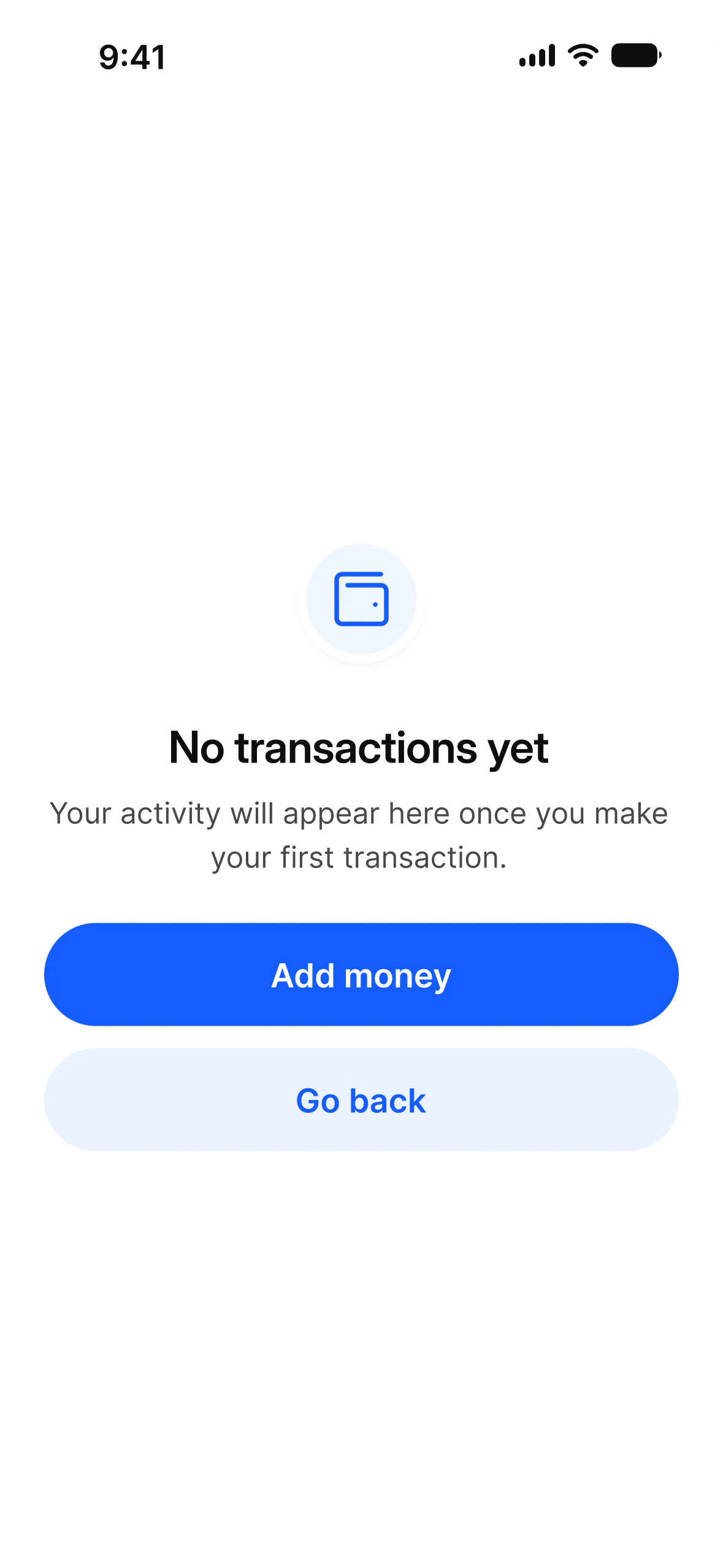
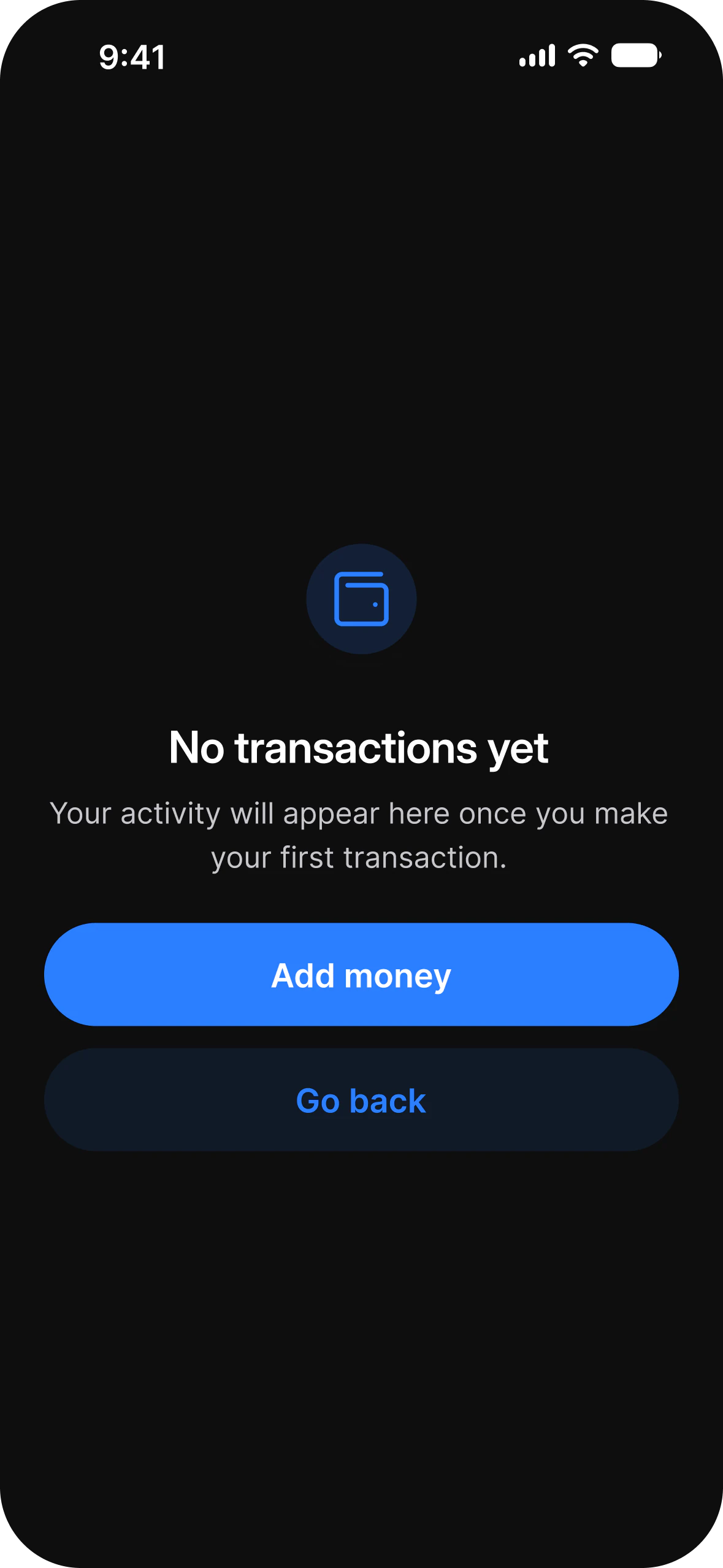
    Empty state in light mode: No transactions yet, with Add Money and Go BackEmpty state in dark mode: No transactions yet, with Add Money and Go Back

Changelog 2.4

iOS and Material 3 layers completed, three new app flows: AI, Booking and Foodie.

Full changelog

Architecture

One source of truth. One file for iOS and Android.

Open a screen group and build today. The token architecture underneath is why a rebrand is still one edit six months from now.
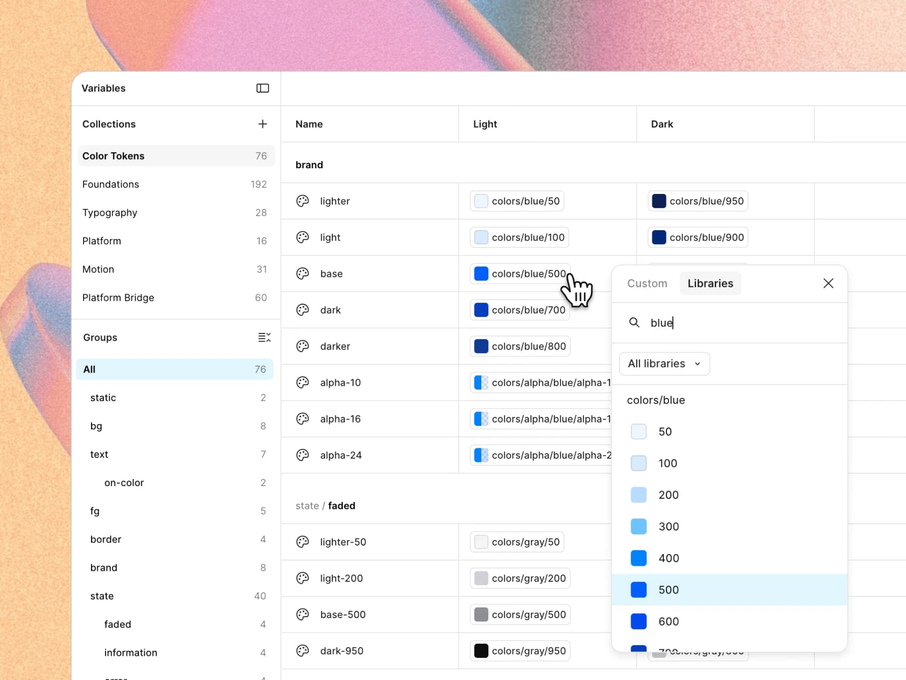
The Figma variables panel: brand/base in the Color Tokens collection being pointed at colors/blue/500 from the library picker, light and dark columns side by side

Tokens

Rebrand in minutes

Change the brand color once. Every component, both platform mirrors, light and dark, follow it. You do not reopen a single screen.
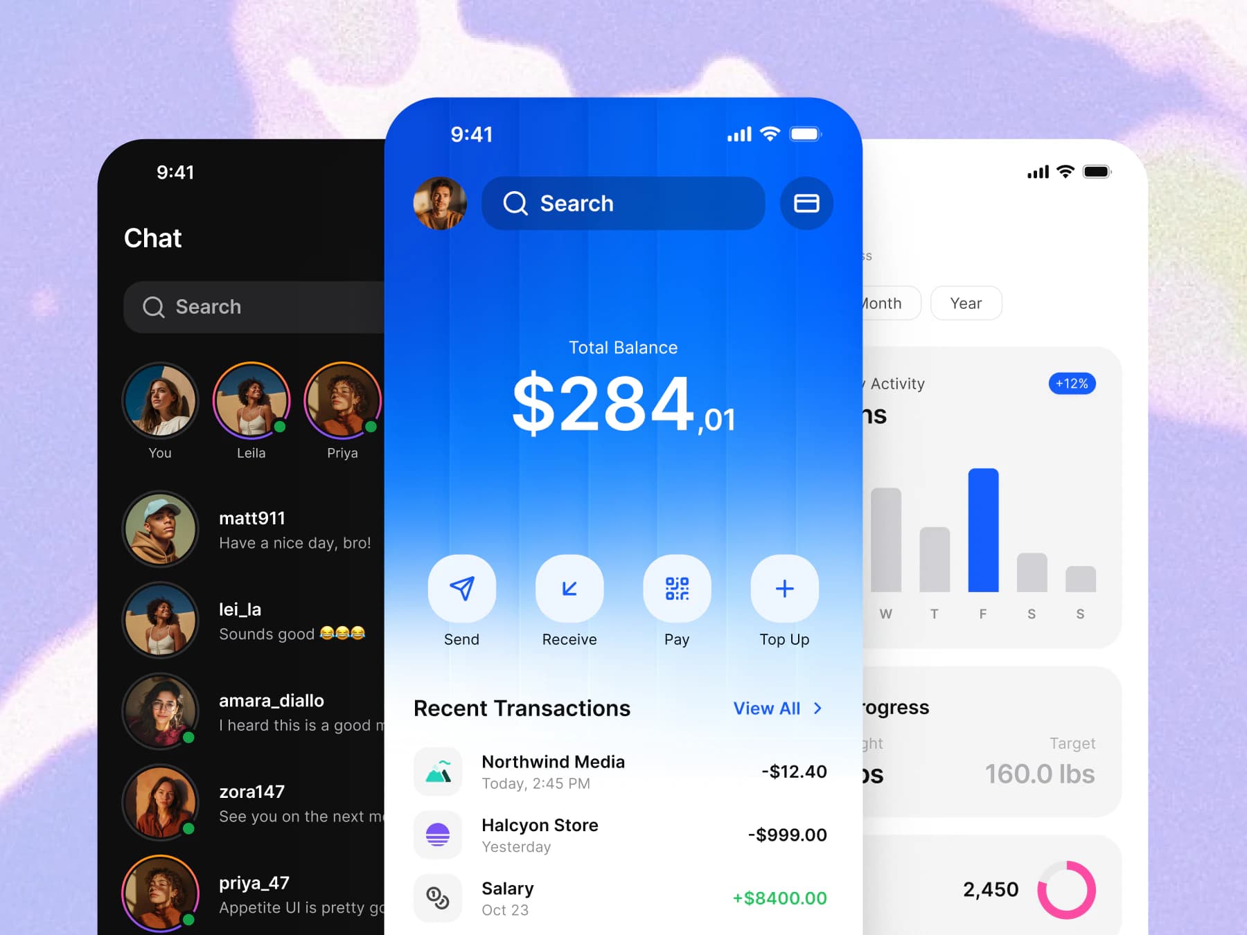
Three app screens: a dark chat list, a wallet with the total balance and recent transactions, and a weekly activity chart

App examples

Ready-to-use screens

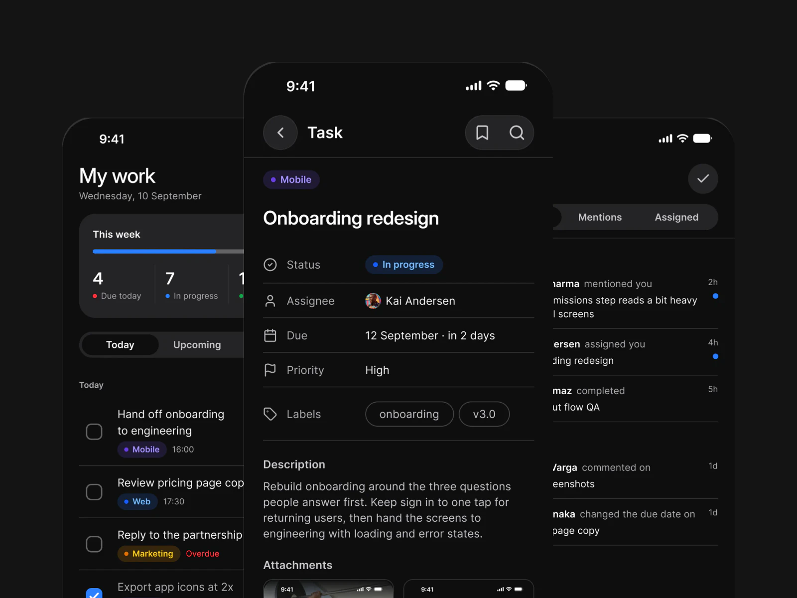
App flows for finance, booking, fitness, social, AI and food, built from the same components and wired to the same tokens.
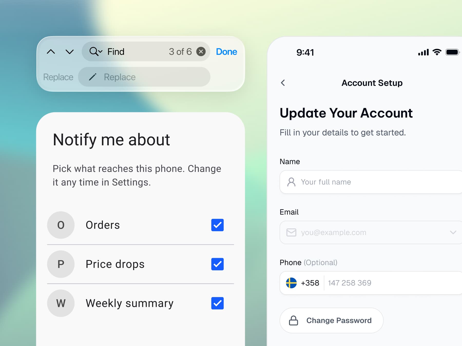
An iOS find and replace bar, a Material 3 dialog with a checked list, and an iOS Account Setup form with name, email and phone fields

Platforms

Ship both platforms

Apple and Material conventions live together. No second library, no translation step.
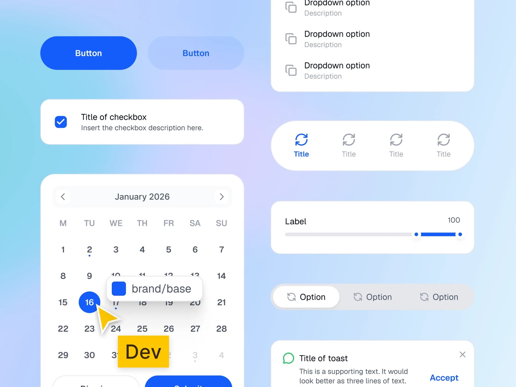
Buttons, a checkbox, a calendar, dropdown options, tabs, a slider and a toast, with a Dev pointer on the brand/base token of the selected date

Code handoff

Hand off without a spec
Your developer adds the token outputs to the project and reads the values you designed with.
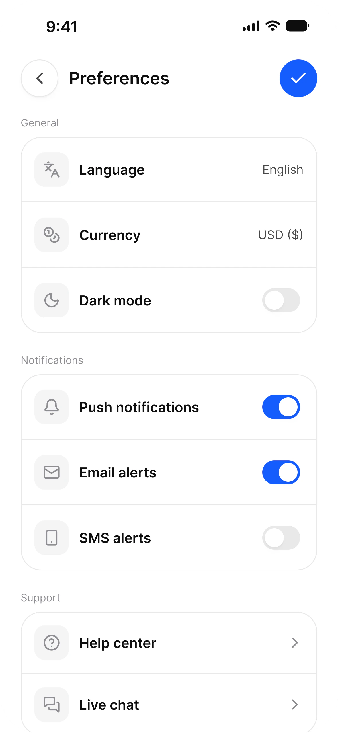
The Account setup screen in light mode: a General group with Language set to English, Currency set to USD and a Dark Mode switch, then Notifications
The same Account setup screen in dark mode, every row, label and switch in the same place

Dark mode

Dark mode is already drawn
Every component already has it, because color is a token and tokens have two modes.
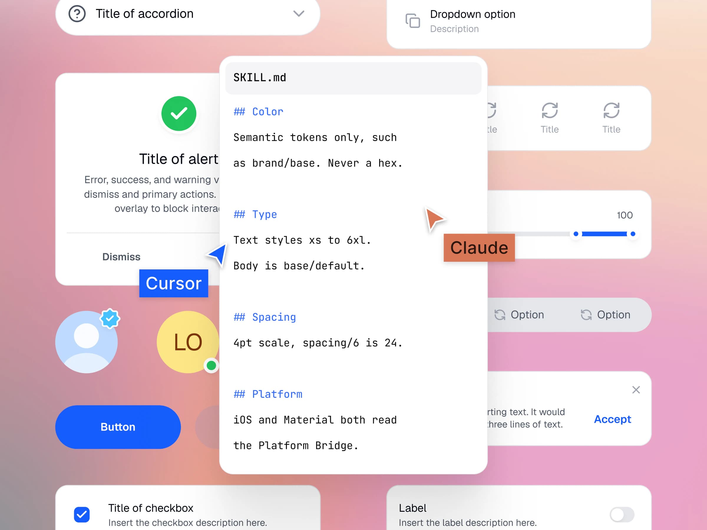
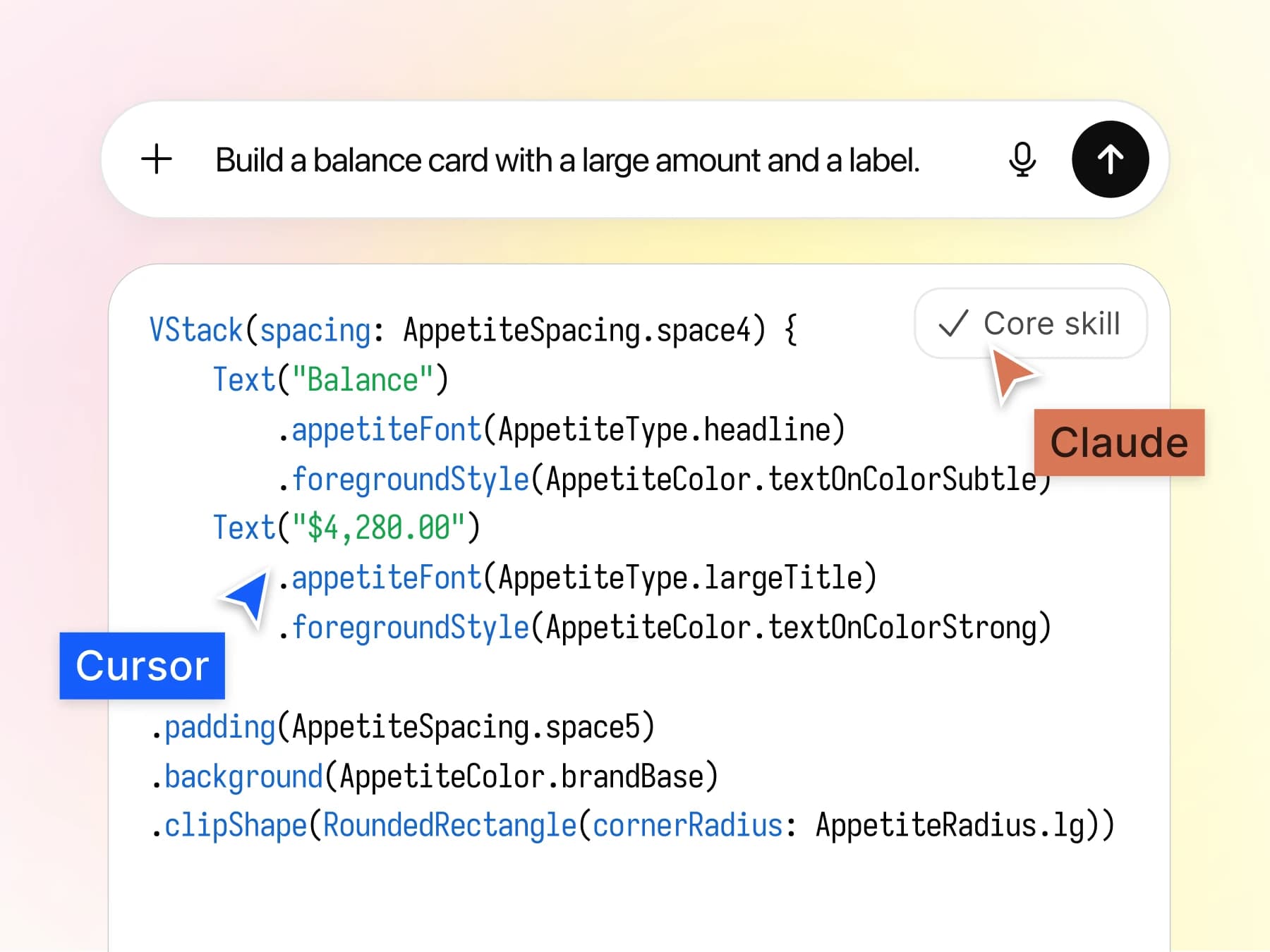
A prompt asking for a balance card, and the SwiftUI an agent wrote from it with AppetiteSpacing, AppetiteType and AppetiteColor tokens, marked Core Skill, with Claude and Cursor pointers

AI agents

Brief an agent in one file

The Core Skill in the file you buy tells Claude, Cursor and Figma Make which token to use.

Screens

Start at screen level, not at button level.

Complete app screens, already assembled and already wired to your tokens. Open one and keep building.
Components

One architecture under every component.

Every component reads from the same tokens: 544 variables in 6 collections, from one W3C DTCG source.

Workflows

Four ways to ship. Multiplatform, iOS, Android, AI.

Changing path never means changing file.

  1. Design once, ship both.

    One neutral token set drives every screen on both platforms. Most projects start here and never need to leave.
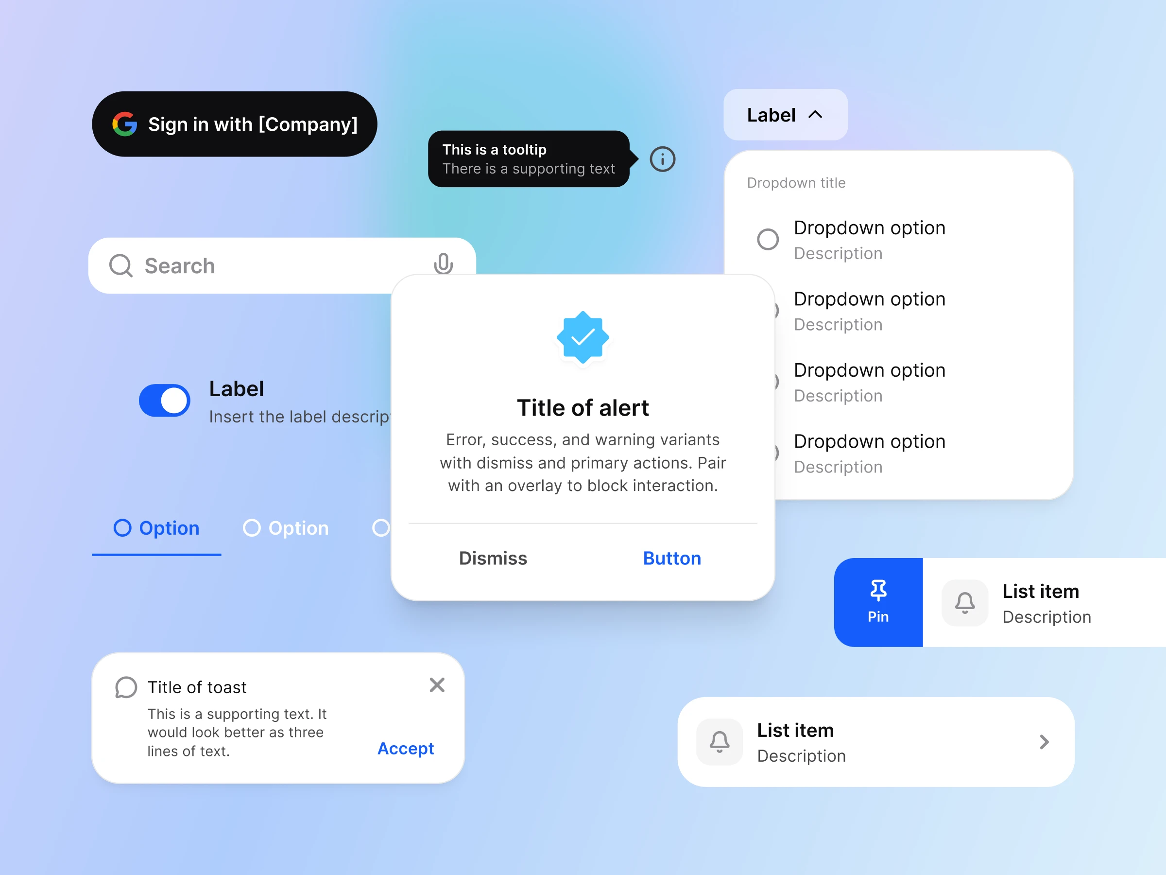
    Shared components on one board: a Sign in with Google button, a tooltip, a search field, a toggle, an alert, a dropdown, tabs, a toast and list rows with a Pin action
  2. Apple conventions, your brand.

    System colors keep their accessibility behavior. Only the accent carries your brand, so nothing about the platform breaks.
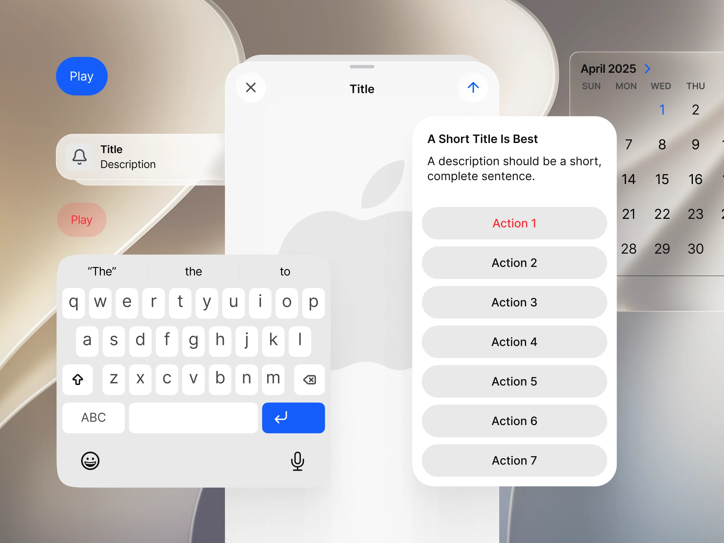
    iOS components in light mode: a Play button in the brand blue, a notification row, a keyboard, an action sheet, a sheet header and a month calendar
  3. Material 3 with real values.

    Material roles mapped to your brand. One dropdown returns the whole set to the untouched system.
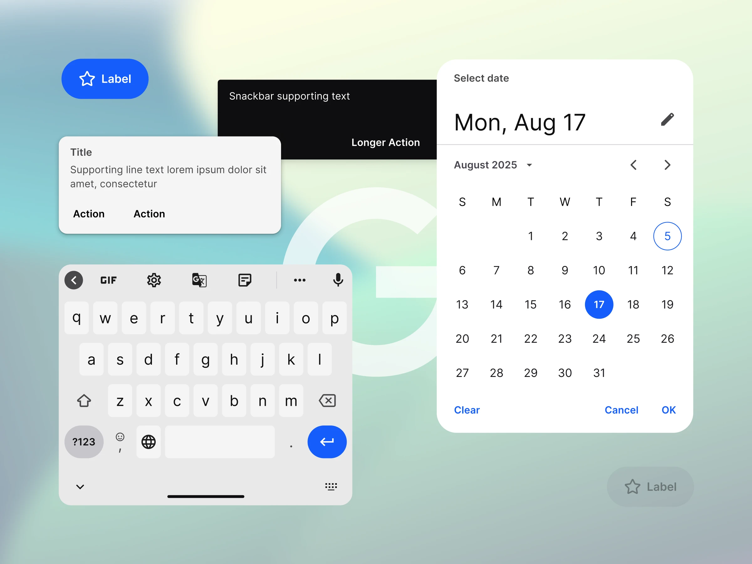
    Material 3 components: an extended button in the brand blue, a snackbar, a dialog, a keyboard and a date picker with the selected day in the brand blue
  4. Your agent reads the same file.

    The Appetite UI Core Skill teaches any agent which token to use and which platform pattern to pick. It is included in the file you buy and works with Claude, Cursor and Figma Make.
    The core-skill.md rules for color, type, spacing and platform laid over Appetite UI components, with Claude and Cursor pointers
I now design systems and apps much faster and more efficiently. A great investment and a foundation for good app designs.
Bára LiškováUI Designer
Appetite UI has helped us develop mobile apps much faster and more efficiently.
Jan DoanUX Designer
The outputs I get from our designer are more understandable for development. I recommend it.
Braňo StupákApp developer
The token architecture is the real product. Everything else in the file is downstream of it.
Jakub EngelbrethDigital Concept Developer

Pricing

One payment. Yours forever.

No subscription and no seat math.

Solo

$79

USD, paid once

One designer, unlimited projects.

  • Personal and client work, no project limit
  • Edit components, variables and styles for your brand
  • Share design files with clients and developers
  • Every future release

Team

$149

USD, paid once

Up to ten people on one shared system.

  • Everything in Solo
  • Ten people sharing the same source of truth
  • Shared library setup guidance
  • Direct support from the maker

Enterprise

Custom

Quoted in writing

Several product teams on one private library.

  • Everything in Team
  • Unlimited users
  • A derived private library for your brand
  • Every future release

In every plan

The same Figma file on every plan.

Solo, Team and Enterprise open one file. The license sets how many people work in it.

  • App screens to start from

    Finance, booking, fitness, social, AI and food flows, built from the same components.

  • Apple and Material 3 in one file

    21 Apple and 17 Material 3 pattern pages on the same tokens.

  • 544 variables in 6 collections

    Light and dark color, type, spacing, radius and motion.

  • Token source and outputs

    One W3C DTCG source, exported to SwiftUI, Jetpack Compose, Flutter and CSS.

  • One-time payment
  • Lifetime updates
  • Unlimited client projects

FAQ

Questions worth asking.

Answered by the person who built it.

Anyone shipping web, dashboards or internal tools. This is iOS and Android only, and a kit built for the web will serve you better. Anyone who needs one screen for a pitch and will never reopen the file should take a free Community file instead. Buy it when the file has to survive a rebrand, a second platform, or a developer who wants the values, not a spec.

Yes. Light and dark mode switch through Figma's variable modes, which need a paid Figma plan, and so does publishing the file as a team library.

Yes. Personal, client and commercial projects, unlimited. What you cannot do is resell, sublicense or redistribute the system, or share the file outside your licensed team. The license sets out the full terms. The Solo license covers one designer, so design teams and agencies need a Team license.

Yes. Appetite UI has shipped continuously since launch, and every future version is included in what you already paid. The changelog shows the pace, so you can judge it yourself rather than take a promise.

Yes. Open the read-only preview of the full file in Figma. It is the whole system, every component and app screen, so you can see exactly how it is built before you spend anything.

Your next rebrand is one edit.

One-time payment, Lifetime updates, Unlimited client projects