
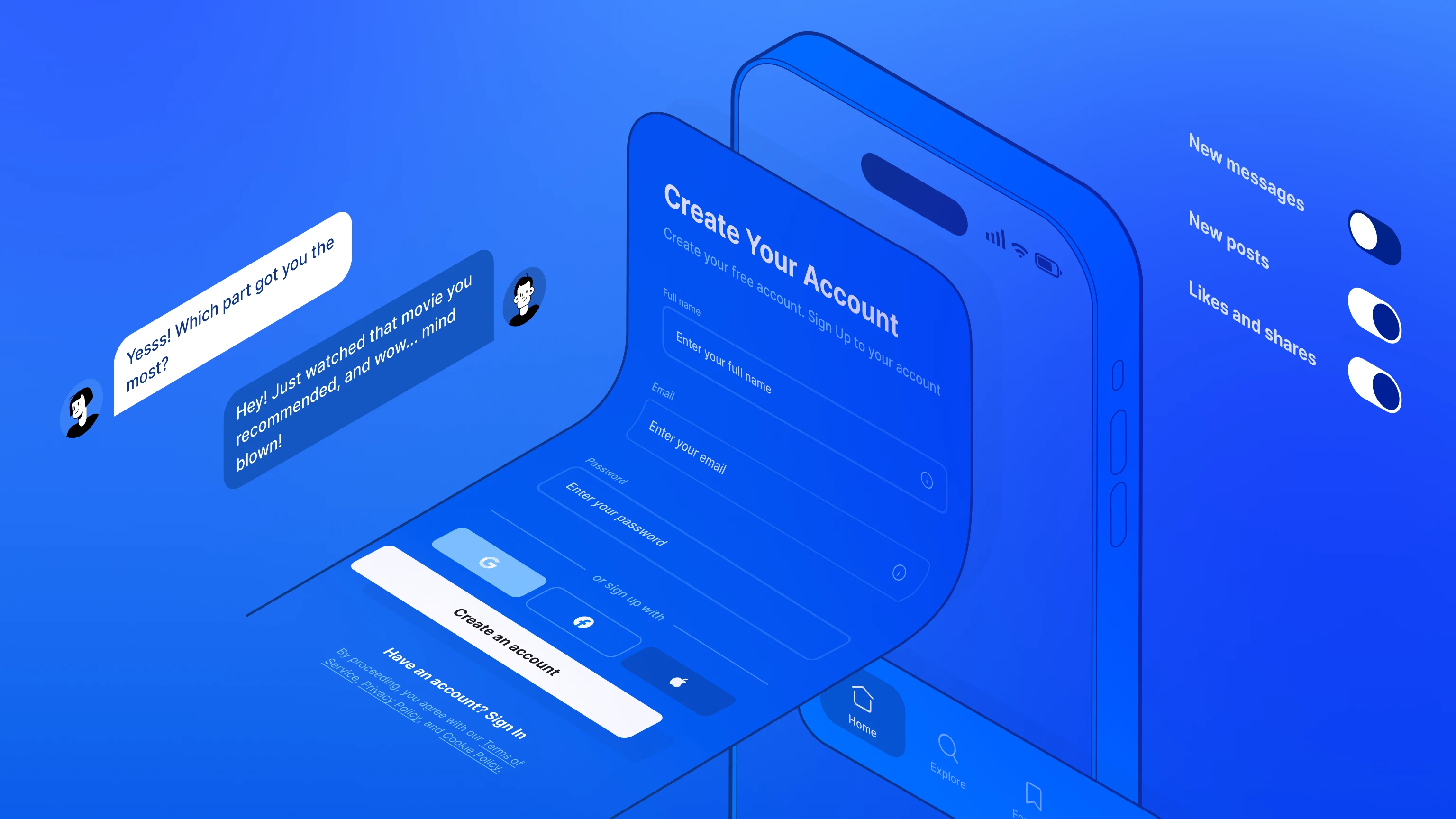
Designing a mobile app that looks and feels great on both iOS and Android can be daunting. Apple’s Human Interface Guidelines (HIG) and Google’s Material 3 each have unique principles. If you’re aiming for one unified design that still adapts elegantly to each OS, the process can feel like juggling two sets of rules at once.
But don't panic. In 2025 has made it possible to develop applications on a single system, which opens the door to simpler design, thanks to coding languages like Flutter. With Figma’s auto-layout, variables, and a structured approach to building cross-platform components, you can streamline your workflow and craft experiences that look right on any device.
Below, we’ll dive into each phase of designing for iOS and Android—from picking screen sizes, fonts, and color modes, to ensuring your final designs are code-friendly and accessible.
Why aim for a unified multi-platform design?
Before we get into the nitty-gritty, it’s crucial to understand why you might want a single design system for both iOS and Android. It boils down to three core benefits:
Brand consistency. Your brand’s style, colors, and UI elements remain consistent across devices, maintaining a cohesive feel for users. Solutions like Appetite UI help unify brand guidelines while respecting each platform’s UI patterns.
Faster iterations. Instead of maintaining two entirely separate Figma files, you can centralize your components, color tokens, and typography. This is most appreciated by startups.
Developer-friendly handoff. A single design file - organized using the correct naming conventions and variants by platform - simplifies the coding process. Your iOS and Android (or multi-platform) developers will love you.
Setting up your Figma environment
Local fonts & permissions
Figma has a default pre-installed font set from Google Fonts. I recommend using fonts from here - they are 100% free and most are well designed. However, it is possible that your brand requires you to choose other fonts, e.g. for headlines and display fonts. If you want to create a clean Apple-style design, install SF Pro, SF Symbols (for iOS) from Apple. This will ensure that you can replicate the standard approach to text and icons in iOS. This ensures you can replicate the standard iOS text and icon approach. Use Figma Desktop whenever possible so you have direct access to local fonts.
Recommended frame sizes
If you're designing an app for only one operating system, I recommend using the dimensions ideal for those devices - for iOS: 393×852px, for Android: 360×800px. If you're designing multi-platform, design in a uniform 375×812px size. By attaching the basic elements (top and bottom bars) to these frames, you'll understand the safe areas (cutout, status bar, home indicator) and typical areas to tap.
Create a foundation page
To keep you and your developers organized, reserve a Figma pages for Foundations with this elements:
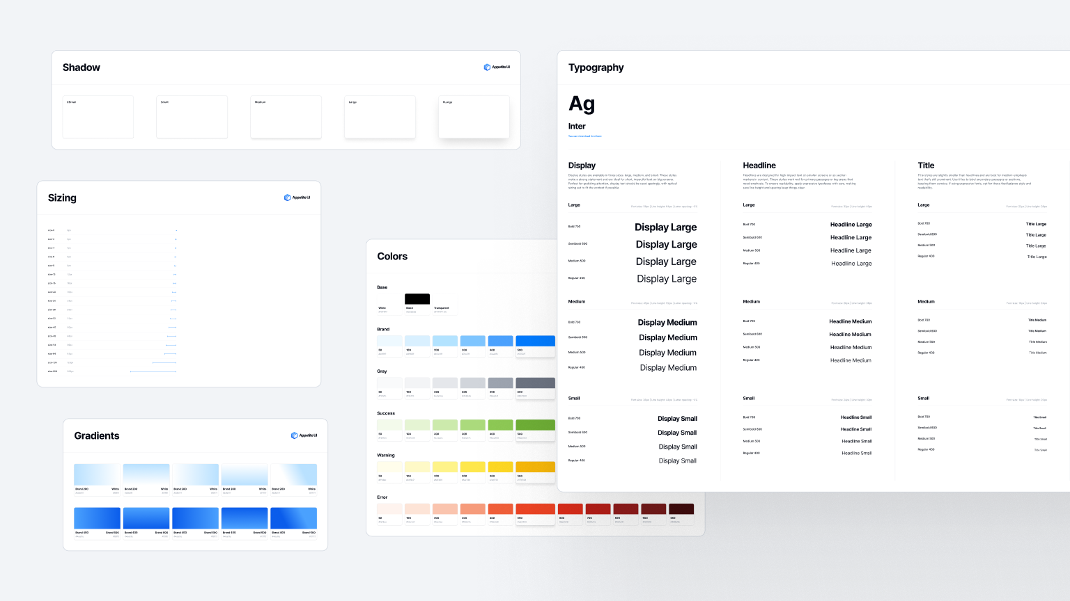
- Colors. Brand, Light, Dark, or any additional (Error, Success, Warning) and accessible variants e.g. for Dark Mode.
- Text styles. Display, Headline, Title, Body, Label, etc.
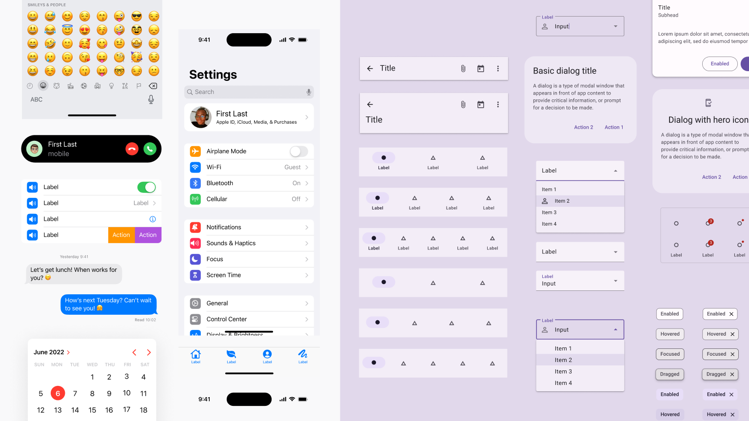
- Icons. SF Symbols for iOS, Material Icons (or your brand icons) for Android or any branded or multi-platform.
- Layouts. Basic sizing settings and working with layouts for individual screens.
- Styles. Styles like shadows or background blur effects.
- Components. Individual components, like Buttons, Switches, Labels, or more complex ones. To make things easier, we have standard components in Appetite UI that are ready to be edited.
If you are new to Figma, we recommend reading the Figma basics first.
Understanding iOS vs. Android design principles
Even if we decide to create a multi-platform design, it is necessary to think about the particularities of each operating system and the fact that each may work slightly differently in certain cases.
iOS (Human Interface Guidelines)
Apple’s HIG emphasizes clarity, deference, and depth. Some key aspects:
Navigation. Typically uses a top navigation bar, with a prominent title or large title style, and optional right/left bar buttons.
Tab Bars. Placed at the bottom, often for global sections of the app.
SF Symbols. System icons that auto-adjust weight for text and adapt to dynamic type.
Android (Material 3)
Material 3 (the newest iteration of Material Design) focuses on personalization, dynamic color, and flexible components:
Navigation. Can appear in bottom bars (like a Bottom Navigation View), top app bars, or a Navigation Drawer for broader sections.
Elevation & Shapes. Subtle shadows, layered surfaces, and shape theming are integral to Material 3’s look.
Working with Color Variables & Multiple Modes
A robust colour system is the basis of every design. It ensures that your brand identity remains consistent, interface elements remain recognizable, and the app remains accessible and adaptable to different contexts (light/dark themes, device types, etc.). We recommend Tailwind's CSS Color Generator tool to get the colors right.
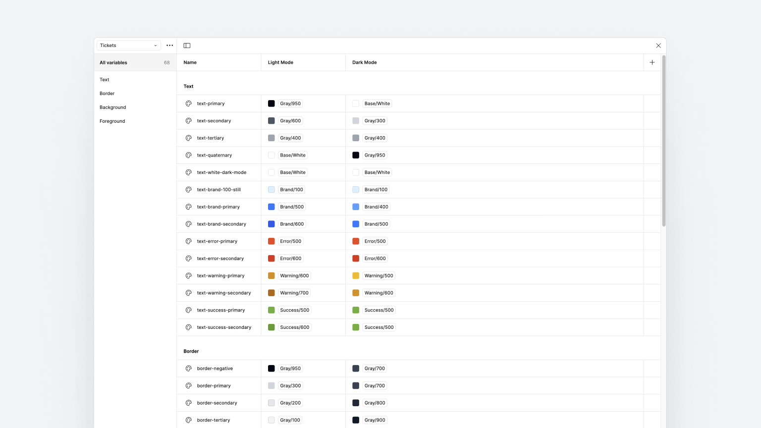
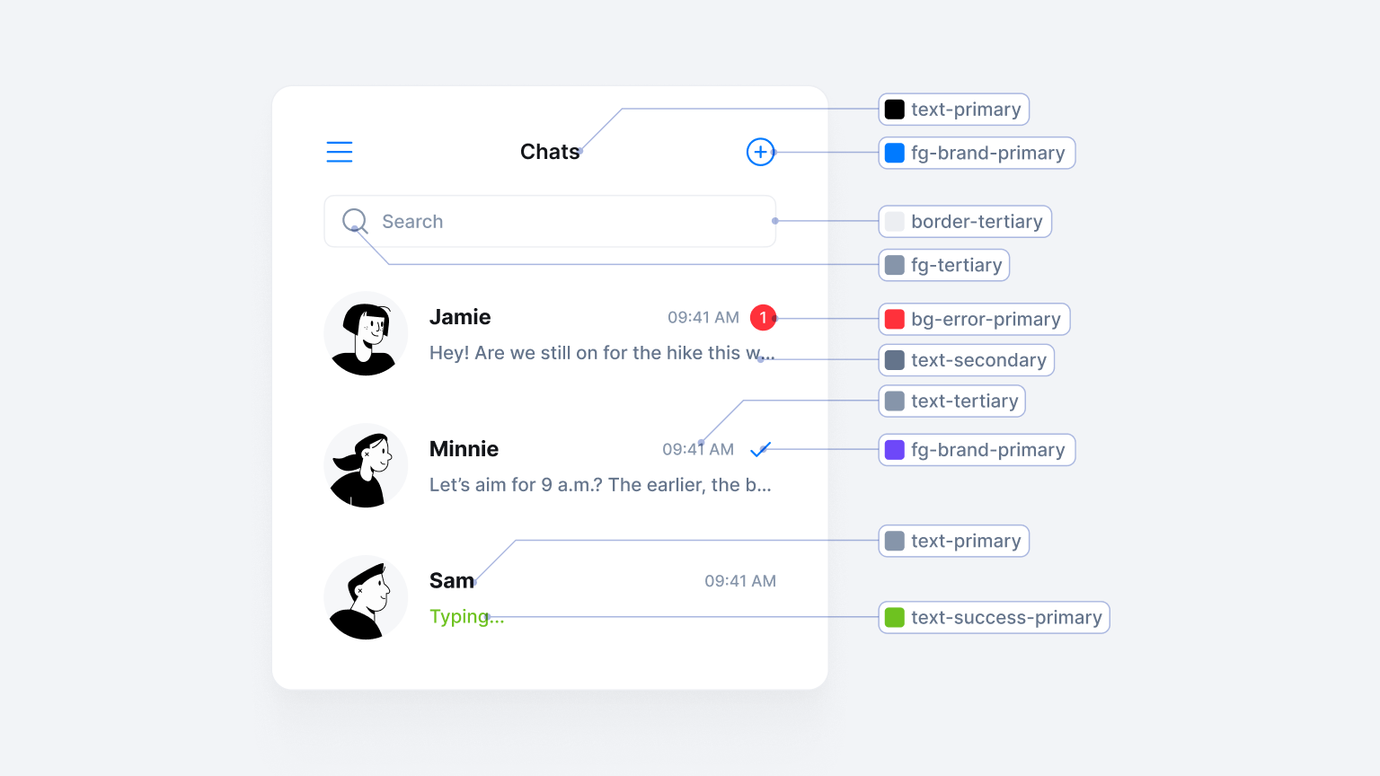
Color Variables (tokens)
Tools like Figma now support color variables—tokens you can assign to different layers. When you decide to tweak a brand accent or introduce a new theme, you only change the variable definitions. As you scale your app to different platforms, tokens keep your color usage consistent and reduce errors:
Color Tokens Example:
- color-primary -> #3C74FF
- color-primary-dark -> #2C5BCD
- color-background -> #FFFFFF
- color-background-dark -> #1C1C1E
Layering & hierarchy
Most modern UI design relies on multiple layers of background and content:
- Base layer. The fundamental background color, often a neutral tone (white or near-white in light mode, near-black or dark gray in dark mode).
- Surface layer(s). Cards, modal backgrounds, or containers that slightly differ from the base color for visual separation.
- Accent or emphasis. Buttons, links, or primary calls to action, typically the brand color or a more vivid hue.
- Semantic feedback. Colors used for success (e.g., green), warning (e.g., orange/yellow), or error (e.g., red).
Maintaining clarity between these layers is key to ensuring your UI looks structured and is easy to parse at a glance.
Accessibility & contrast
Contrast is crucial for readability and is especially helpful for people with vision problems.Your text or interactive elements must meet sufficient contrast ratios (often 4.5:1 for normal text or 3:1 for larger text, per WCAG guidelines). Always test your color pairs (foreground vs. background) with a contrast-checking tool.
In a multi-platform app, consider that screens vary widely in brightness, color calibration, and user environment. If your contrast is borderline on a perfect monitor, it may be illegible on a phone in bright sunlight.
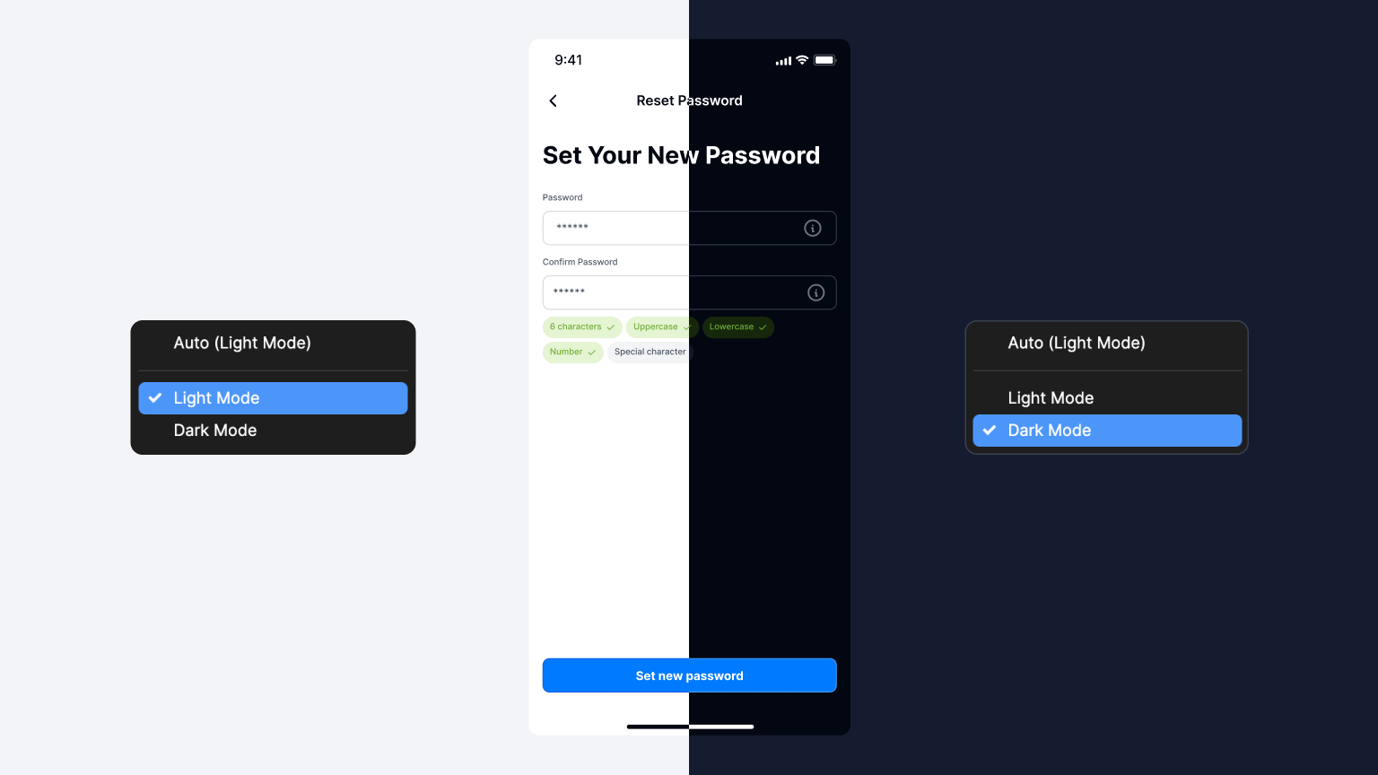
Light & dark modes
Many users prefer dark mode for comfort, or to reduce eye strain at night. In general, texts in Light Mode are easier to read, but Dark Mode is more modern and will definitely appeal to the younger generation. So, we recommend Light Mode for blogs, informational, or clean apps. Dark mode is better for exclusivity, modernity, or as an option for night reading. If you decide to give the user a choice between Dark Mode and Light Mode, don't forget to think about the correct setting of brand and complementary colors for each of these modes.
Using typographic guidelines & dynamic text
Typography is about legibility, hierarchy, and brand personality. In a multiplatform context—where screen sizes range from tiny phone displays to large desktops—it’s essential to have a scalable, consistent type system.
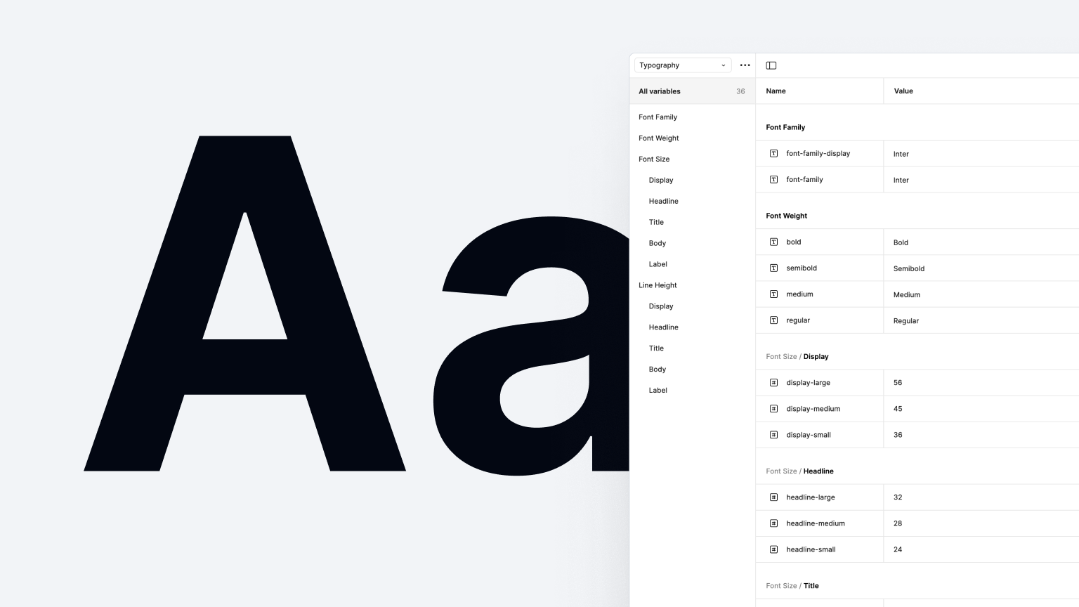
Type scale & hierarchy
A clear type scale sets the foundation for headings, body text, and smaller captions. For example, you might define something like:
- Display (Huge Titles)
- Headline (Main headings and subheadings)
- Title
- Body / Paragraph
- Button / UI Label
Each style has a font size, line height, and potential letter spacing that complement your brand. Use consistent ratios (e.g., 1.25 or 1.33 increments) to create a visually harmonious scale.
Font choices & pairings
Your choice of primary typeface affects the entire feel of your product. Common strategies include:
- One Font Family. (using different weights—regular, medium, bold—for hierarchy).
- Two-Font Pairing. A sans serif for main UI text (legibility) and a serif or display font for headlines or branding.
Ensure you have the necessary font licenses for all platforms (iOS, Android, web, etc.) or rely on free options like Google Fonts if you need universal coverage with minimal overhead.
Readability & leading (Line Spacing)
Leading (line height) is vital for reading comfort. Dense text can strain eyes, while overly loose leading can break visual unity:
- Aim for line spacing around 120%–150% of the font size for paragraphs.
- UI elements like buttons or tabs typically have less spacing since they must remain compact.
Responsive & adaptive text
In a multi-platform environment, text may be rendered on small phone screens, tablets, or even TVs. You might need dynamic scaling or adapt your type scale based on the device category. Some apps automatically adjust font sizes if a user increases system-wide "Text Size" for accessibility. Ensure your design system can handle this gracefully (e.g., by labeling text styles semantically, so developers can map them to “scalable text units” in code).
Brand personality vs. usability
While a distinctive custom typeface can reinforce brand identity, always weigh it against user-friendliness. Overly stylized fonts may hamper readability, especially on smaller screens. A stable, clean typeface with subtle brand flair often works best for consumer apps. Save your highly decorative fonts for marketing materials or splash screens.
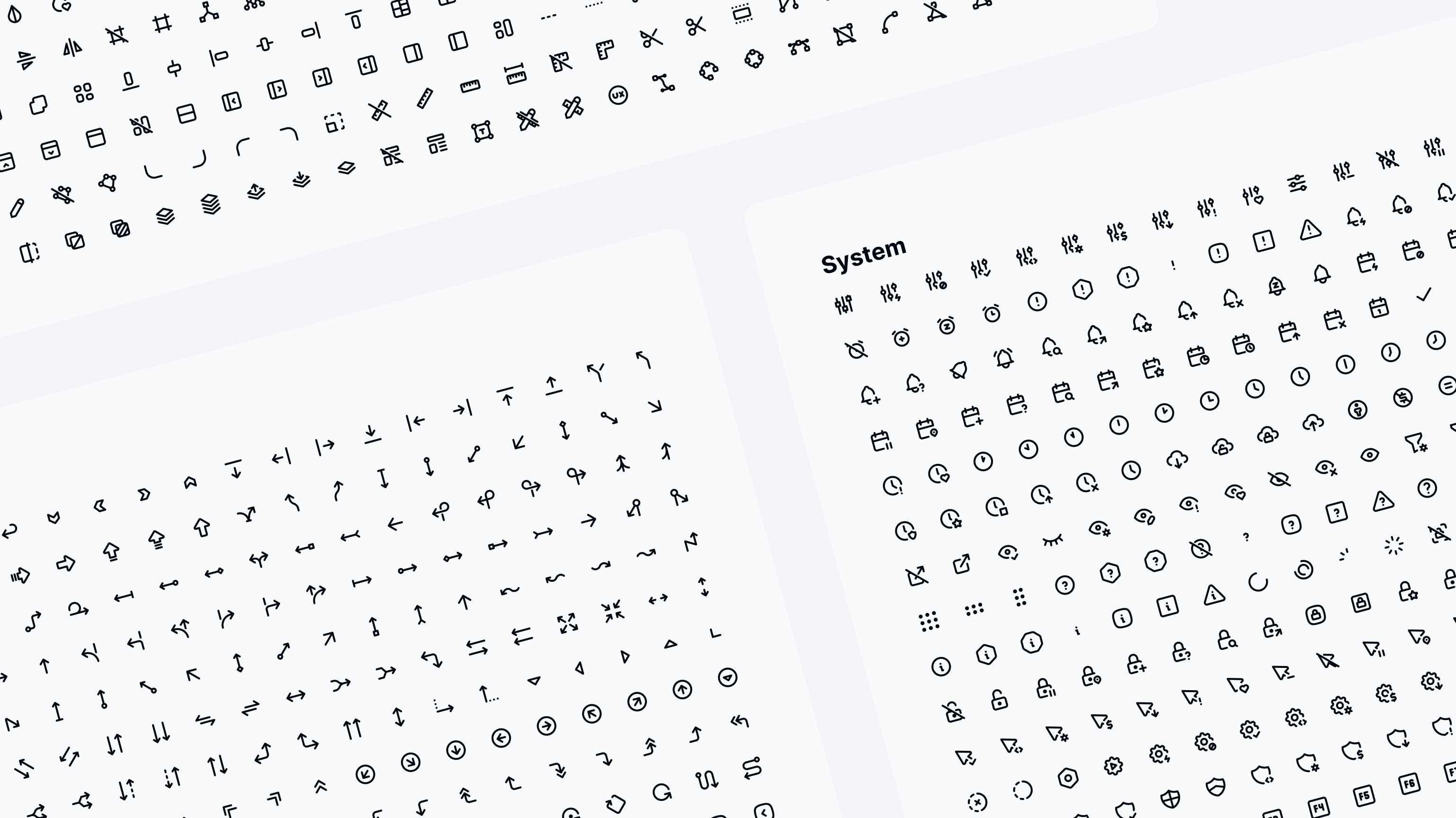
Icons
Icons often serve as the universal language of any user interface. Whether signaling actions like "edit," "delete," or "share," or denoting categories like "music," "finance," and "settings," well-crafted icons help users quickly identify features and navigate your app without relying on text labels alone.
Consistency & clarity
Stylistic Consistency. Keep line weights, corner radii, and visual density uniform across all icons. A cohesive set looks more professional and is easier to parse.
Minimal Detail. Icons should be immediately recognizable—even at smaller sizes. Avoid overly intricate shapes that lose clarity on high-DPI mobile screens.
Avoid Ambiguity. Each icon should have a single, obvious meaning. If an icon can represent multiple concepts, consider adding a short text label or rethinking the metaphor.
Semantic & systemized approach
Semantic Naming. Similar to color and typography, name icons by their function (e.g., Icon/Play, Icon/Settings, Icon/ArrowLeft), rather than purely visual descriptions. This helps with organization and developer handoff.
Platform-ready resources:
Many designers use SF Symbols on iOS or Material Icons on Android for built-in consistency and automatic resizing or theming.
In the Appetite UI library, we use the icons behind the Tabler set, which fit perfectly into both IOS and Android systems.
Size & tap targets
Regardless of whether your layout uses Apple’s Human Interface Guidelines or Material 3 patterns, aim for a minimum touch target of about 44–48px to ensure users can tap icons easily. The icon itself may occupy only a portion of that area, but the surrounding clickable space should be sufficient.
Dealing with layout differences & safe areas
Layout is where visual structure and usability converge. A layout system that scales effortlessly across platforms and screen sizes reduces friction for your dev team and fosters a consistent user experience.
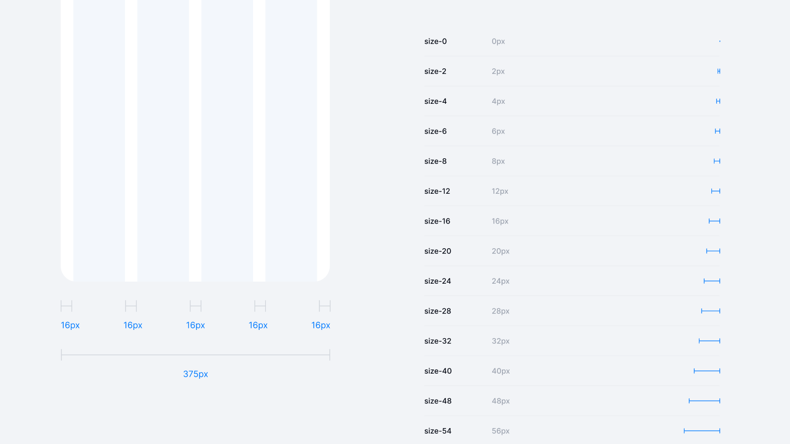
Grids & spacing systems
A grid system organizes horizontal and vertical space, ensuring consistent margins and alignment:
- Columns. e.g., 4, 8, or 12 columns for more complex or larger screens. On mobile, you might rely on a simpler 4 or 6-column structure due to the narrower width.
- Gutters / Margins. define uniform spacing between content blocks, typically based on multiples of 8 or 4. The "8px Grid" is common because many devices scale well with increments of 4 or 8.
By using a consistent grid, you’ll ensure elements line up neatly. On bigger breakpoints, you can subdivide columns for more advanced layouts.
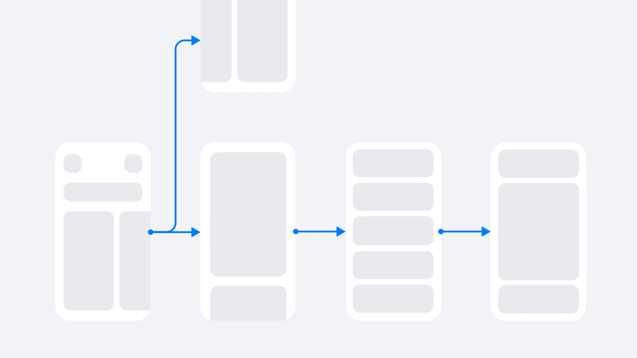
Auto-Layout & responsive behavior
Tools like Figma Auto Layout or responsive constraints allow frames to resize when content grows or the container changes. This is particularly important for:
1. Dynamic content. If text changes length (localization or data-driven content) or if images have to fit variable aspect ratios, auto-layout ensures the UI reflows properly without manual tweaks.
2. Orientation & screen rotation. On tablets or phones, a user might rotate the device. A well-crafted layout system can adapt from portrait to landscape gracefully.
Hierarchy & visual grouping
A good layout not only looks balanced but also guides the user’s eye:
• Zoning. Group related content together, separate them with whitespace or subtle dividers.
• Emphasis. Use spacing to highlight the main call-to-action area or important metrics.
• Above the fold vs. below the fold. On smaller screens, users see a limited area without scrolling. Key tasks should often stay accessible near the top.
Navigation patterns
While the specifics can vary across platforms, some universal layout principles apply:
• Top-Level navigation. Many mobile apps use bottom tabs or a side drawer. On larger screens, sidebars or top nav bars are common.
• Consistent placement. Keep major actions (like "Add," "Search," "Profile") in predictable spots so returning users can find them quickly. If possible, standardize the placement and structure across multiple apps in your brand ecosystem, maintaining familiarity.
Gestalt & white space
Gestalt principles (like proximity, similarity, closure, continuity) help your layout “make sense” visually. Leaving sufficient white space around elements not only looks modern but also improves scannability. Resist the urge to cram everything in a single screen—users prefer clarity and breathing room.

Making your app accessible & inclusive
High contrast & larger text
Remember that some users have difficulty reading small text or prefer higher contrasts. iOS and Android both allow for system-level accessibility overrides. If your color contrast is borderline, your text may vanish for some users.
Testing different modes
In Figma, create separate frames for testing how color-blind users see your designs or simulate scaled-up text. Even if it’s approximate, it’ll reveal potential pitfalls like clipped labels or color-coded icons losing meaning.
Custom vs. native components
Many standard iOS or Material 3 components automatically incorporate accessibility properties (like voiceover labels, correct tap zones). Overly custom elements may require more dev effort to remain accessible. Striking a balance is crucial.
Prototyping & testing
Figma mirror & interactive prototypes
Figma Mirror (iOS/Android). See how your design looks on a real device. This helps you confirm margins, font sizes, and finger-friendly tap targets.
Prototype connections. Add transitions (Tap, Drag, Smart Animate) to navigate between screens. This is perfect for quick user testing sessions.
Beta testing with users
If your team is comfortable coding prototypes, you can also do short "TestFlight" or "Android Beta" builds. This can reveal platform-specific issues that might not appear in a Figma prototype (like performance constraints or device-specific gestures).
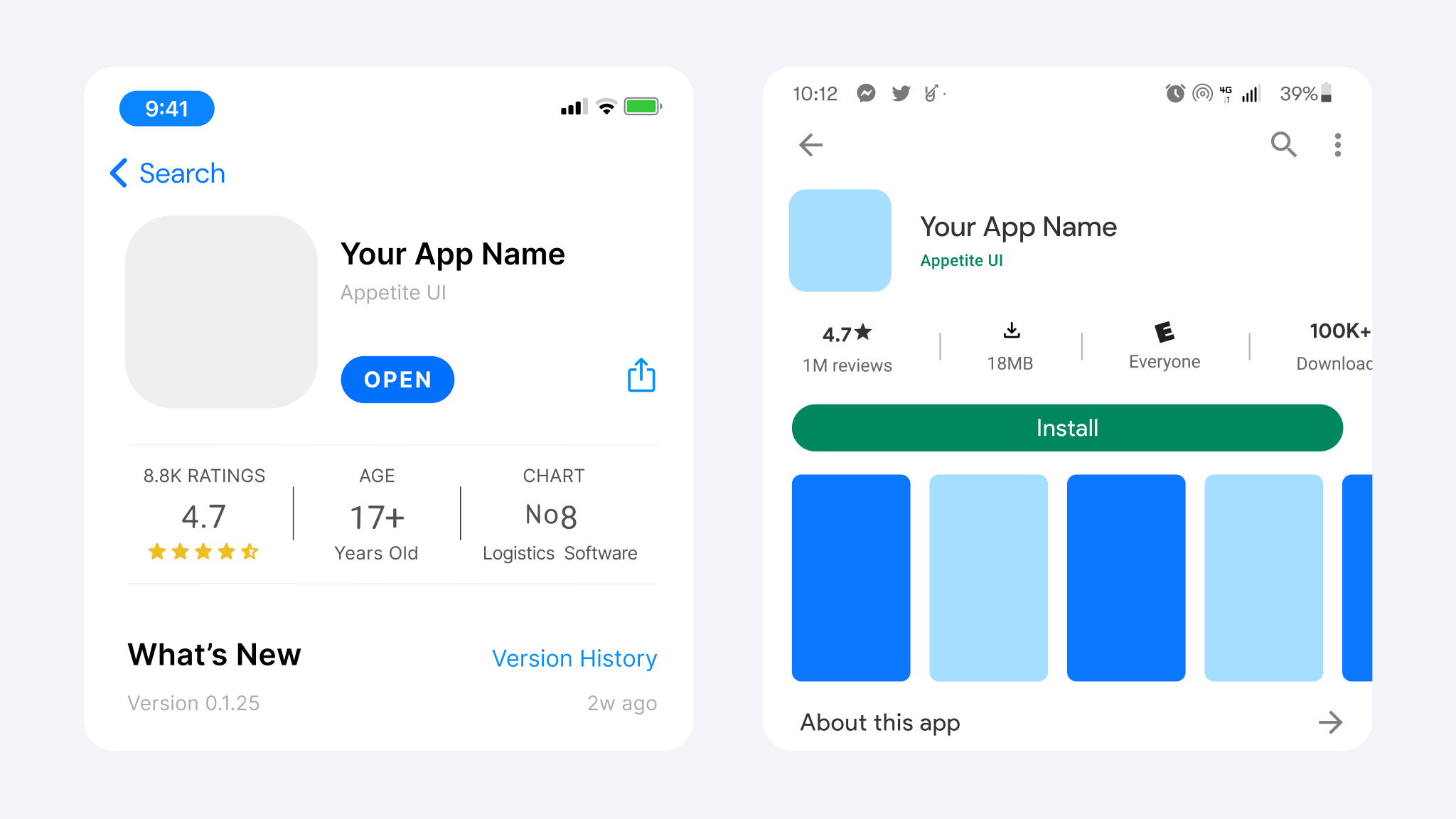
Icon design & App Store / Google Play screenshots
When your cross-platform UI is near completion, you’ll need to prepare the marketing side:
App icon
- iOS icons are often simpler, with no background transparency and consistent corners.
- Android’s adaptive icons can show different shapes depending on the device.
- If you want a uniform brand presence, keep a single shape or color scheme. But be mindful that iOS corners are more rounded, while Android adaptive icons might crop differently.
Screenshots
- The Apple App Store typically requires screenshots for the 6.7" and 5.5" phone sizes.
- Google Play has its own recommended dimension sets (e.g., 1080×1920).
- Show off your best features or flows. If your design is consistent across both platforms, you can re-use the same basic layout but swap iOS vs. Android UI chrome.

Developer handoff & code friendliness
Comprehensive documentation in Figma
Add short notes or tooltips for each variant—explain that "Variant A: iOS standard," "Variant B: Android standard," etc. The more clarity you provide, the easier devs can implement your designs.
Linking to system components
- iOS devs might need to know "This button is a UI Button with SF Symbol X in size 20px."
- Android devs might want the color hex or token references (like attr/colorPrimary) or an excerpt from Material theme attributes.
Continuous feedback loop
Once devs start building, they might discover subtle differences—for example, text baseline alignment with iOS large titles vs. an Android toolbar. Stay flexible and iterate as needed to preserve your shared brand identity while respecting each OS’s standard layouts.
Designing for iOS and Android under one unified design system doesn’t mean ignoring platform differences. Instead, you tackle them head-on: create carefully named variants, manage color modes with variables, and keep your brand identity consistent throughout. Tools like Appetite UI or any multi-platform Figma library can lighten the load by offering pre-made iOS and Android components with a shared visual DNA.
Ultimately, the goal is to give users a familiar experience on their chosen OS while showcasing a consistent brand vibe. Follow the official guidelines—Apple HIG for iOS, Material 3 for Android—for best usability, but unify them via shared colors, typography, and design patterns. By harnessing Figma’s advanced features (auto layout, component properties, variables), you can craft an app that’s code-friendly, easy to update, and a pleasure to use on both sides of the mobile fence.

